For the past two or three weeks I’ve been bashing out ideas for my practical project, the type family designed especially for Burmese dictionaries. As I blogged before (Thoughts on a Brief and Exploring Burmese), I’m aiming for a fresh, lively and cheerful design, in which the Burmese and Latin scripts harmonise well.
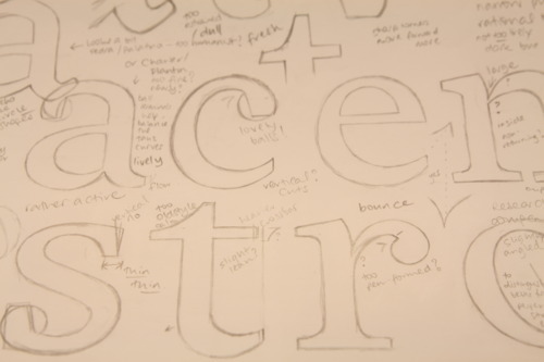
My first scribbles with paper and pencil (above) looked like a strange imitation of Charter, Miller or Times New Roman. I adopted round ball terminals on the /a/ and /c/, in a crude attempt to reflect the circular forms of Burmese letters. The problem was it’s boring. The vertical stress wasn’t providing enough dynamism, and the flat serifs seemed too modern and fussy. Overall it looked restrained and dull, not at all the sort of thing I wanted to spend the next eight months working on. However, I wasn’t quite ready to throw away my sketches as something about my /n/ seemed to show some interesting potential.
I’d subconsciously picked up on the idea of designing the whites, the counterspaces, before the blacks, the strokes, and this had meant I was focussing on the white notch above the join. Making it large seemed to have two benefits: reducing clogging at small (dictionary) sizes by lightening the junction, and pushing the upper curve forward creating some nice movement and liveliness, giving a nice ‘legato’ effect to letters. In addition, the shape of the trap seemed to represent the path of a bounce, accidentally perfect to suggest liveliness.
A second attractive feature of the /n/ was that the inner curve of the arch didn’t have so much speed in the curve — all the action was in the outer curve — allowing me to indulge my interest of dissociating the two sides of the stroke, in a Dwiggins or Bloemsma* sort of way, producing something unachievable by a real tool. This led me to further research Bloesma’s logic behind Balance or Legato: his solution was to link the letters by rotating the counters, but what if there’s another way?
I began to sketch again (below), trying to incorporate the active stroke movements and flow between letters. A solution here was to make the serifs flow out from the stems, rather than looking like bars across the bottom of strokes. And they needed to become slightly asymmetrical to emphasise the desired forward movement.
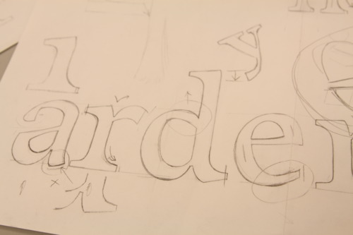
I completely redesigned the /a/, actually by reverting to an unmodulated, sans serif design, to see how the underlying architecture could work, and then adding the contrast. With the /e/ and /s/, I tried to make the inner sides of the strokes less round, directing the eye along the reading line to the next letter, rather than curving all the way back into the centre of the letters (below). And yes, that /s/ isn’t quite there yet.

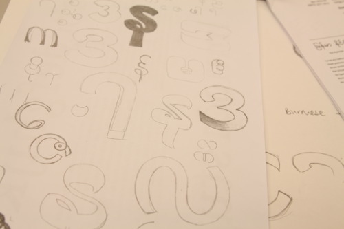
I’d also been playing with Burmese letterforms (below), thinking about how some of the details of my Latin design could be transferred over. I wanted to add a small amount of stroke modulation, and thought the terminals especially would be an area in which some clever solutions could make my design more unique. After all, I want to make something that isn’t just a set of geometric circles. Adding some humanist or calligraphic touches seemed reasonable.
So far so good. And then I presented my design brief and font sketches to Gerard Unger, thinking I had a solid basis for a type family. Instead, Gerard suggested, where I had been considering my Burmese as a non-Latin script, I could consider my Latin as a non-Burmese script. Oops! But what does this mean exactly? Well, start by looking at the Burmese letterforms, thinking about how the strokes are made, with which kind of tool, and what effect that has on the appearance of letters. Sure, they’re circles, but they’re also monoline, and can be rotated or squoosed to look Latin. Not that he suggested I mimic the Burmese details in the Latin, but that it could be instructive to think about the angles and roundness of Burmese when constructing the Latin. He suggested I study Futura, VAG Round and DIN Rounded. An interesting idea, I thought.
Feeling confused by rounded, geometric sans serifs, which I couldn’t link in a meaningful way to a typeface for small text in dictionary columns, I dutifully went back to my Burmese sketches whilst looking at DIN Round. Hm, just what I expected. Monoline, geometric shapes, a real spanner in the plan to make my Burmese more humanist.
But then it struck me I didn’t want to make the Burmese dictate the style of the Latin, in the same way Gerard was eager for me to avoid simply adapting my Latin into different stroke patterns. What I want is to give both scripts equally strong identities in the family, neither dominating the other, and with influences going both ways. After experimenting with Thai letterforms, I also want to ensure the two scripts are clearly distinguishable on the page, rather than blending into each other and getting swallowed up.
A potential solution occurred to me unexpectedly. Whilst looking back at my Burmese, thinking about which letters should be my starting blocks, I realised the importance of writing them on paper: Burmese words are written left to right, but the strokes are drawn in circle sections that go both clockwise and counter-clockwise. Some letter circles are started at the bottom and go clockwise, and some are drawn anti-clockwise from the top. And some letters are constructed in sections: strokes in opposite directions. Gerard’s suggestions were making me think.
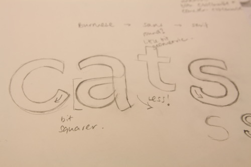
Whilst considering the relevance of this, I started sketching the sans-serif version of the Latin letters, which seemed to be the most promising way forward from Gerard’s suggestions. So what happens if the sans version took a little pinch of Burmese roundness, and a little of its geometric construction, and of course the more monoline approach would suit a sans face better, and what happens if into that mix, we start constructing strokes backwards as well as forwards? What if we start a /c/ or an /s/ at the bottom? Can instrokes and outstrokes be flipped on their heads?
To be continued…
*(Lots) more on Bloemsma’s Legato over on Typophile.