This week, the annual ATypI conference is taking place in Hong Kong. Unfortunately I’m not going to be attending, but its theme, ‘Between black and white’, has prompted me to think in more depth about how the principles of notan can be implemented in typeface design, not just as a curiosity, but as a pragmatic tool to enhance readability.
One of the attractions of type design is in the breadth of its influences, and a natural borrowing is from the Japanese concept of notan. The term refers to the art of balancing the opposition of black and white in Japanese paintings, and it has been somewhat hijacked of late by type designers referring to the interplay of the black (foreground) and white (background) elements we design with when creating type. Specifically, it alludes to the dissociation of the two, allowing the designer to intentionally mould the counterforms (white areas) as desired, not just to be determined by the black lettershapes. The byproduct of this separation between letter and counterspace is that it forces the type designer to abandon the stroke model and instead adjust letters’ outlines in isolation. To me, how this can be utilised in a pragmatic way is a massively interesting area for the discipline of type design, not least because it is so little explored.
As I mentioned when starting out on my MA typeface, Lumen, my aim was to make the letters flow together, so that in dictionary settings, where things are often rather choppy, smooth reading would be enhanced by legato, connected word-images. The ultimately connected type style would of course be a script face, with joined up writing. For obvious reasons this is not suitable for immersive reading or for setting a dictionary. How then can letters be linked together? How about making the white, rather than the black, be the part that joins up? A perfect opportunity to employ original creative responses to foster the principles of readability.
This sort of ‘pure’ design had been tackled by Evert Bloemsma in his Legato typeface; as Kris Sowersby notes, the design is ‘free of stylistic conceits’ with the important decisions made in pursuit of the goal of connectedness. What Bloemsma had done was rotate (or skew) the inner counters in the opposite direction to the outer black forms, breaking up the letters’ rigid uprightness and giving the white space a direction, rather than letting it simply exist as a dead space or byproduct of the black letters. While I didn’t want to follow this logic to the same conclusion as Bloemsma, I found in his theory a seed for further development.
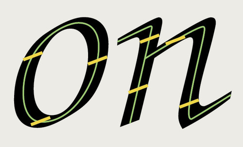
In calligraphic typestyles, the edges of strokes are determined by the width and angle of the tool.
Above: in most typefaces, based on a tool-and-stroke model, the white counterspaces are simply a byproduct of where the edges of the tool fall. In Zapf Chancery, the track of the pen (green) and the width and angle of the nib (yellow) determine the edges of the stroke at every point, and the stroke’s edges form the boundary between black and white. Now type design can be emancipated from the tool-and-stroke model with interesting results.
I took the idea of designing the whites semi-independently, but sought to make them connect across letters. Underpinning the architecture of every letterform was the theory that the white space should bend and flow to lead the eye smoothly along the reading line. The inner contours of letters mainly project outwards towards the adjacent letters, and employ curves of a lower frequency than the outside black edges. As well as helping the letters compose into harmonious images, this flattening of the counters emphasises the horizontal reading direction from left to right.

Comparison of Helvetica and Lumen showing how letters link differently.
The image above shows that the countershapes in Helvetica are directed inwards (or at nothing), making the letters stand alone, referring only to themselves; the lack of activity between letters also creates dead space that breaks words apart. In Lumen, the countershapes have been designed to harmonise and lead the eye across intervening letterspaces.
These days, people are increasingly asking whether there is any need for new typefaces and whether everything interesting hasn’t already been tried. I’m strongly opposed to their arguments: type design, like the disciplines of architecture or music composition, is a response to particular circumstances of time and place, and at its best, blends together personal expression, original and critical thinking, an appreciation of type history and underlying theories, and skills polished through extensive practice. In our increasingly connected world, the interesting question is what other concepts can type design borrow and benefit from?