Last month I was delighted to be invited to speak at the sixth BITS conference in Thailand. My presentation explores how we can create natural-looking designs in scripts we’re not native to, but at the same time unify diverse scripts into a coherent design. Since the most popular slide sharing media don’t seem to allow me to keep the transcript with the slides, I’m posting the slides as images and transcript as text below. Continue reading
Tag Archives: font
Reviving Emerson
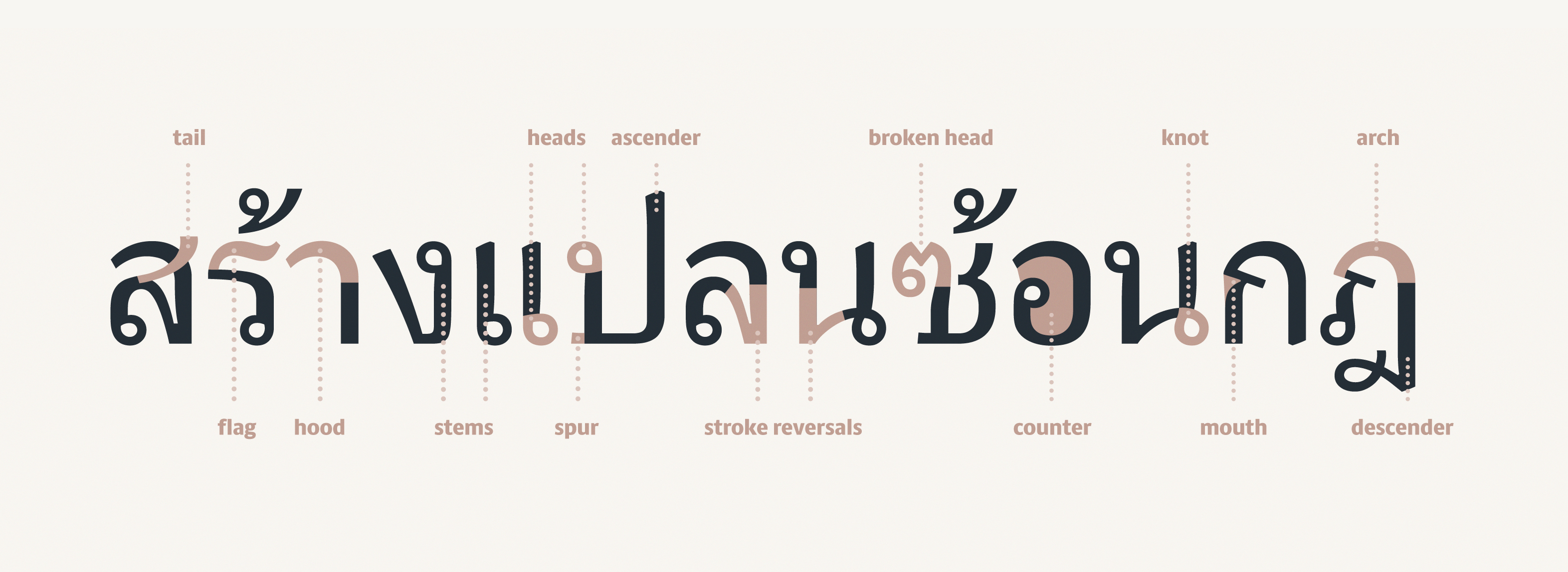
Thai letter anatomy
International Student Typeface Exhibition
The Ampersand Conference is always great because it brings many of my friends from the type community around the world to Brighton, my hometown. This year was extra special because I coordinated the first ever exhibition of student typeface work from around the world. Continue reading
Between black and white
This week, the annual ATypI conference is taking place in Hong Kong. Unfortunately I’m not going to be attending, but its theme, ‘Between black and white’, has prompted me to think in more depth about how the principles of notan can be implemented in typeface design, not just as a curiosity, but as a pragmatic tool to enhance readability. Continue reading
It’s May already!
The year has flown past at an alarming speed — not that it’s over yet, but as our project deadlines are in June, it feels like we’re very much in the final stretch. After our fantastic field trip to Antwerp, Amsterdam, the Hague, Haarlem and Bussum, the Easter break gave us some much needed breathing room to get down to some serious business with FontLab. Continue reading
Finally, Burmese begins to click
Our Spring term has flown by, and progress on my typeface was honestly a bit disappointing. Perhaps I tried to tackle too many things and ended up spreading things a bit thin with unresolved attempts at Greek and Thai, or perhaps it was the packed timetable of workshops, visiting lecturers and assessment deadlines, but I was expecting to have achieved more by the end of term. I was especially unhappy that I didn’t have very much new stuff to show Gerard in his two visits of the term, as I’d been focussing on the non-Latin designs rather than bold, italic or sans fonts I’m also trying to develop. On the plus side, however, my Latin lowercase in the regular weight is now accomplished, including most of the spacing, so I’m freezing that now to work on the caps and Burmese. Continue reading
The typographic tradition in non-Latin scripts
In Europe, the various strands of typography came together over centuries. Even before the arrival of printing, there were many styles (and sub-styles) of writing: the Greek and Roman inscriptional capitals and everyday ‘rustic’ letters, the Carolingian and insular uncials, and the textura and rotunda gothics to name only a few key elements. Printing types started in the fifteenth century by mimicking the forms of handwritten letters, and thenceforth, developments in type included bicameralism (including upper- and lowercase versions of letters in one typeface), the integration of uprights with italics, and the gradual movement away from humanist models to the elegant swelling lines of the “modern’ types. Later we see the introduction of sans-serif faces, and the invention of the fat, poster faces that gave us our bolds. Continue reading
Designing the design
There’s a phrase that pops up from time to time in the department; it’s probably a Gerry-ism. ‘Designing the design’.
My take on it is that before we start drawing letterforms and thinking about details like what style of serifs we’d like, there’s the important matter of how the thing should look holistically. Can I visualise the rhythm and texture on the page, the way the letters perform together? Am I aiming for a particular mood and tone? What connotations and atmospheric values would I like to suggest? Continue reading
On multidimensional balancing acts
I decided to take advantage of Gerard’s third visit of the year to finalise the relationship between my Latin serif and sans serif designs. Several people had remarked that the sans was looking too skinny, too small or too light, but I wasn’t really sure whether fixing it meant stretching the thing or redrawing completely. In the end it was an illuminating and actually quite easy process, despite the many dimensions at play. Continue reading


