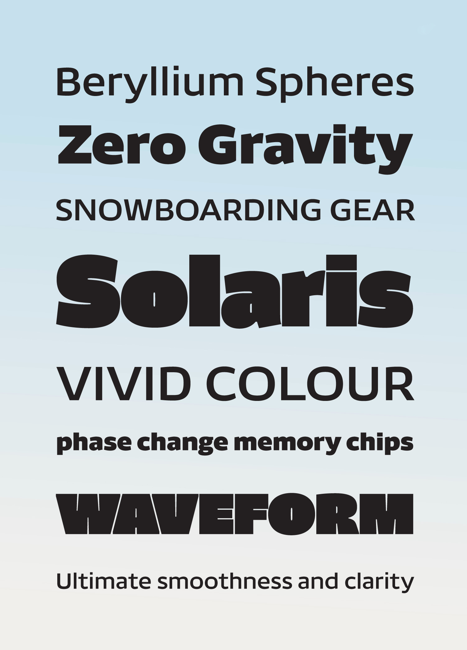
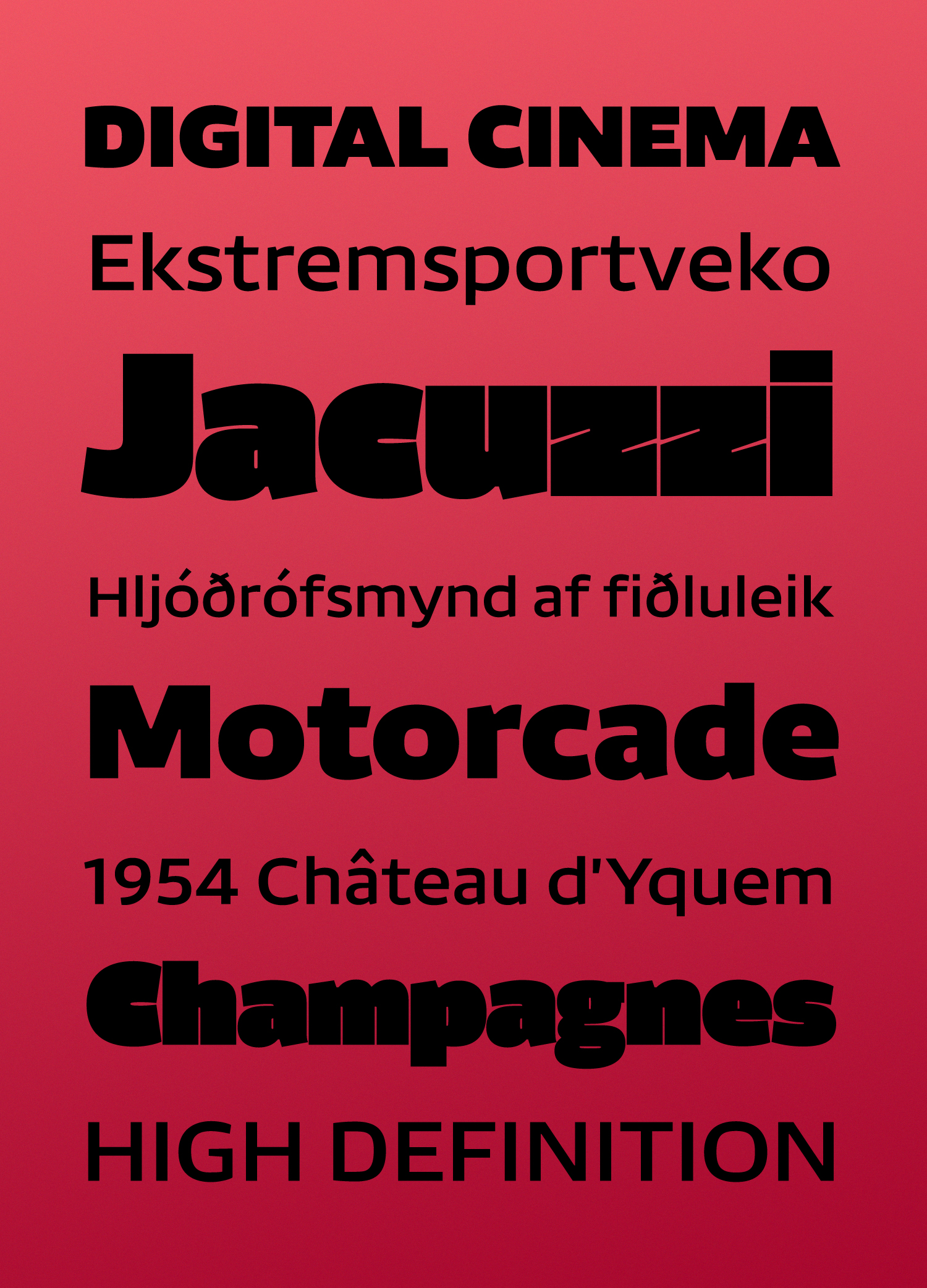
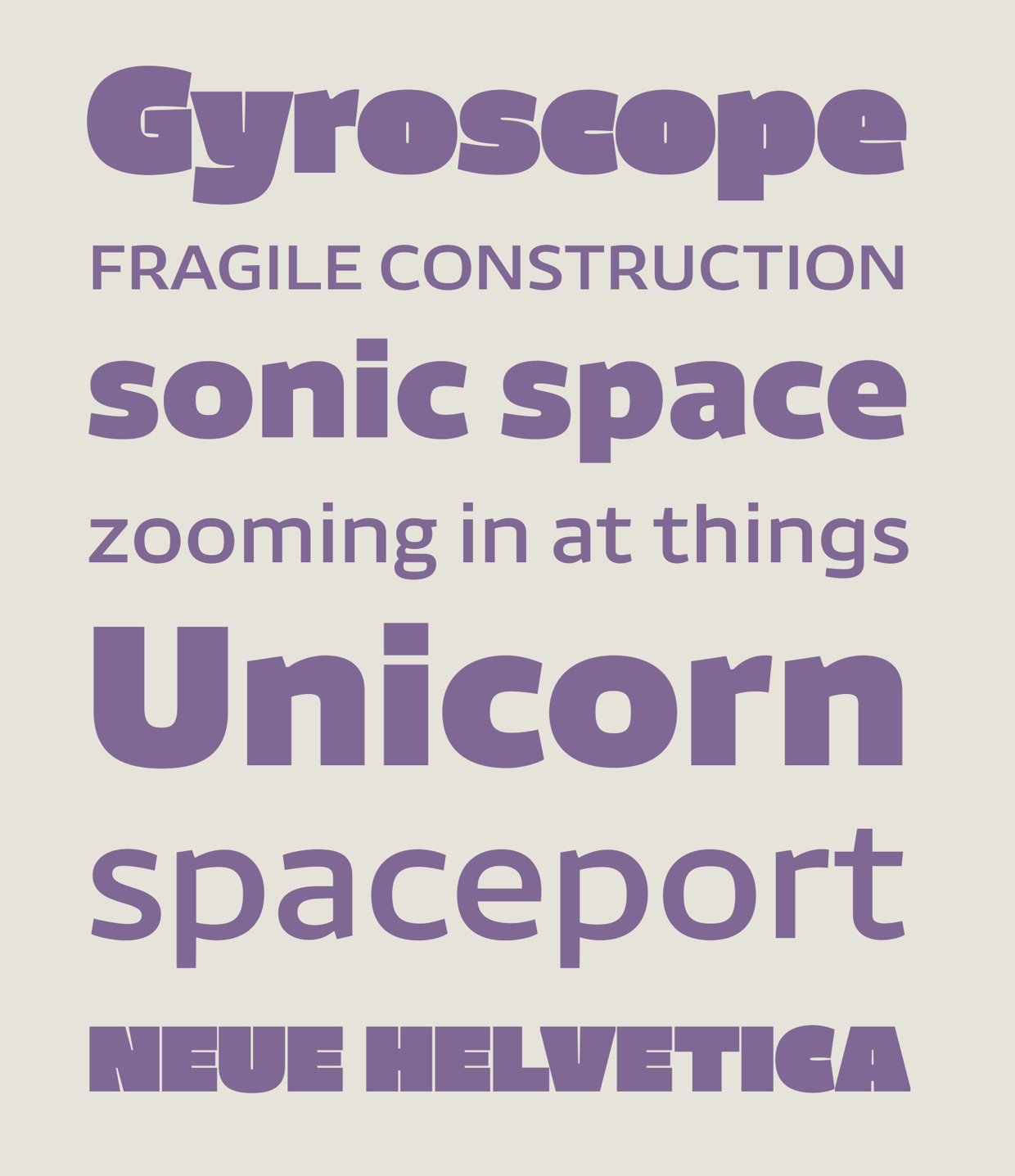
Futon emphasises its horizontals with squarish, modular forms, but retains its ergonomic feel with hints of the humanist pen in its modulation, open counters and sheared terminals. This makes it ideal for brand design and magazine use in sectors such as extreme sports, electronics and audio-visual technology.
On common characters like ‘a’ and ‘e’, the weight is distributed ‘centrifugally’ — away from the centre — a unique design solution that allows the shapes to retain their sturdy architecture without adding too much colour to the page. This effect becomes more prominent and widespread in the heavier weights, which look most luscious at large sizes for headlines.
At large sizes, Futon is full of character and freshness, ideal for display and headline use, but it performs well on screen at text sizes due to its boxy forms and regular, open counters.
Futon
Futon
Futon
Futon

Futon