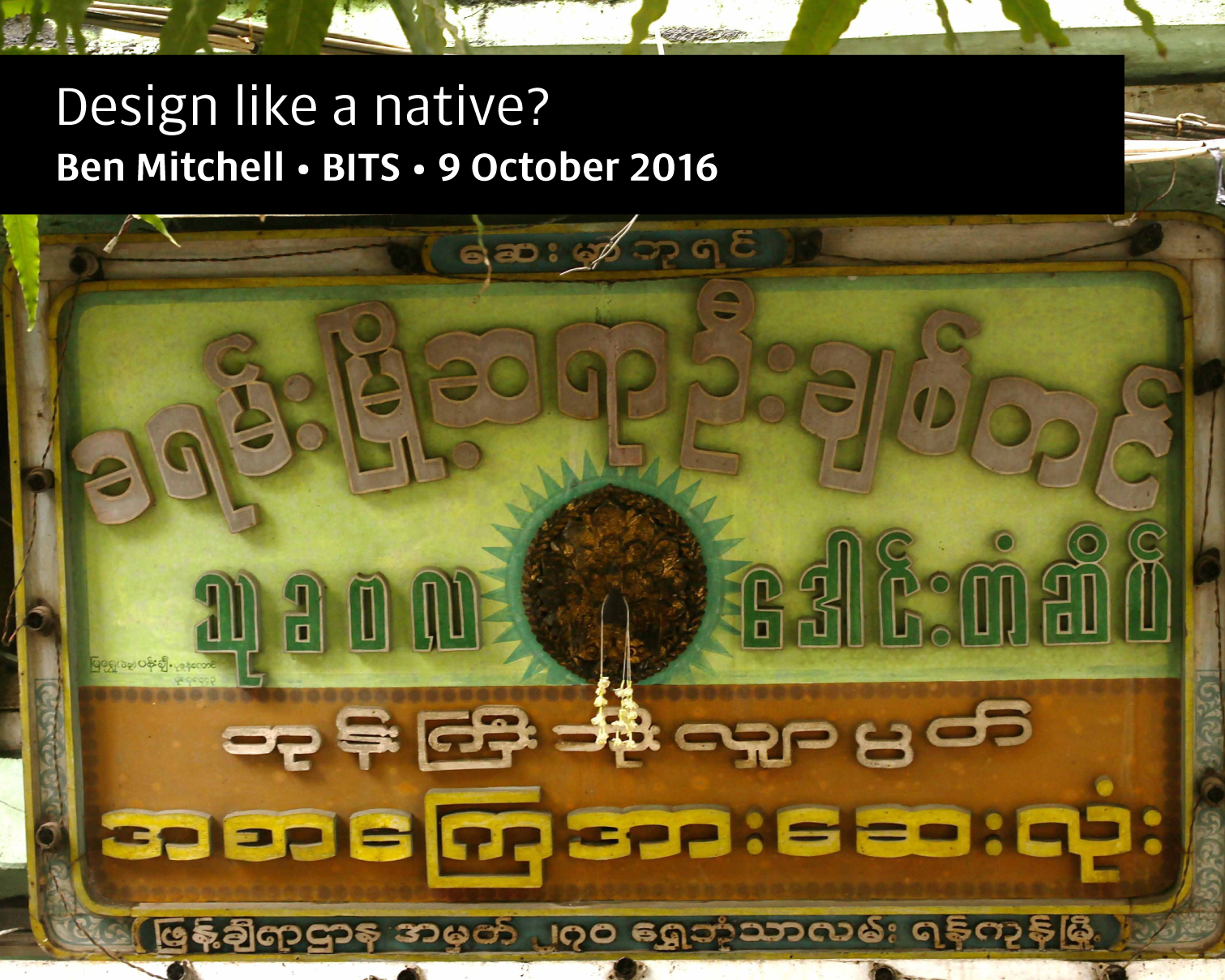
Last month I was delighted to be invited to speak at the sixth BITS conference in Thailand. My presentation explores how we can create natural-looking designs in scripts we’re not native to, but at the same time unify diverse scripts into a coherent design. Since the most popular slide sharing media don’t seem to allow me to keep the transcript with the slides, I’m posting the slides as images and transcript as text below.
Hello everybody. Thank you so much for inviting me here this week, it’s a great conference and a pleasure to be back.
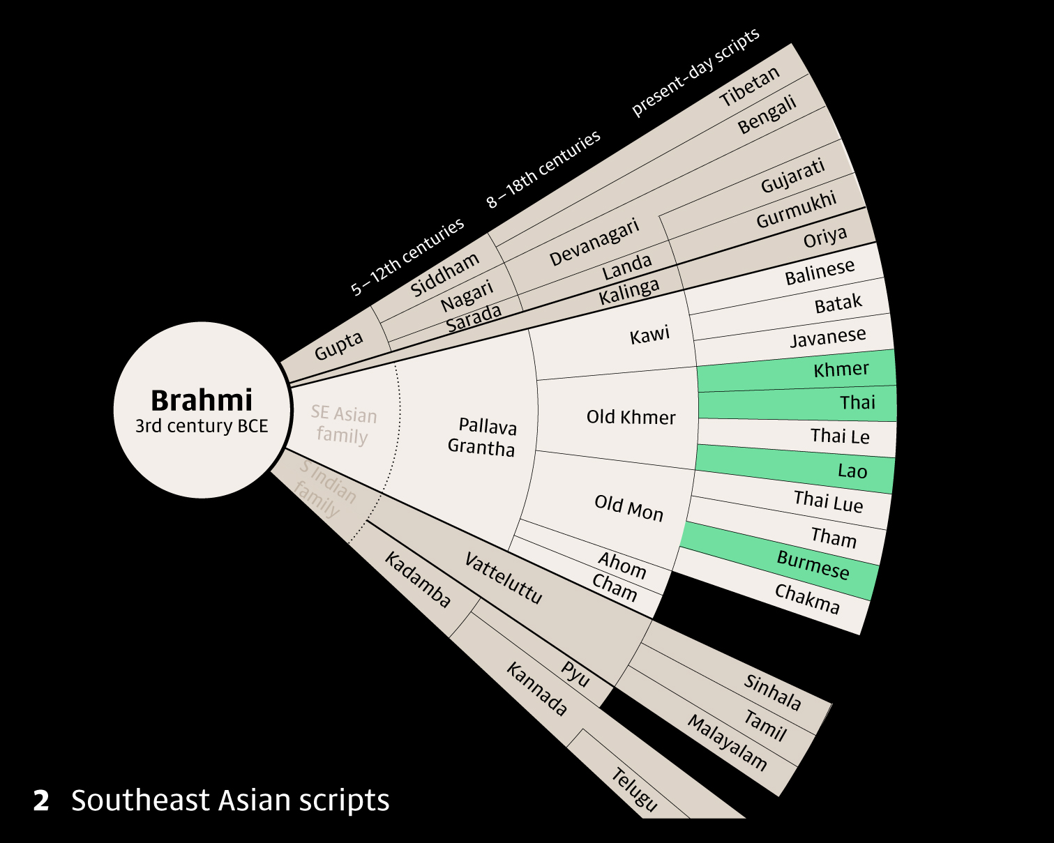
2 My name is Ben Mitchell and I work as a freelance type designer, based in the UK most of the time, but these days working on the writing systems of Southeast Asia. It’s a really nice area to work in, with some very varied writing systems; the green highlighted ones are the ones I’ve worked on up till now. As you can see, they all descend ultimately from the same root, Brahmi, which means they share a lot of characteristics, behaviour and some similar letterforms. We’ll come back to the way they relate a little later.
Although I’ve been visiting Southeast Asia for nearly twenty years, I’m definitely not a native user of any of the Southeast Asian scripts:
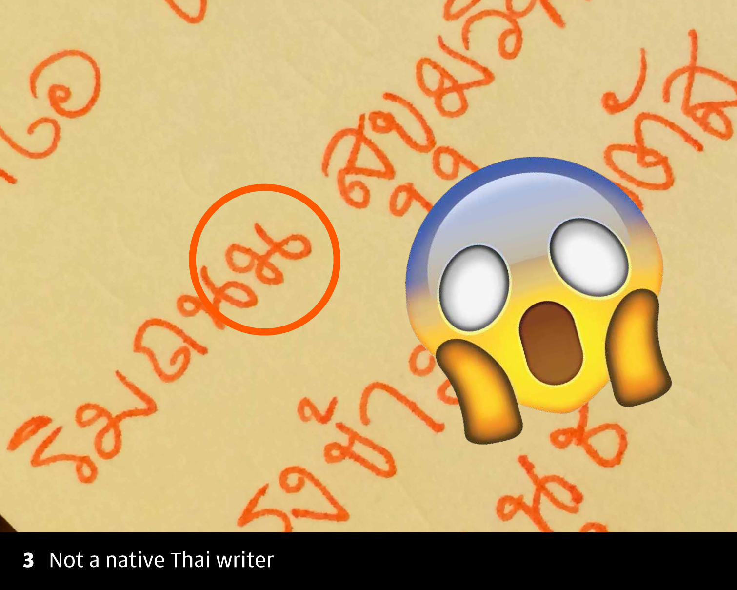
3 As you can see here, sometimes my fingers get a bit confused and do things like this when I write.
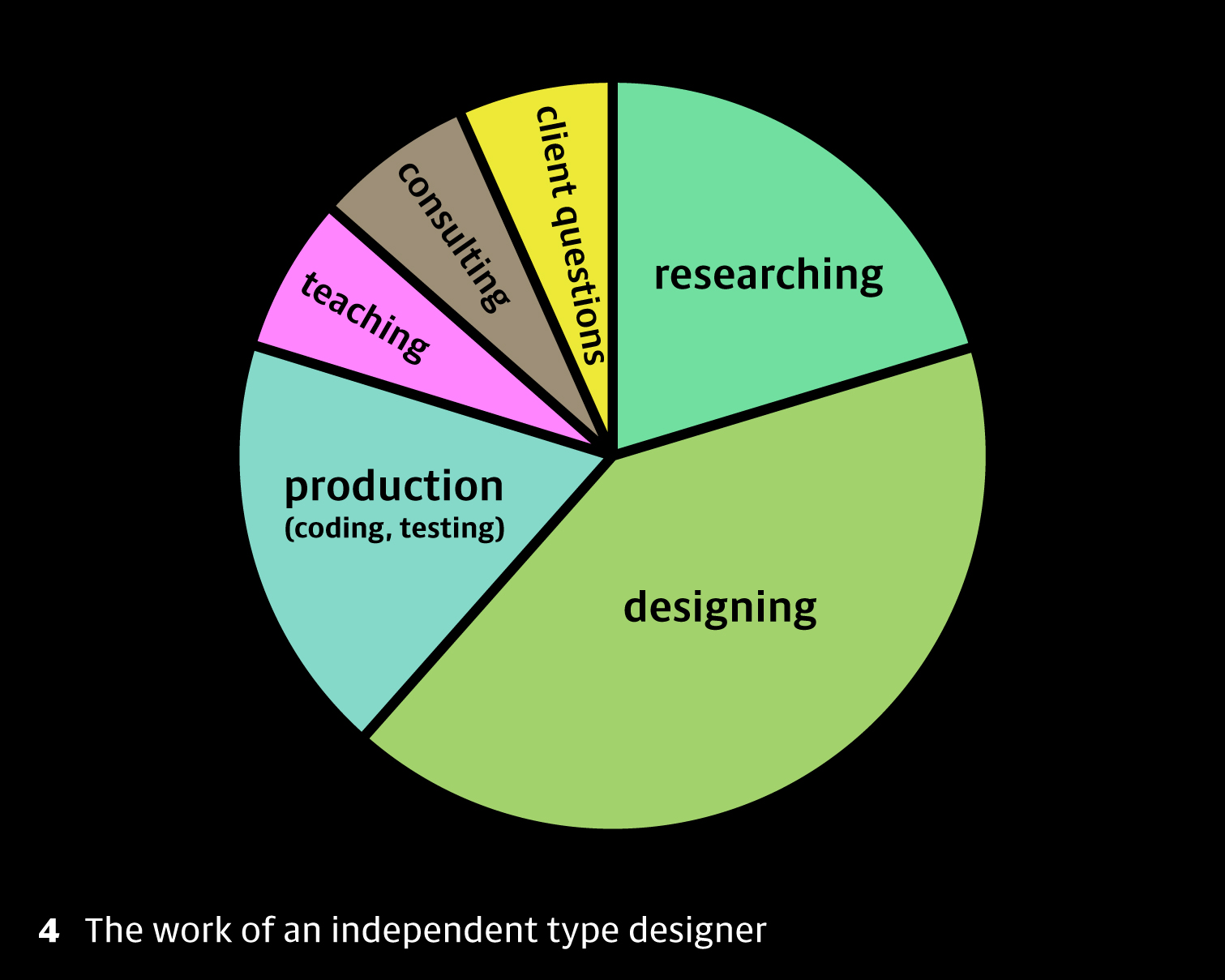
4 So what does working on these scripts actually mean for me? Here’s a little pie chart showing how my time is spent. Quite a lot of my time is spent researching. I’ll talk a bit about my approach to research and how it helps with the next stage: designing. I also want to talk about how to bring two different scripts into a single design. It’s a question that gets asked a lot, including last year at this BITS conference, and though I’ve heard a lot of different opinions, I’ve not really heard anyone talk about the process of how they do it, in practical terms. As our clients expand into new regions, they’re aware that their brand identities and typographic voices need to be consistent across a broader range of scripts, so it’s a question that type designers need an answer to.
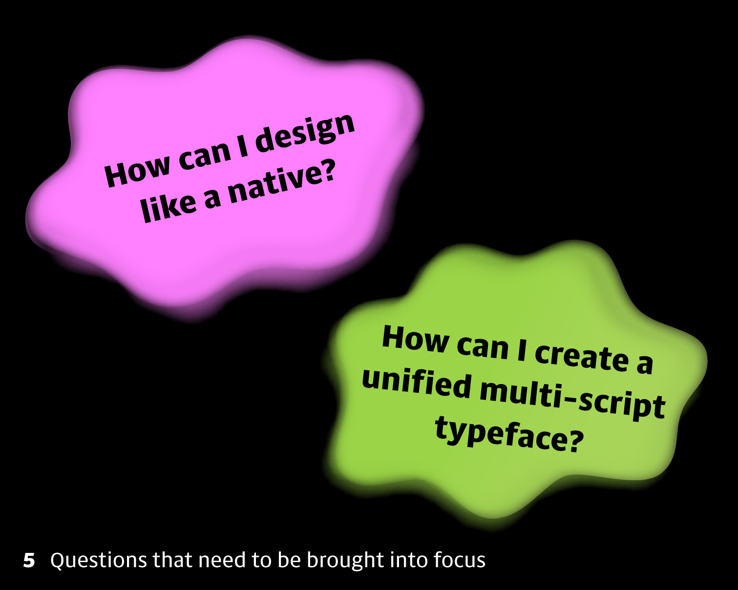
5 So my two questions today are firstly, how to get to a point where we can think and see and design like a native, and secondly, how to approach multi-script type projects. They’re interrelated questions, and sometimes pull in opposite directions, which I find fascinating. On the one hand, we want to give each script its proper identity, and be fully aware of its needs and conventions, but on the other hand, we need to make sure all the scripts within a project share the same look and feel. Actually the tension and balance between these two objectives is really helpful in forcing you to think like a designer, and for me they kind of keep the momentum going when working on a project.

6 So what do I even mean by ‘design like a native’? It’s a bit of a funny phrase, isn’t it? The important thing is that our design should look competent and natural, not foreign and inexperienced. When I look through some of my system fonts’ Thai coverage, I find things like this, where a lot of the shapes just look really uncomfortable. I asked a Thai colleague to tell me what they thought of these letterforms…
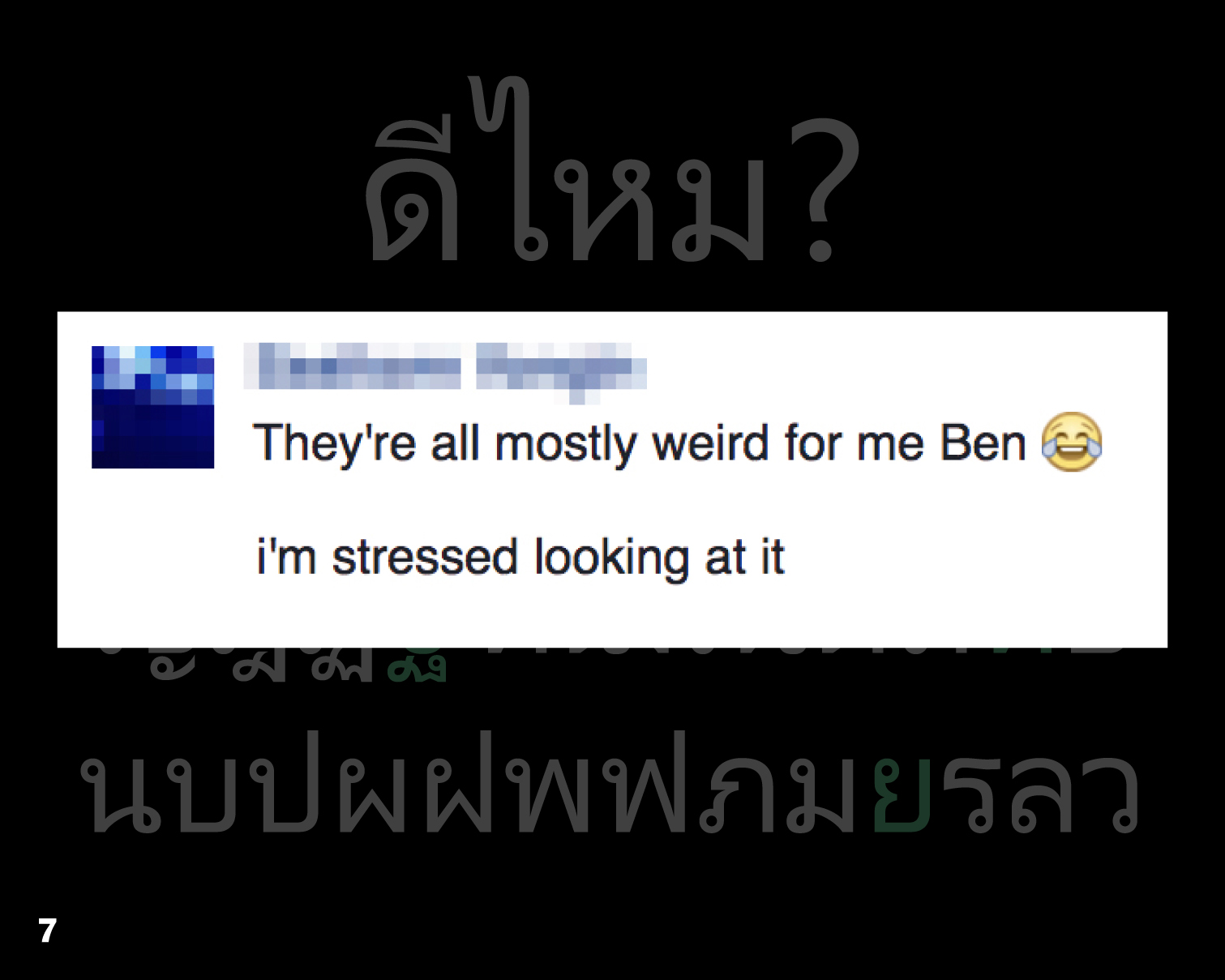
7 And here’s the response. It’s clearly not designed by a native. And there are plenty of other examples.
Well, the question of how we appraise fonts is a bit beyond what we’ve got time for today, but we do need to make sure we look at the right stuff, and talking to local designers is a great start.

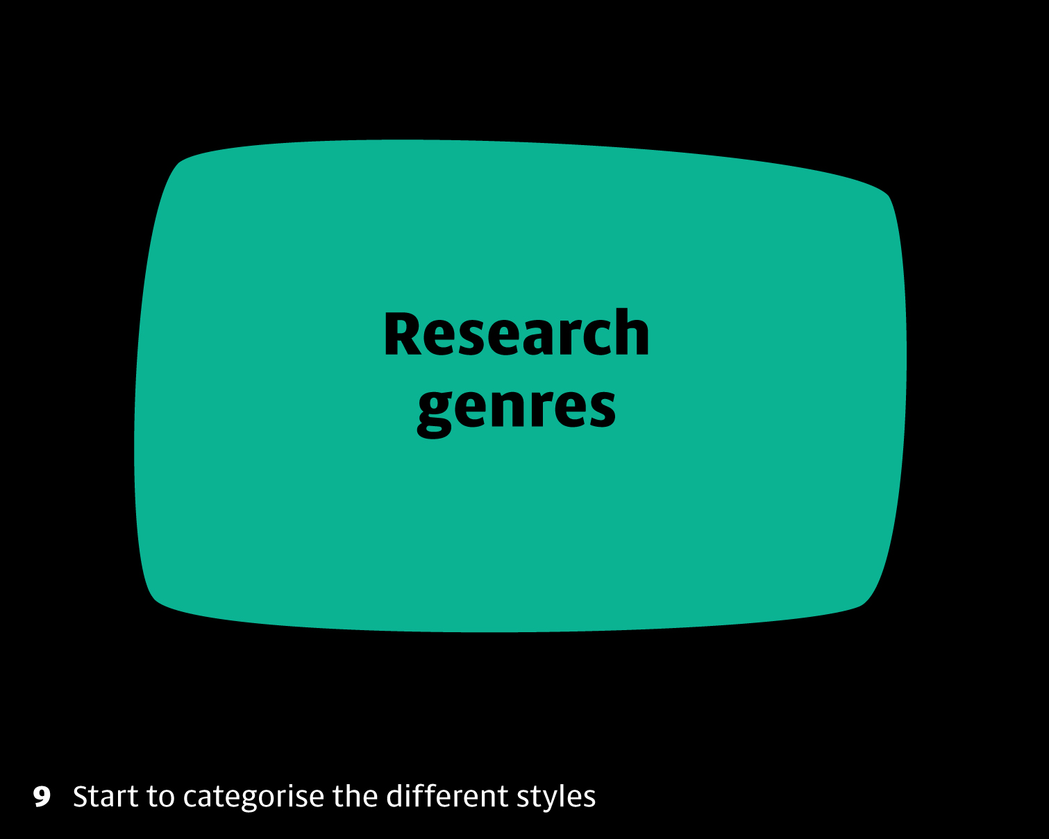
8 The first step I think is to really consult a lot of resources. Research can sound like boring work, but actually for me it’s one of the most enjoyable parts. As type designers, we’re exceptionally lucky because writing is all around us, and there’s always more to find. As well as digital fonts, we can look at books, newspapers, magazines, websites, signs, menus, calligraphy, everyday handwriting, stonecarving and manuscripts. Looking at that stuff is of the reasons I keep visiting Southeast Asia for research. But there are also super collections of resources in the British Library and other institutions in the UK, some of which have digitised archives online too.
9 But how does looking at these things help the designer? Well, firstly they begin to show you what styles or genres of writing are possible. From a wide range of different letters, we can begin to see what categories there are, and this ties in really well with what Kwan was showing us on Friday with the classification of Thai typestyles. It is a useful way to approach a writing system.
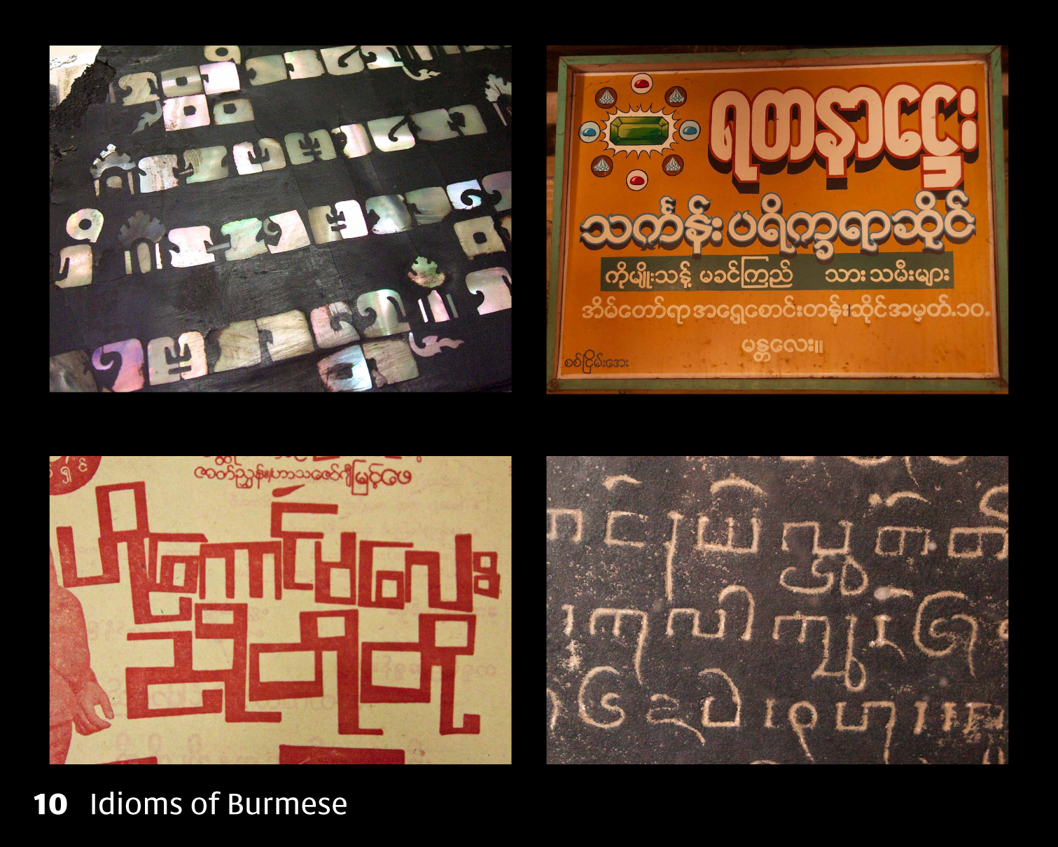
10 In these four pictures, you can see round and square Burmese, and perhaps some subcategories too. We can begin to form an idea of what design space is available for a script, where the genres came from, and importantly what they are used for. Why is that important? It means you can come up with a design that’s suitable for the brief. If we know that Burmese can be condensed, as in the top right example, we don’t end up trying to force it to always stay round, even when the brief calls for a compact design. Or when we look at examples of the square style, we begin to learn that it’s only really used for inscriptions, display work and for special occasions, so wouldn’t work well as a book or editorial style. These examples also start to give you important general pointers, like what’s the normal weight of a script, which elements are particular to a genre and which are essential elements in a letter’s structure.
11 I think the next thing these resources can show you is more specific to the individual letters. What does each letter look like? What’s its ideal form? Here we’re starting to build an archetype in our head of each letter. Within the genre you’ve identified, what’s the scope for playing with the structure? Can bits be added or removed without changing it into another letter or making it unrecognisable? What are the normal proportions? There may be more than one standard form for each letter, but knowing the possibilities for interpretation gives you room to explore in your own design.

12 Here we can see Jo Jaan (จ) from the Thai alphabet, and the ways it can change, but also what needs to stay the same within the text typeface genre to keep it from turning weird. From these examples, we can begin to create a mental image of the letter, what its proportions are, how the roof relates to the loop, and what sorts of variations are possible for the right hand side. Note that I’m picking fonts that are popular for text use in Thailand here; that tends to mean foreign-designed fonts are excluded.
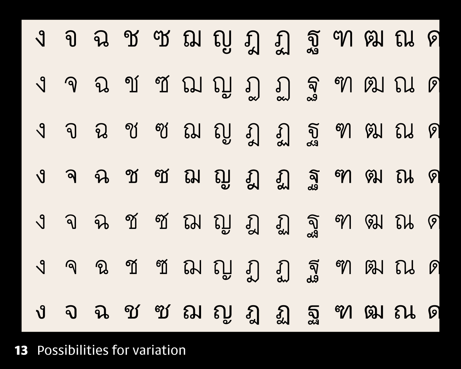
13 I think text typefaces are the purest expression of a script, because they’re not fancy things and you can get a sense of the letter in itself, without decoration. I often suggest designers look really closely at the most popular digital fonts found in newspapers, magazines and books. We need to get to that mental archetype, so we need to ask what’s the straightest representation of each letter’s structure? What identifies it, what does it have in common with other letters, what differentiates it, and how can the whole alphabet be brought together into a consistent design?
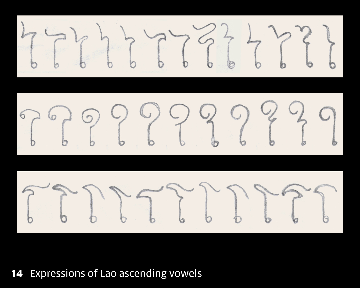
14 Here are three Lao vowel signs, which I’ve sketched really roughly from examples I found in Laos. Though there’s a lot of variability, there’s also this idea of a common thread running through each one, and by looking at the similarities and differences, we get access to those archetypes: the top one always has some sort of bend to the right before swinging out to the left; the middle one needs some sort of spiral; and the bottom one heads left before turning around to the right. Although these examples don’t tell us which shapes are most common, we can get a sense of which variations are most expressive and which are more straightforward.
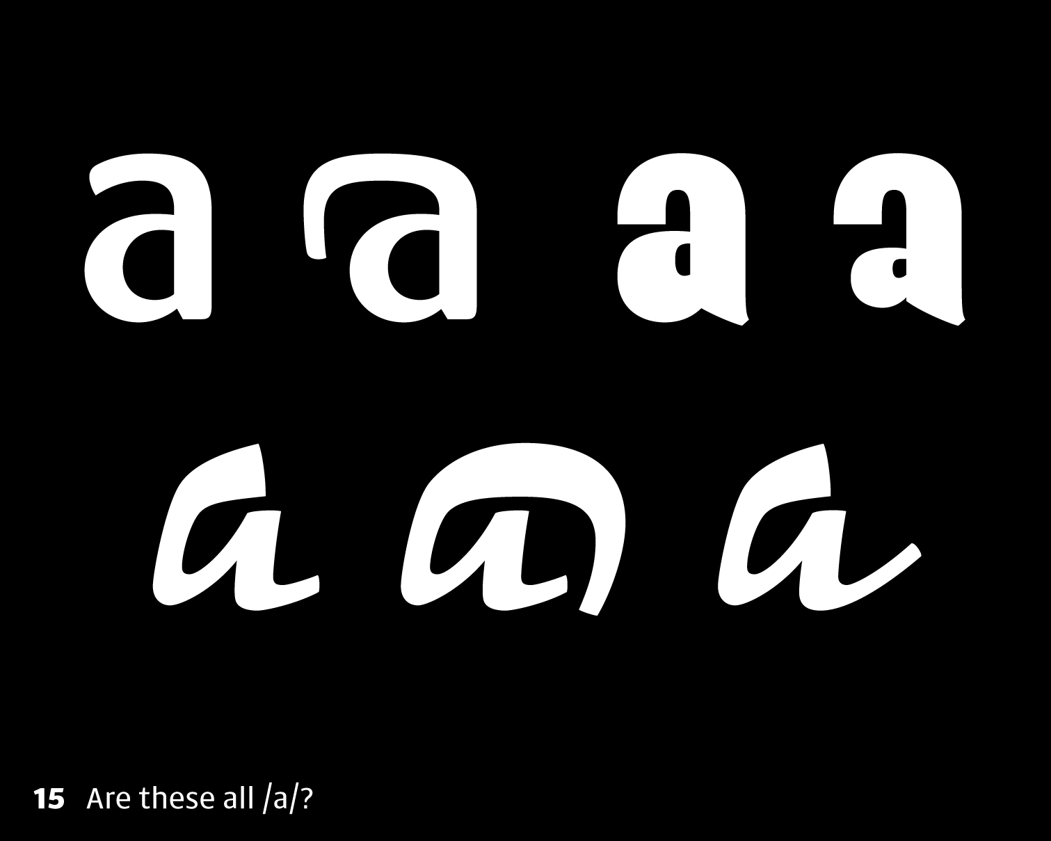
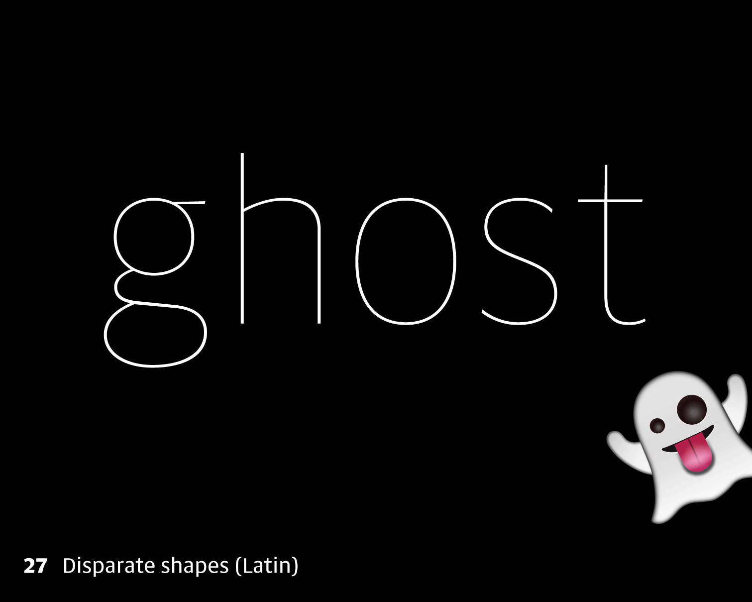
15 If we’re designing something more expressive, we also need to know the ways in which letters can be given more personality. We need to think in terms of a range of acceptable proportions, what can be done with a letter before it stops being itself. We probably have firm ideas about how an /a/ can look, and some of these would be really problematic in most genres of Latin type.
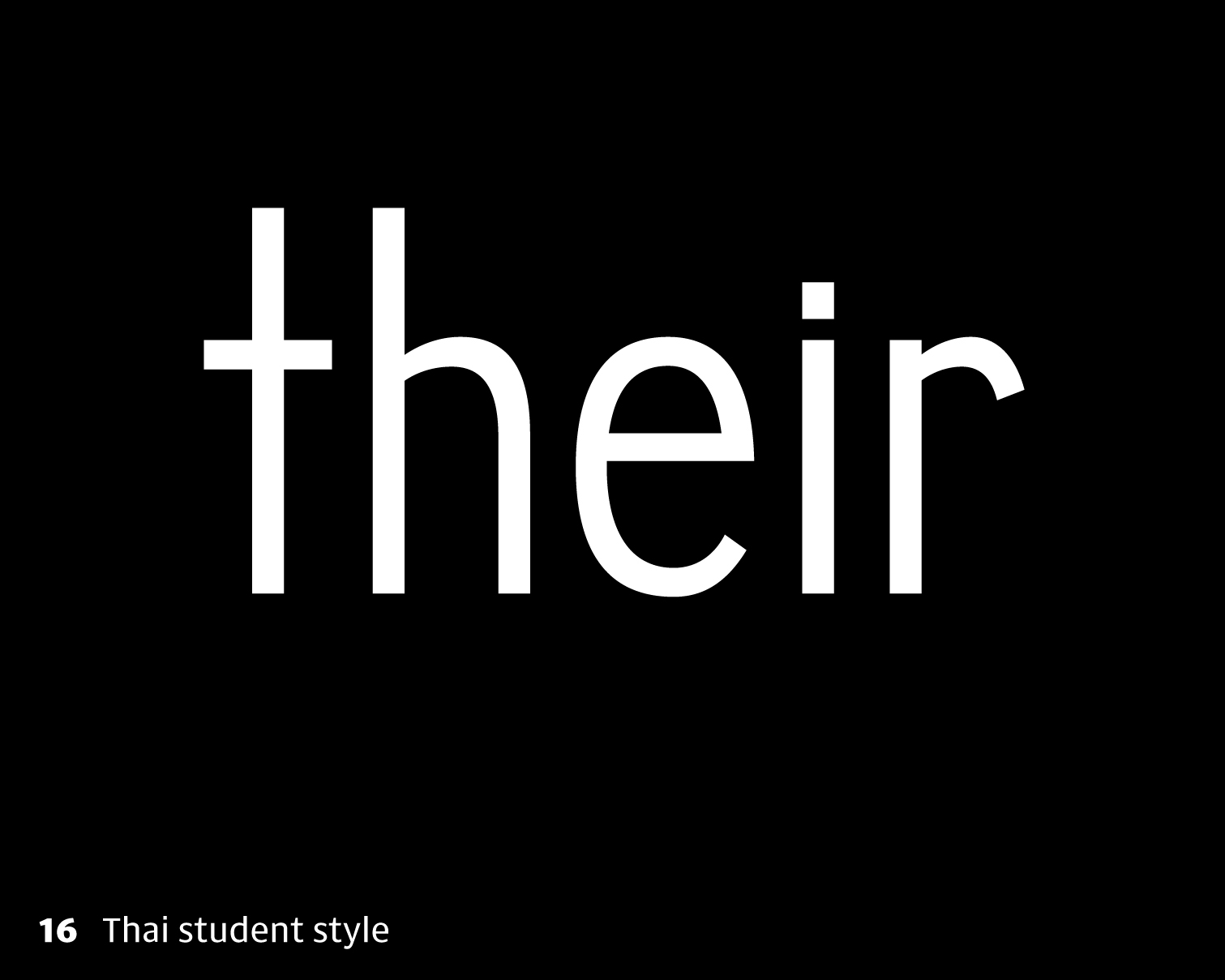
16 Looking at things the other way around, when I teach, I find lots of Thai students come up with rather unnatural lowercase Ts, like this. I’m not saying it’s necessarily wrong, and this shape may be called for in certain designs, but it’s not the archetype, so it looks abnormal.
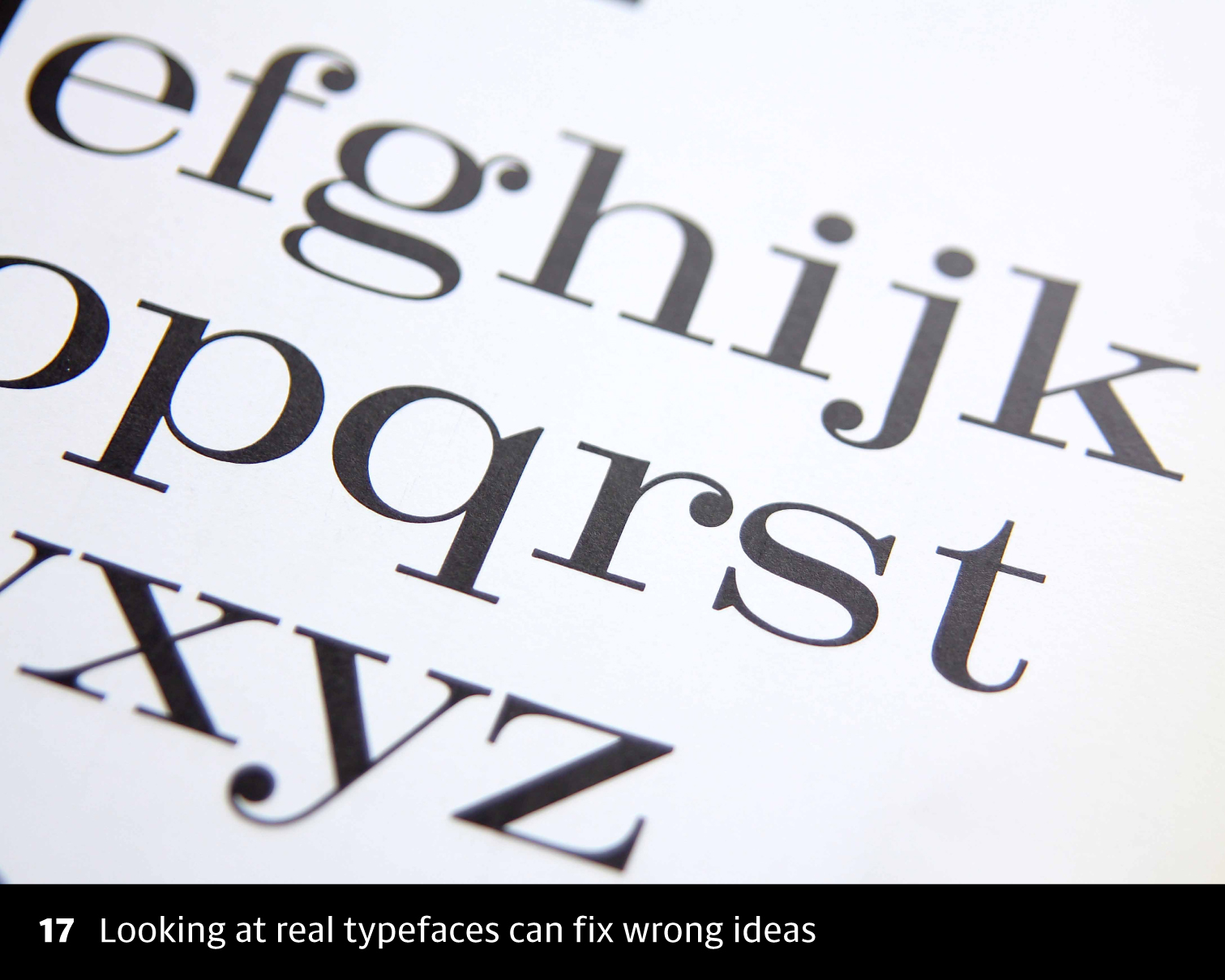
17 When this happens, I tend to put a bunch of real Latin typefaces in front of them and ask them to spot the difference. Pretty quickly they see that t shouldn’t reach the full ascender height, and it generally has the foot.

18 When we start to look at the script more closely like this, we start to see patterns, and I find it useful to create a toolbox of elements that can run through the script, you can call them components, and study how those elements or components are handled in different styles. In Thai, Lao and Khmer, for example, we see various features that we don’t have in Latin: loops, knots, stroke reversals and tails, among others. This is what makes multi-script design more interesting, and we’ll come back to this question in the second part of this talk.
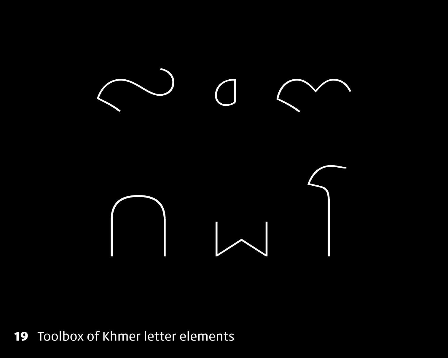
19 Here are the key letter elements used in Khmer, and we need to study how these are handled in different genres of typeface. If we can figure these out, in a way that they relate well to each other, we can put together more than half of the Khmer base letters.

20 I guess the final thing I look at in these resources is orthography: knowledge of a script’s behaviour. Unlike our simple Latin alphabet, all of the Southeast Asian scripts I work with are complex, which means that characters interact with each other and often change shape or position. By scouring through real text, we can begin to find out what happens when a particular letter combines with something else. So we already know the shape of a letter, but we also need to know what combinations are possible, how it behaves in those situations, how many alternates it needs, where it’s positioned, and when it’s typed. Otherwise the shapes might not work together in the right way, or might not fit the boundaries of the font.
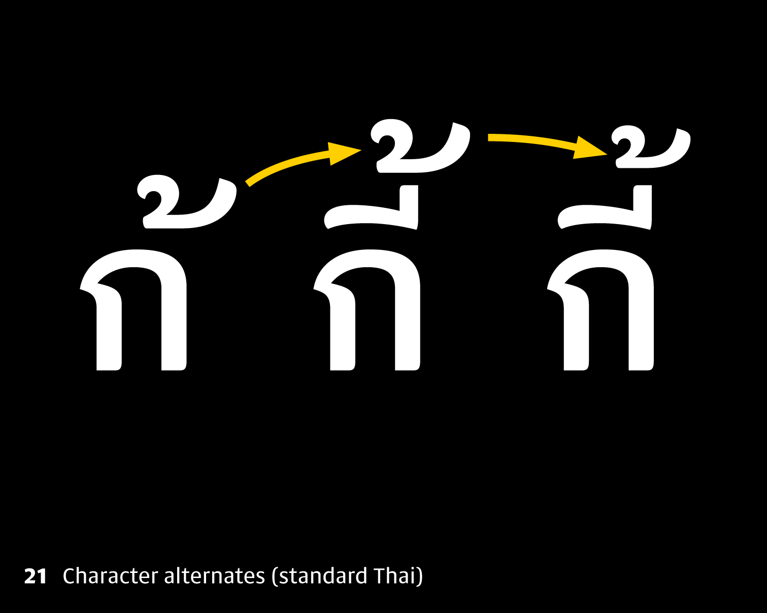
21 Here’s a very simple example from Thai. The little mark above, mai tho (้), moves upstairs when it’s typed after a vowel above the consonant, but it also generally shrinks a bit to stay balanced.
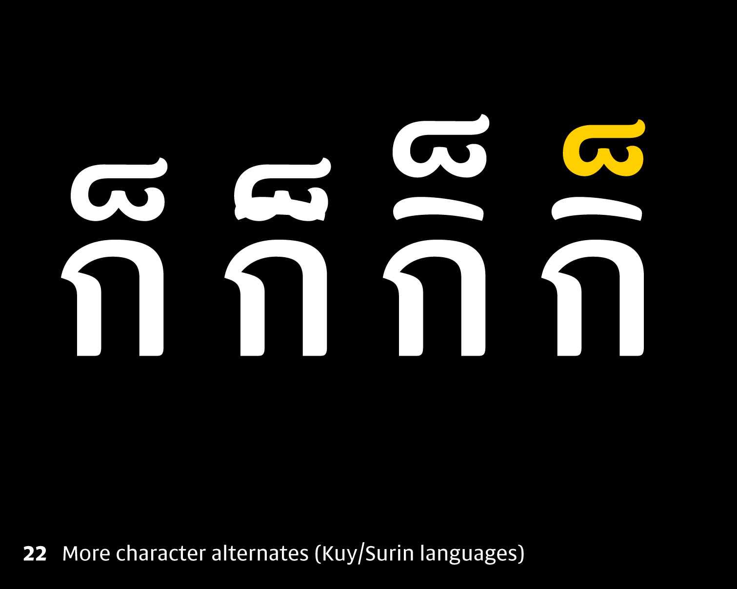
22 And here’s one you might not know, Mai taikhu (็) can also sit above those vowels in some of the minority languages of eastern Thailand. If we haven’t considered all the possibilities, some users will get unexpected results, with glyphs overlapping or falling outside the boundaries of the font.

23 In the case of Burmese, things are more complex, and until you start seeing real Burmese words, you wouldn’t know that the box-shaped medial Ra shown in Unicode on the left actually needs a large number of glyphs for different situations. This is the point where it’s very, very useful to talk to a language expert. They’ll be able to tell you whether these combinations will ever actually occur.
24 Other people are of course, also a resource! So not only do I look at books and pictures of writing, but I also ask fellow designers, linguists, teachers, friends and colleagues whether I’ve got the right ideas. Sometimes it’s not always easy to figure out the way things should look, and there will always be gaps in your knowledge and in the examples you’ve found. I think the best designers are the ones who show their work and ask for feedback, and keep their eyes open for new knowledge.
25 Ok that’s all I want to say about how research can help us design like a native. Now, onto my second part. Here’s where I want to talk about multi-script design. People use a lot of different words to describe what I’m talking about. Some talk about ‘harmonising’ different scripts to work together; others use the word ‘matching’ or ‘balancing’.

26 Here’s the problem. Burmese looks one way, mainly circular, Khmer looks another way, quite angular, Thai and Lao look different again: sometimes you can see the similarities, but sometimes they’re really not obvious, despite the shared roots. Well, we can’t make a circular zigzag or a zigzaggy circle, but we do need a way to make these shapes all relate to each other and not all look like different fonts. Someone here last year asked ‘how can we achieve design unity in a type family of different scripts without sacrificing cultural authenticity or breaking the conventions?’ and it’s a fantastic question. There are quite a lot of opinions about it, too. Some people say it’s just not really possible to unite two different scripts; some people say it’s only possible for scripts that are similar enough to start with.
Well, my opinion is that it’s entirely possible, at least for the Southeast Asian scripts and Latin, which by now I’m familar with. My idea of ‘unifying’ is about creating a coherent design with the same DNA running through all the scripts. It needs to look as though it’s been designed by one person, or at least with the different scripts having been conceived together at the same time, not in isolation, and with a clear aesthetic running through all the scripts.
Well, so we have two different demands: we want alphabets to work together as much as possible, but don’t want to sacrifice their individual identities.
27 But let’s hang on just a second because… isn’t this what type designers are already doing all the time? Within any alphabet, we have a bunch of different letters, which are all different shapes. We have letters with circles and letters with straight lines, letters with arches, some with simple forms and some with complex forms. And the thing is, we manage to design them in a way that makes them all fit together. Why should this be any different for letters from a different alphabet?
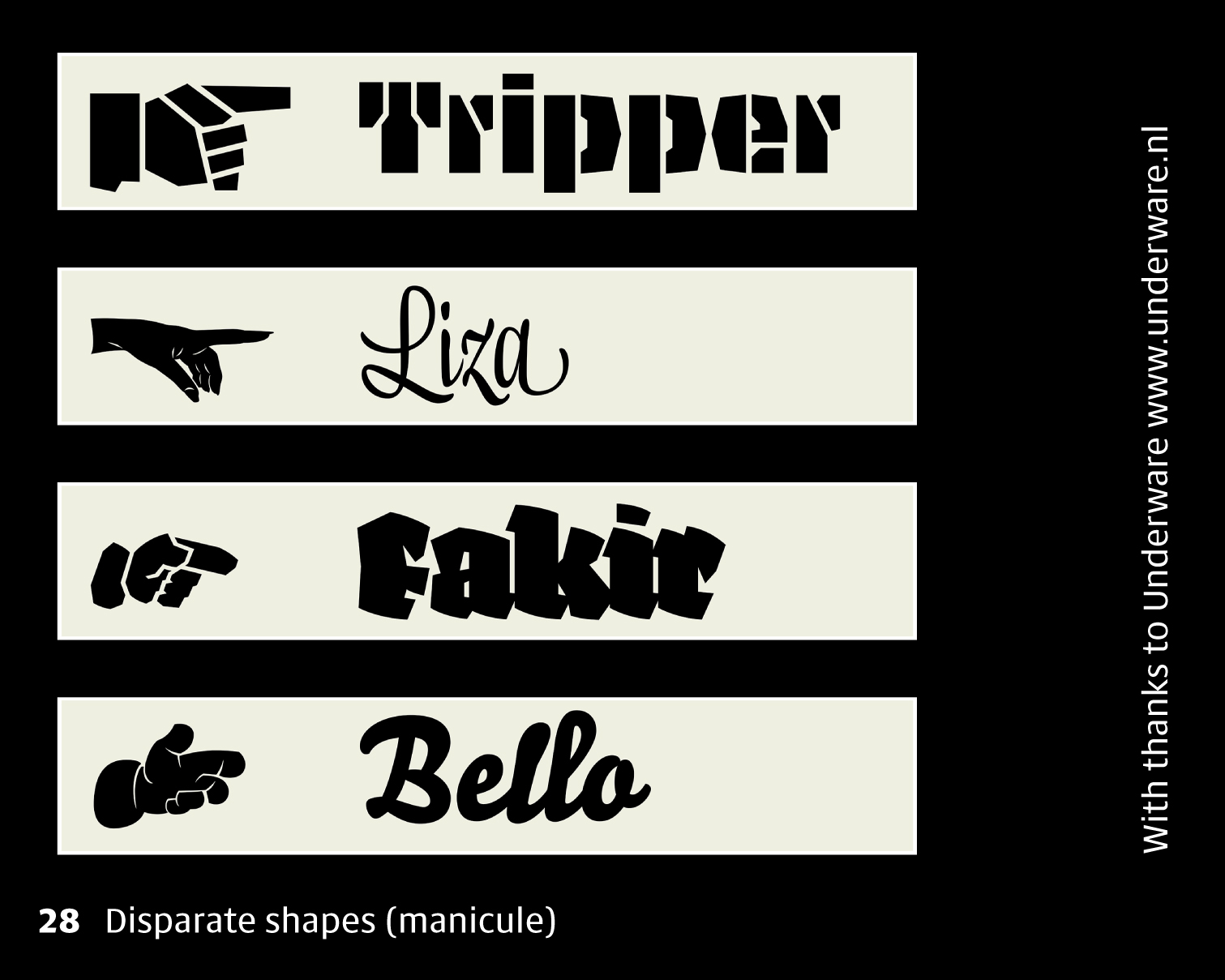
28 Or even, symbols and shapes that are not even alphabetic. Type designers are uniquely qualified in making shapes work with other shapes, making pointing fingers look like, well not like letters, but like they were designed together. If we really know what shape we’re aiming at, we can do an awful lot with it. My opinion would be that having deep enough knowledge of a script means actually the whole question of ‘harmonisation’ becomes a non-issue.
So how do we do it? I’ll talk about the approach I favour.
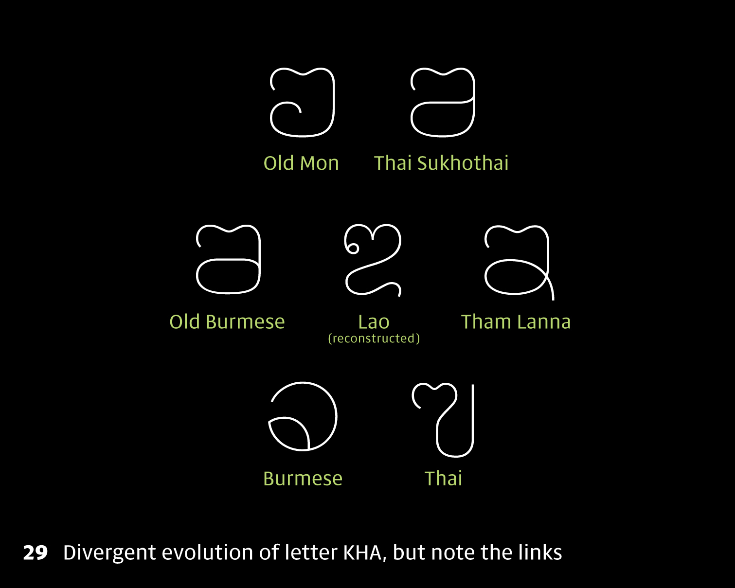
29 An important piece of the jigsaw, for me, is to learn about the history of a script, and its relation to neighbouring scripts. So in the case of Thai, it’s also useful to look at Lao and Burmese, and things like Tham and Khom. We can start to see how from the same roots, different parts of the letter have become more important, and so Thai and Burmese have ended up looking really different. Each has evolved an identity of its own, and understanding that helps us achieve cultural authenticity. When we look at all the letters, we can begin to see what makes the letters Thai, which letter-parts differentiate letters from one another, which are open to interpretation, which are structurally essential.
30 With that knowledge, we need to come up with a vocabulary for describing our intended design. This will direct the way the letterforms will be interpreted for a particular project. I tend to consider two things, what I call ‘shape descriptors’, and things I call ‘atmospheric values’.
Shape descriptors talk about things like the x-height, tension or flatness of curves, the degree of modulation, the way terminals are handled, the open or closedness of the counters, how condensed or bold the design should be.
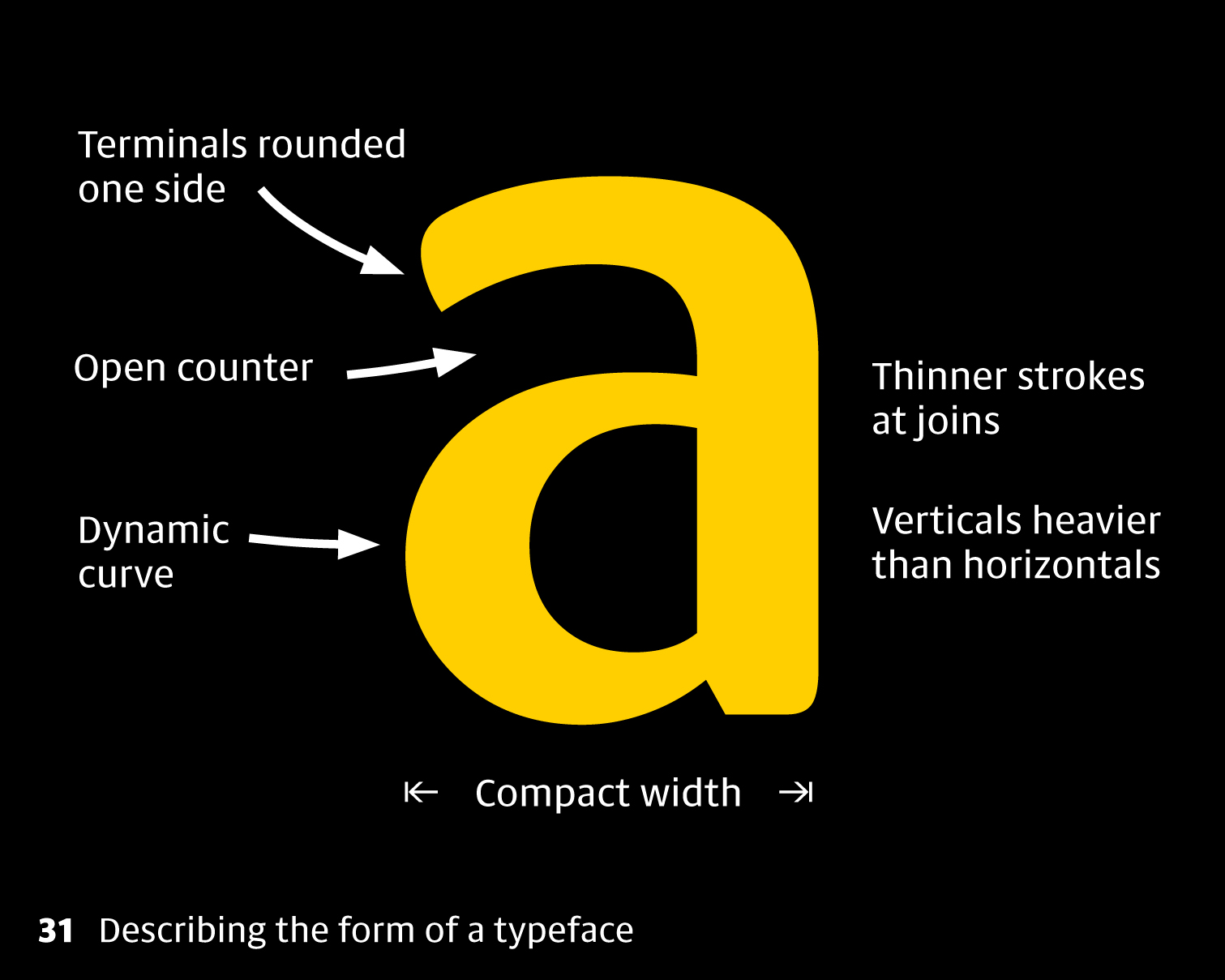
31 Here’s one of those As from earlier. If I’m going to think of some shape descriptors, I’d say it’s a bit compact, with a vertical, upright emphasis. The strokes are quite gestural, as though related to handwriting; the top counter is fairly flat and open, creating a bit of tension there with the round, bottom counter. The terminals look a bit brushy, curved on one side. Modulation is used in places that are appropriate to the Latin alphabet: that means strokes are thinning towards the junctions with stems.
32 Atmospheric values talk about the mood or tone of the design, what connotations it has, or what feeling it communicates with you. Is it expressive or reserved, is it sharp or soft, is it friendly and informal or stiff and elegant? Adjectives are very helpful here.
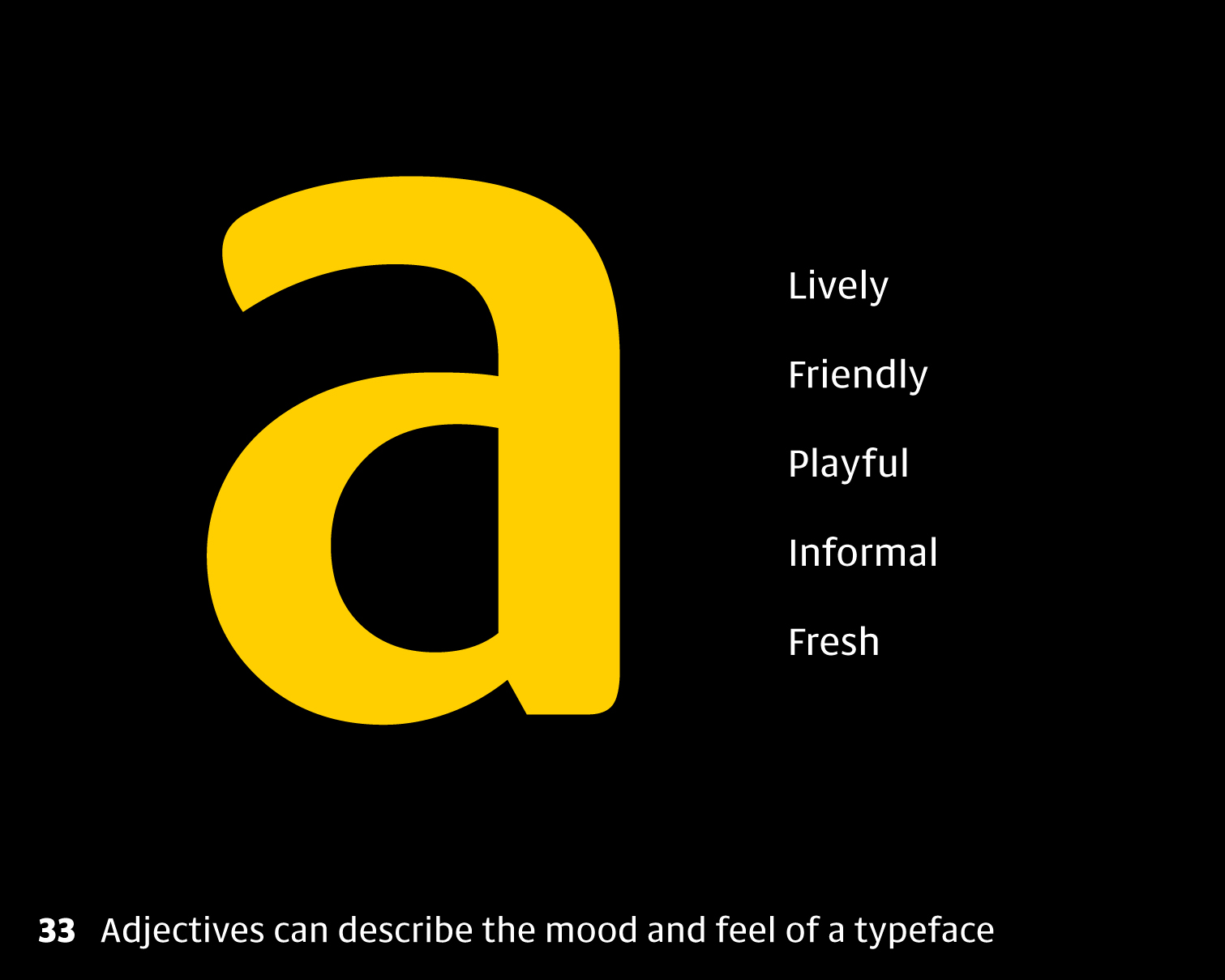
33 If I’m thinking about the atmospheric values of this design, I’d say it was more or less contemporary, it looks quite friendly with those rounded parts, and it feels somehow bouncy or playful.
All these descriptors of course need to be measured in relation to our knowledge of the script: so an open counter in Burmese may be quite a different shape to an open counter in Thai or Latin, so we do need to make sure we’ve already got a deep enough understanding of the archetypes.
As we found in the workshop yesterday, it’s also really handy to think in terms of what tool might have been used to create the letterforms in a typeface, and imagine using the same tool for the other scripts.
The brief will also give you lots of clues because it tells you where the typeface is supposed to work, and testing it in that target environment will surely give you feedback about what’s working or not, across all scripts. For example, it’s a safer bet to do Thai and Lao in a looped style if the typeface has to work in long paragraph text.
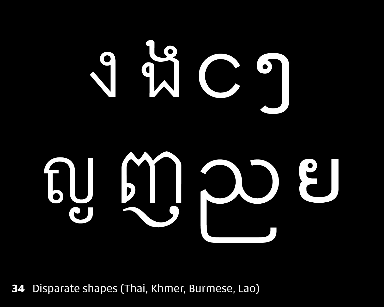
34 So let’s try designing some of those Southeast Asian letters in the same style. Remember those glyphs from earlier. Well of course these were not designed together. The strokes are different weights in each script, and there isn’t any way to describe all four scripts with the same vocabulary.
As I said before, different scripts tend to have different letter elements. Harmonising doesn’t mean copy-pasting elements from one script to another, but figuring out how to design different shapes that work together, in the same way that we design a Latin Z and an O to work together although they share no common elements.
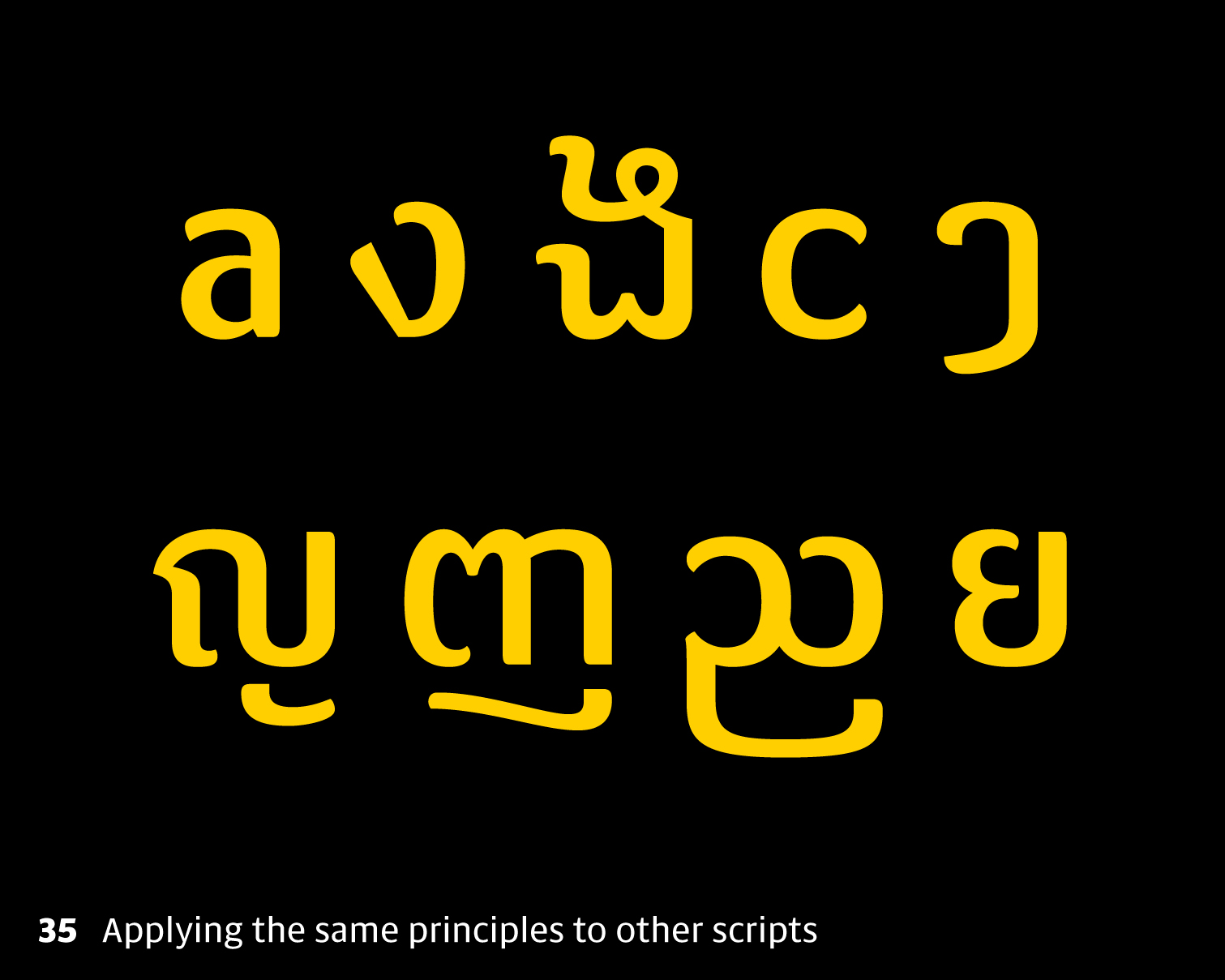
35 So here I’m not copying any shapes from Latin, but I’m aiming to give the curves the same quality, and use the same thinking when I construct the non-Latin letters. One of my atmospheric values for the Latin was ‘informal’, which is why I decided on a loopless design. It also seemed like the sort of design that might be used for branding, rather than extended text settings, which reinforces the decision to go loopless.
These other letters are not much like Latin, so don’t have the familiar stroke and junction element that we see in Latin. Instead, I’ve used modulation in places where it’s appropriate to the other scripts, which is in the stroke reversals and smaller elements within the letters. These are only some quick examples, but once we have our concept with a common vocabulary for describing the design, we can extend the character set fairly easily.
36 I wanted to show a counterexample. The Latin has borrowed some elements of the Burmese, and the result is not true to the conventions of Latin. It works in this context, but it’s meant to catch your attention and communicate cross-cultural dialogue. I call this stuff ‘cross-script letterforms’, and it’s not normally the aim in a multi-script project, but it can be fun in its own way.

37 So in summary: Learning to design like a native means researching. Remember we need to know the genres or styles, or create a classification system. Then we need to get a mental image in our head for each letter, in its purest form. It’s good to build a toolbox of common elements for the script and learn how those are handled in different genres. Then we need to learn about the script’s behaviour so we know how many alternates are needed for which situations. Finally we need to check we’ve got it right by getting feedback from people.
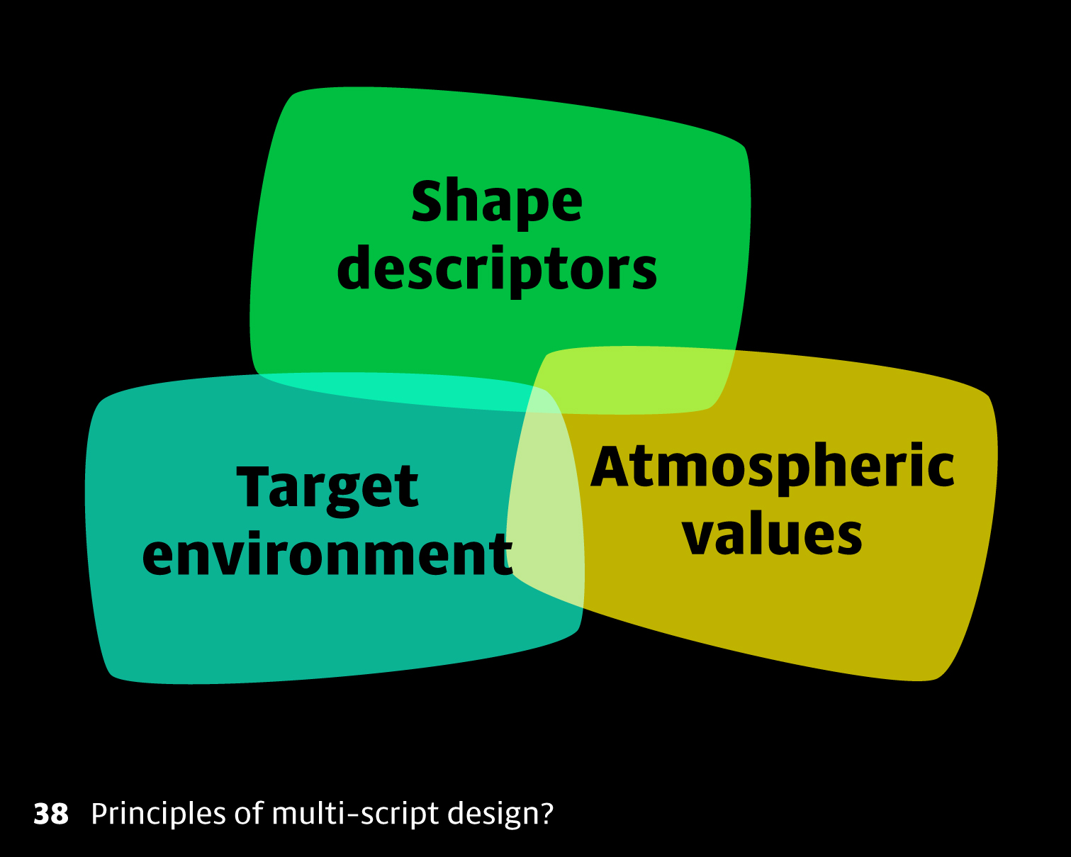
38 When designing different scripts together, it’s handy to think in terms of shape descriptors, atmospheric values and a good brief that explains the target environment. These considerations will help unify alphabets into a coherent design.
39 That’s all for today. I hope this can encourage you to try some new alphabets and figure out how to make them coherent with the ones you already have. And please let me know if you come up with different approaches! Thank you very much.