Come and learn what to do and how, what not to do and even how what not to do, plus all the rest with our little team of font fanatics. This year, we’ll be covering Khmer and Javanese with all the resources you need to get started on these scripts. Running Monday 7th to Thursday 10th October at the TCDC Chiang Mai, the workshop takes place the same week as the BITS conference, so participants can combine both in a single trip. Continue reading
Category Archives: non-Latin
Phnom Penh Type Workshop II
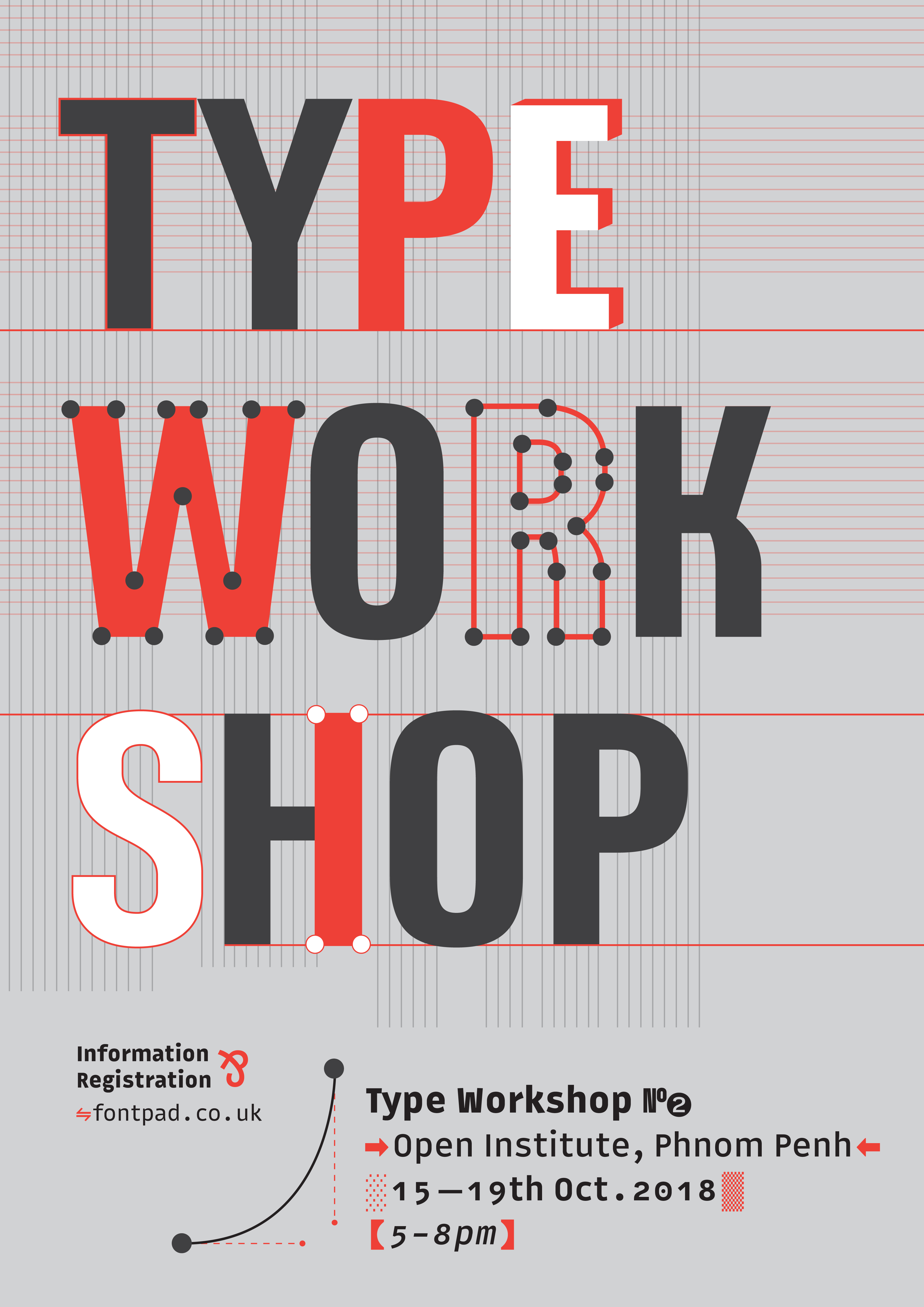
This October we are happy to return to Phnom Penh for our second annual type workshop! Join us to learn the first steps in creating your own digital font, from your first sketches to digitising your outlines. For more info and to register for FREE, please click here. With kind thanks to the Open Institute, Phnom Penh for their support.
Southeast Asian Font Workshop 2018
Come and learn what to do and how, what not to do and even how what not to do, plus all the rest with our little team of font fanatics. We’ll be covering Thai, Lao, Burmese and Khmer with all the resources you need to get started on these scripts. And did we mention it’s by the beach in Hua Hin, Thailand? Continue reading
Designing like a native?
Last month I was delighted to be invited to speak at the sixth BITS conference in Thailand. My presentation explores how we can create natural-looking designs in scripts we’re not native to, but at the same time unify diverse scripts into a coherent design. Since the most popular slide sharing media don’t seem to allow me to keep the transcript with the slides, I’m posting the slides as images and transcript as text below. Continue reading
Thai italics part 2 : Design
This post follows on from Usage, in which we found that italics in Thai are used slightly differently to their Latin counterparts. The two main discoveries were:
- Thai italics can stand alone as body text, even for long passages, unlike in Latin where they tend to be embedded in bodies of upright text.
- Thai italics are used for meta-text and to convey the ‘about’ voice. They are not for emphasis or names of things, which use bold instead.
Thai italics part 1 : Usage
The question of Thai italics has kept cropping up lately. In this two-part blog, I’m splitting the question into what are hoped to be digestible chunks. This post, Usage, talks about the ways that Thai typography uses italics differently to Latin, and tries to establish the principles underlying their use, and what implications there might be for the type designer. The second part, Design, will talk about a rationale for creating ‘true’ italics for Thai (not just sloped uprights or obliques), and will explore the possibilities of drawing on some of the traditional idioms of Thai penmanship. Continue reading
Ornamented lettering in Luang Prabang
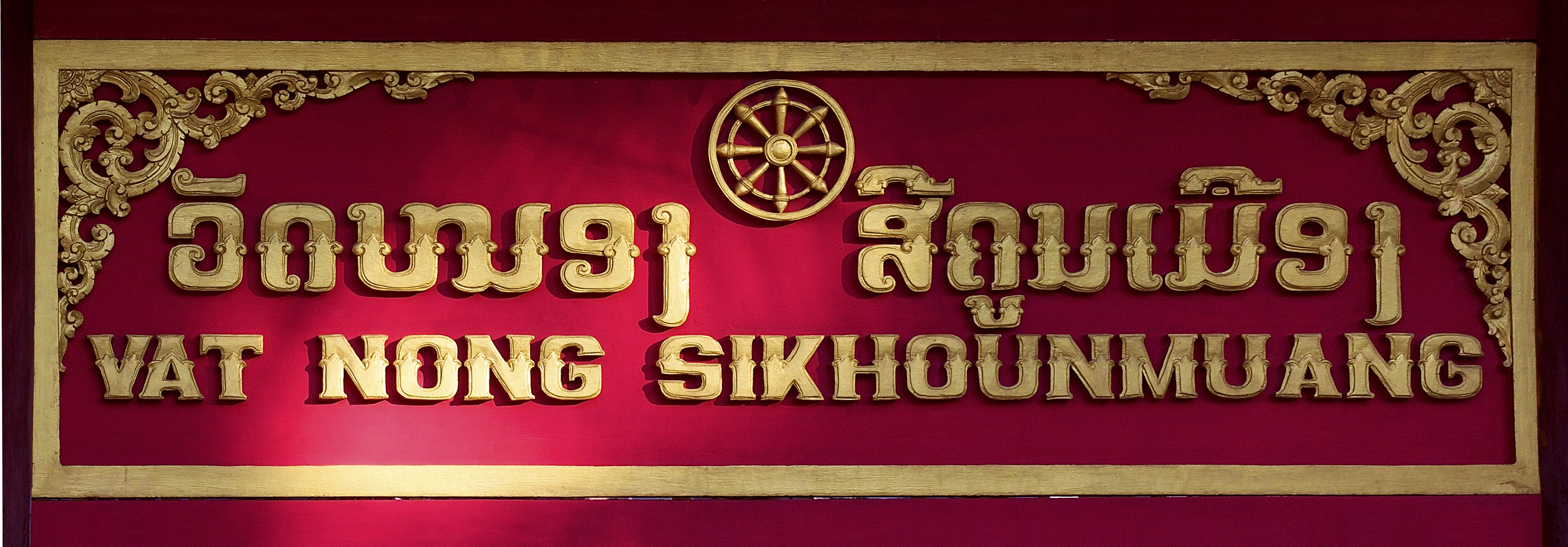
A recent trip to Luang Prabang, Laos, revealed this lovely tradition of handcarved wooden signage. As with many second cities, Luang Prabang is rich with culture and the arts, containing some of the country’s oldest and most revered temples, colonial architecture, and a lively handicrafts market. Writing is a direct window into the heart of a culture, giving form to its ideas, traditions and dialogues, so it’s no surprise in a place where traditions are alive to find abundant styles of writing. Continue reading
Figgins’ Pica Siamese
This wonderful font synopsis presents one of the earliest instances of the Thai script in printing type. Unfortunately there’s no accompanying information with the sheet, but Fiona Ross suggests it dates to between 1836 (when Vincent Figgins died and his business passed to his sons Vincent and James) and the 1880s (the latest date of type specimens under the name of V&J Figgins). Continue reading
Thaipography
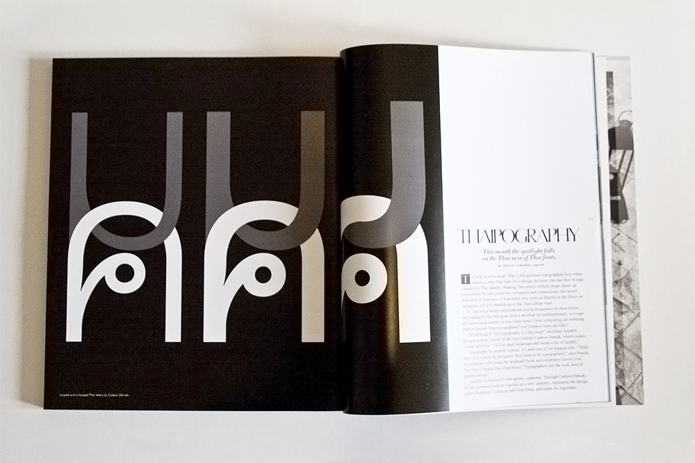
In the Bangkok Post’s The Magazine, November 2014, Philip Cornwel-Smith discusses the complexities of typography in Thailand. The story includes interviews with Anuthin Wongsunkakon, Pracha Suveeranont, Roj Siam Ruay and some nice quotes from this blog. Download the full article Thaipography [ pdf] here.
Cornwel-Smith is a writer and journalist, whose bestselling book Very Thai celebrates the wonderful idiosyncrasies of Thai visual culture.
Tham Lao manuscript

Four leaves of a palm-leaf manuscript written in Tham Lao script, probably Pali language. Likely late 20th century. Found at the night market in Luang Prabang, Laos.