The question of Thai italics has kept cropping up lately. In this two-part blog, I’m splitting the question into what are hoped to be digestible chunks. This post, Usage, talks about the ways that Thai typography uses italics differently to Latin, and tries to establish the principles underlying their use, and what implications there might be for the type designer. The second part, Design, will talk about a rationale for creating ‘true’ italics for Thai (not just sloped uprights or obliques), and will explore the possibilities of drawing on some of the traditional idioms of Thai penmanship.
In Latin, we have quite distinct uses for italics1Of course, italics get their name from the Italian chancery styles of the 15th to 16th centuries. This makes the name ‘italic’ altogether unsuitable for scripts that have no typographic connection with Latin or Italy. However, in the absence of a better term, and since it the word ‘italic’ is so widely familiar, I’m going to continue using it for the time being.. They are generally embedded within upright text for specific purposes such as emphasis, foreign words, quotes and book titles. Much Thai typography is rather poor due to a so-far relatively under-developed infrastructure for design education. As we saw in Thai Press Typography, there’s a tendency in contemporary newspapers and magazines to chuck an assortment of unrelated typestyles in different sizes and colours onto the page together willy-nilly with little consideration of an overall system or how the fonts look together. This makes it harder to discern what rules (if any) are being followed. However, by scrutinising some of the more typographically judicious publications, I’ve uncovered some of the ways that Thai typographers are using italics2This blogpost is based on a quick survey of newspapers and magazines that I’ve picked up over the past few visits to Thailand. It’s therefore strongly biased towards the typography of the mass media, and not necessarily of printed books. It doesn’t pretend to talk about highly specialised typography such as in dictionaries.. And it turns out to be more sophisticated than at first I assumed.
Editorial voice
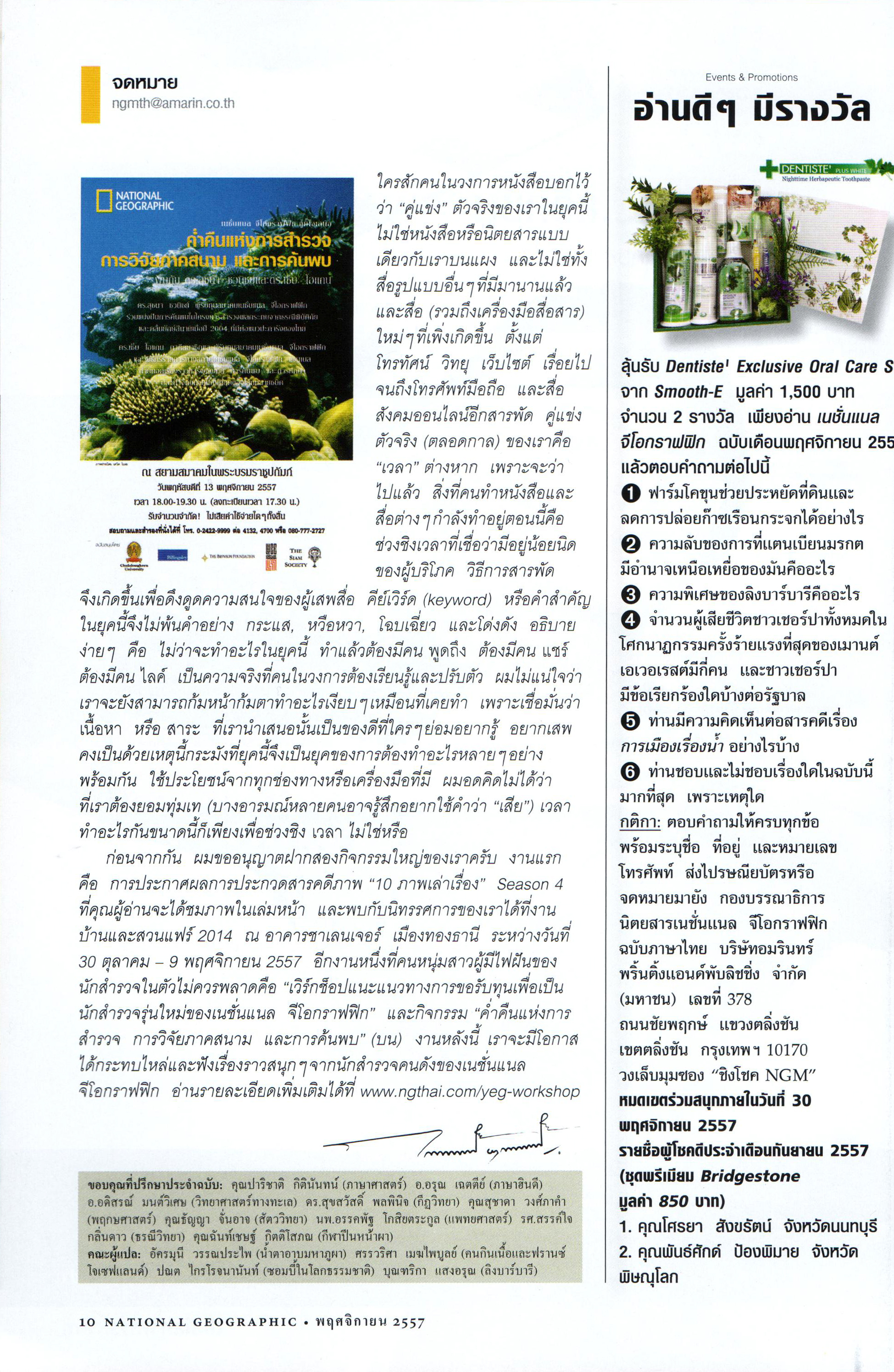
In Latin, it’s rather unusual to see italics used independently from upright letters, at least for paragraph text. By contrast, Thai has no problem using standalone italics for longer stretches of text, especially text with editorial overtones. Here’s the editor’s introduction to National Geographic:
Meta-text
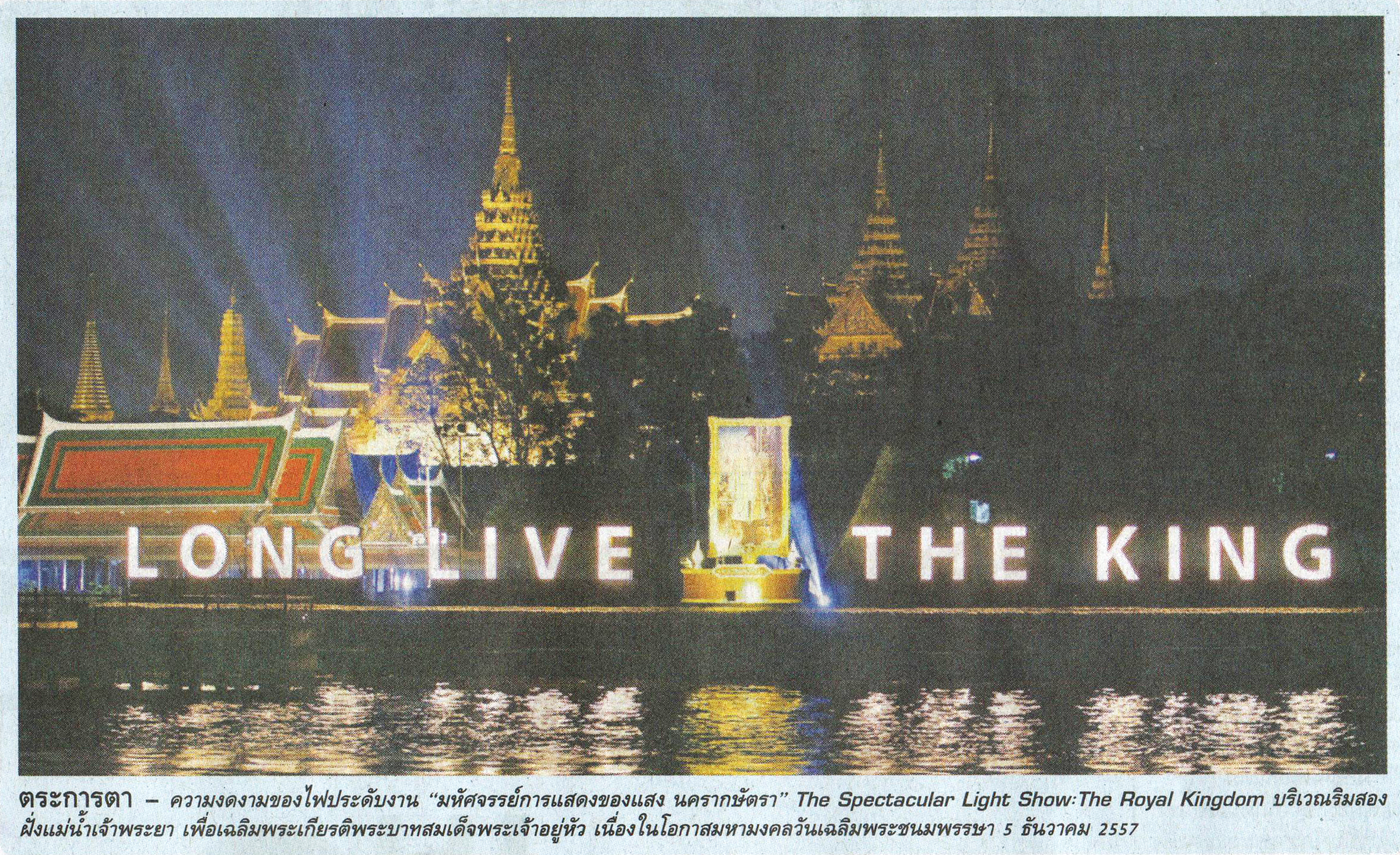
It’s not just pure editorial that’s considered worth italicising. Other snatches of meta-text to do with labelling, commentaries, summaries and document wayfinding often use italics. Picture captions are a good example of labelling, and predominantly use italics:
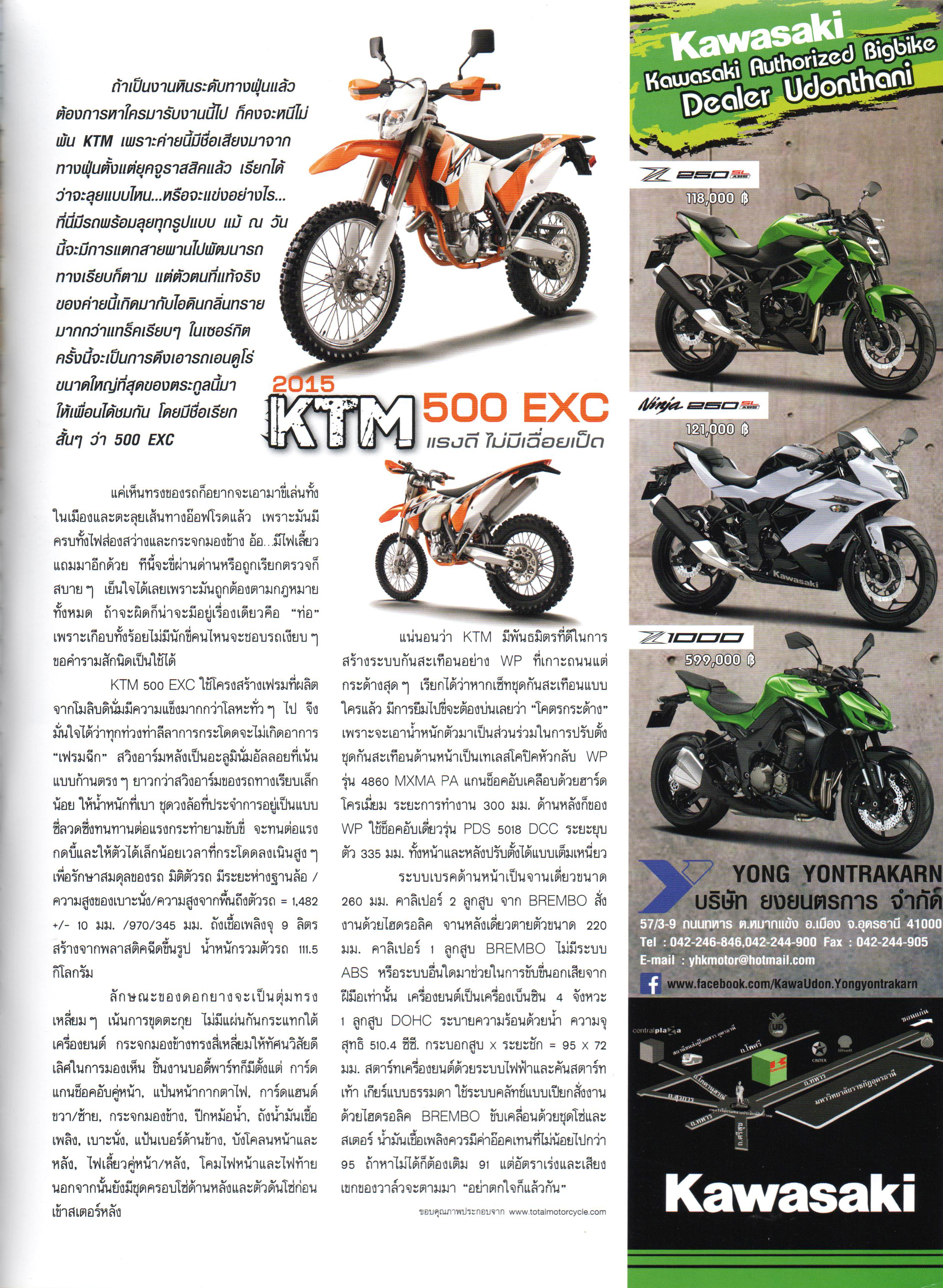
Standfirsts (the introductory paragraph summarising a news story) in magazines and newspapers also tend to use italics. In the first case below, a loopless style has been chosen to further set the standfirst apart from the main body text.
And a newspaper example:

Emphasis
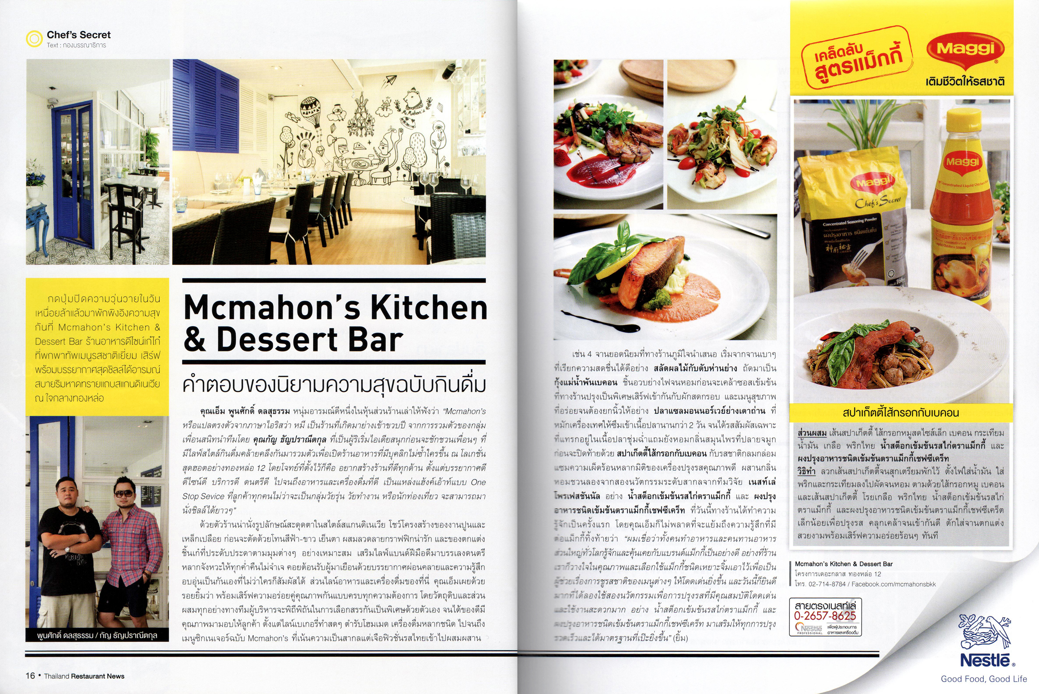
In the image above, we can also see bold style used in the story’s lead-in (the first line of body text). It’s common to see bold (or sometimes bold italic) used this way for inline emphasis and names of things, and not italics as would be the case in Latin. In the image below, the right-hand page has several instances of inline bold used for emphasis (here used for names of dishes).
Direct speech
The spread above shows another use of italics in its first and last paragraphs: quotes within speech marks. This use of italics is the closest thing to a ‘rule’ I’ve found in Thai typography; it’s very common.
The ‘about’ voice
It’s instructive to try to describe the pattern that links these disparate uses together, and I think I’ve found one. I’m calling it the ‘about’ voice. Using italics for direct speech shows the quote — somebody’s words about something — is helping convey the story’s message, giving extra details about the topic to help the reader. The ‘about’ voice is also evident in the way that captions talk about images or the standfirst talks about a piece of text. Italics therefore can be seen to run alongside text, guiding the reader through the main content or giving supplementary information such as a quote, explanation or introduction. Perhaps this kind of added information is the kind that would be skipped when skim-reading, useful for facts and details but not vital to the core message.
Conclusion
As we’ve seen, the usage of italics in Thai is rather different to Latin. Our conclusions from all the above would be:
- Thai italics can stand alone as body text, even for long passages, unlike in Latin where they are embedded in bodies of upright text.
- Thai italics are used for meta-text and to convey the ‘about’ voice. They are not for emphasis or names of things, which use bold instead.
What does this mean for the type designer? Both of these conclusions allow for a less subservient style of italics, one that can stand somewhat apart from the uprights with its own coherent identity and that can convey a different authorial tone. The appropriate amount of divergence will depend on the designer’s preference or on the design brief for a typeface.
In the next blogpost, Thai Italics : Design, I’ll build on these ideas to develop the concept of ‘true’ italics for Thai.
Notes
| 1. | ↑ | Of course, italics get their name from the Italian chancery styles of the 15th to 16th centuries. This makes the name ‘italic’ altogether unsuitable for scripts that have no typographic connection with Latin or Italy. However, in the absence of a better term, and since it the word ‘italic’ is so widely familiar, I’m going to continue using it for the time being. |
| 2. | ↑ | This blogpost is based on a quick survey of newspapers and magazines that I’ve picked up over the past few visits to Thailand. It’s therefore strongly biased towards the typography of the mass media, and not necessarily of printed books. It doesn’t pretend to talk about highly specialised typography such as in dictionaries. |
Pingback: Thai italics part 2 : Design | The Fontpad