This post follows on from Usage, in which we found that italics in Thai are used slightly differently to their Latin counterparts. The two main discoveries were:
- Thai italics can stand alone as body text, even for long passages, unlike in Latin where they tend to be embedded in bodies of upright text.
- Thai italics are used for meta-text and to convey the ‘about’ voice. They are not for emphasis or names of things, which use bold instead.
Since italic passages act in a more standalone way in Thai than in Latin, and are employed to convey a different editorial voice, I’d like to consider ways to free them from the yoke of the uprights. Increasing the design distance between uprights and italics would better differentiate them on the page, and expand the tonal range of type families.
This re-imagining of italics also divests Thai of the Latin concept of merely adjusting the uprights via slanting to create italics. Mere sloping of upright forms is an approach that lacks imagination if it’s not plain wrong in the context of Thailand’s rich written heritage. Rather than copying this geometric translation, a deeper level of design can address the principle behind Latin italics: that they derived from different models of handwriting to the Roman/upright1namely the chancery hand of the 15th century. It was only over time that italics settled into their current role as an accompanying style and became regularised into tonal harmony with the uprights.
It so happens that Thai provides plenty of models for freer interpretations of accompanying styles. The examples below illustrate some of these traditional idioms of Thai lettering and penmanship2This discussion also restricts itself to the genres that can provide inspiration for italics in a text font, and therefore doesn’t cover styles such as Farang Ses, Narit script, or other kinds of display lettering. For anyone getting to grips with the Thai alphabet in its different styles, Doug Cooper’s essay ‘How do Thais tell letters apart?’ [ pdf] is a useful starting point.. I’m intentionally steering away from examples of digital type, as the whole point is to identify potential starting points for Thai italics that are new and do not cleave to the trammelled conventions of existing type systems3And besides, I have identified only one typeface that gives italics a different treatment to the uprights, the award-winning Sarabun Mai typeface. Its italics are given subtle hints of cursiveness in the outstrokes..
Manuscript tradition
Like handwriting anywhere in the world, Thai handwriting comes in a variety of shapes and sizes, and differs in style and slant, even when penned by the same hand. Thailand’s manuscript tradition therefore reflects this variation and demonstrates both upright and sloped models.

Upright handwriting style found on paper manuscript. On display at the Siam Society, Bangkok.

Sloped handwriting on palm-leaf manuscript4Both upright and slanted styles are found in paper manuscripts and in palm-leaf manuscripts. What’s interesting in this example is the way the slant of the Thai letters corresponds with the grain of the palm leaf: strokes at certain angles are easier to write. So the choice of substrate and the way it is processed and oriented can be seen to directly affect the style of handwriting. . BL Add MS 12259 1750–1840.
At once it can be seen that the upright letters take a much more angular approach than the sloped letters. This is partly due to the substrates concerned, but it’s also a stylistic choice. Typographically there are other differences. The upright style is written on traditional sa paper (made from the bark of the paper mulberry tree, Broussonetia papyrifera), while the sloped example is from a palm-leaf manuscript (as we saw in Tham Lao manuscript, these are written on the leaves of the Talipot (Corypha umbraculifera) or Palmyra palm (Borassus flabellifer) trees).
The writable area of these two kinds of document is very different: in the first, the pages are large enough to allow long lines of text with large phrase breaks and even section markers to help the reader. Lines are spaced much more widely, allowing the longer, expressive letter tails we see here. These swashed tails are not just a decorative effect, they help draw any excess ink from the pen-lift away from the letters. Tail blobs are best avoided as they could interfere with the parsing of head loops, which can easily accumulate too much ink and fill in, as they do in the top example.
The sloped, palm-leaf example has the lines of text about as close together as possible, while still allowing for interlinear vowel marks to be accommodated. The flicked outstrokes have been trimmed, but we still see some letters, such as จ and ว, have quite long hoods that have been rolled over the letter and stay within the bo-height (base character height).
Earliest typefaces
Following on from the manuscript forms seen above, the first decades of the 19th century saw the introduction of printing in Thai, and the earliest typefaces emulated the handwritten forms people were familiar with. The first two designs followed the sloped model.

Nancy Judson’s Tua Liam typeface, likely cut by George Hough in Rangoon in 1819. Said to be based on the handwriting of Thai prisoners of war along the Burma-Thailand border5From conversations with Santi Lawrachawee, November 2014..

Typeface first attested in the 1828 imprint A grammar of the Thai or Siamese language printed in Calcutta. Type likely to have been cut at the Mission press at Calcutta or Serampore.
Though both these designs show some peculiar characteristics, technically they’re pretty accomplished considering this was the first time a casting and composition method had been devised for Thai. The systems allow vowel and tone marks to be positioned in the right places above or below base characters, even allowing for bases that have ascenders, and there is a definite rationalisation of letterforms to make them belong together in each design. The tua liam design even shows evidence of kerning.
Nancy’s design retains the angularity noted above in the upright manuscript, and though the letters do not have the long tails, some of the vowel marks above do have exaggerated length. The Calcutta design does away with the angularity and the letters are fluid and curly, and reminiscent of the sloped manuscript style above. The combination of open loops, closed knots (indeed the introduction of new knots in some letters) and lively forms suggests it could have been cut by punchcutters experienced in cutting typefaces for Indian scripts: punchcutters such as Panchanan Karmakar and his son-in-law, Manohar, who were responsible for cutting type in 15 scripts including Bengali, Chinese, Burmese and Arabic.
As with many other scripts around the world, the sloped style fell by the wayside and the next generation of typefaces embraced the vertical style, a trend that has continued ever since. Compositors found it easier to set upright letters6Ibid., and doubtless it would have been easier position marks correctly on an upright body, and easier for the punchcutter to cut upright punches.

Dan Beach Bradley’s first typeface, Bradley square, cut in 1844 in Bangkok.

Text from Treaty of friendship and commerce between Great Britain and Siam, (aka the Bowring Treaty), 1856, printed by J H Chandler at the Washington Press, Bangkok. Typeface of unknown provenance. Note the persistence of rolled-over hoods on ส and อ.
The use of ligatures quickly declined from this point, as they could mostly be approximated by close letterfitting, and would have entailed the production of extra punches, matrices and sorts, and extra compartments in the type cases. The bo-height (body height) was made consistent — previously the outstrokes of ฐ and ส among others had ascended above the other letters — making the letters all the same height would have allowed above-marks to all sit on the same level and would have reduced composition times.
The preceding images show where sloped and upright typeforms began to diverge, and suggest some ways to reinstate aspects of cursive forms into Thai italics. The roundness of the palm-leaf forms, the longer outstrokes of the upright forms, the lively, untypographic forms of the Calcutta type, and the rolled-over hoods of the palm-leaf writing and Bowring type are all elements that could be viable in a true Thai italic. Now we’ll look at other ways of differentiating letterforms.
Simplification of letterforms
Like the rest of us, Thai people have neat handwriting and messy handwriting, and perhaps also something in between. In fast handwriting, the forms are much simplified, with loops falling open or disappearing altogether. Angles give way to curves and flat strokes become rounded.
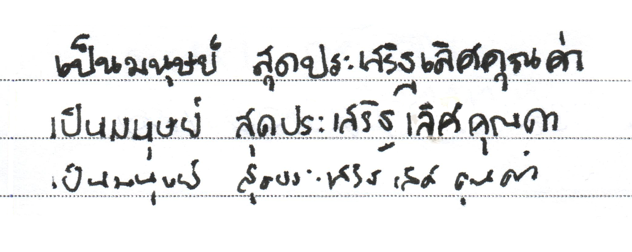
Different speeds of handwriting. The loops, knots and firm strokes of the top line give way to less clearly structured shapes as the speed of handwriting increases7With thanks to Anuthin Wongsunkakon for his handwriting.. Note also how the disappearance of loops towards the bottom saves space, allowing more letters per line, a finding exploited to good effect in Arisa Yongchuyot’s Pim Lek typeface for packaging design.
One aspect of cursive handwriting that is interesting to consider is the way the base of letters like ป (second letter above) changes from a square form to a round form. Many of today’s popular text styles use these rounded forms as a way of reducing three strokes (down, along, up) into one smooth curve.
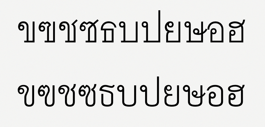
Square and round forms of consonant letters. Typefaces Fongnam (top) and Sarabun (bottom).
It is not (yet) common to see this kind of distinction applied between uprights and italics in the same family, though it is something I implemented in a recent project (of which more at a later date).
The logical conclusion of this simplification is expressed by the loopless styles that we looked at before. But in fact there’s a whole spectrum of styles to explore from fully looped to fully loopless, showing ways loops can be simplified, ranging from filled-in loops to hooks.
inspiration from Calligraphic styles
Written Thai provides plenty of other sources of ideas that can be tailored to work in italics. Here follow two last examples:
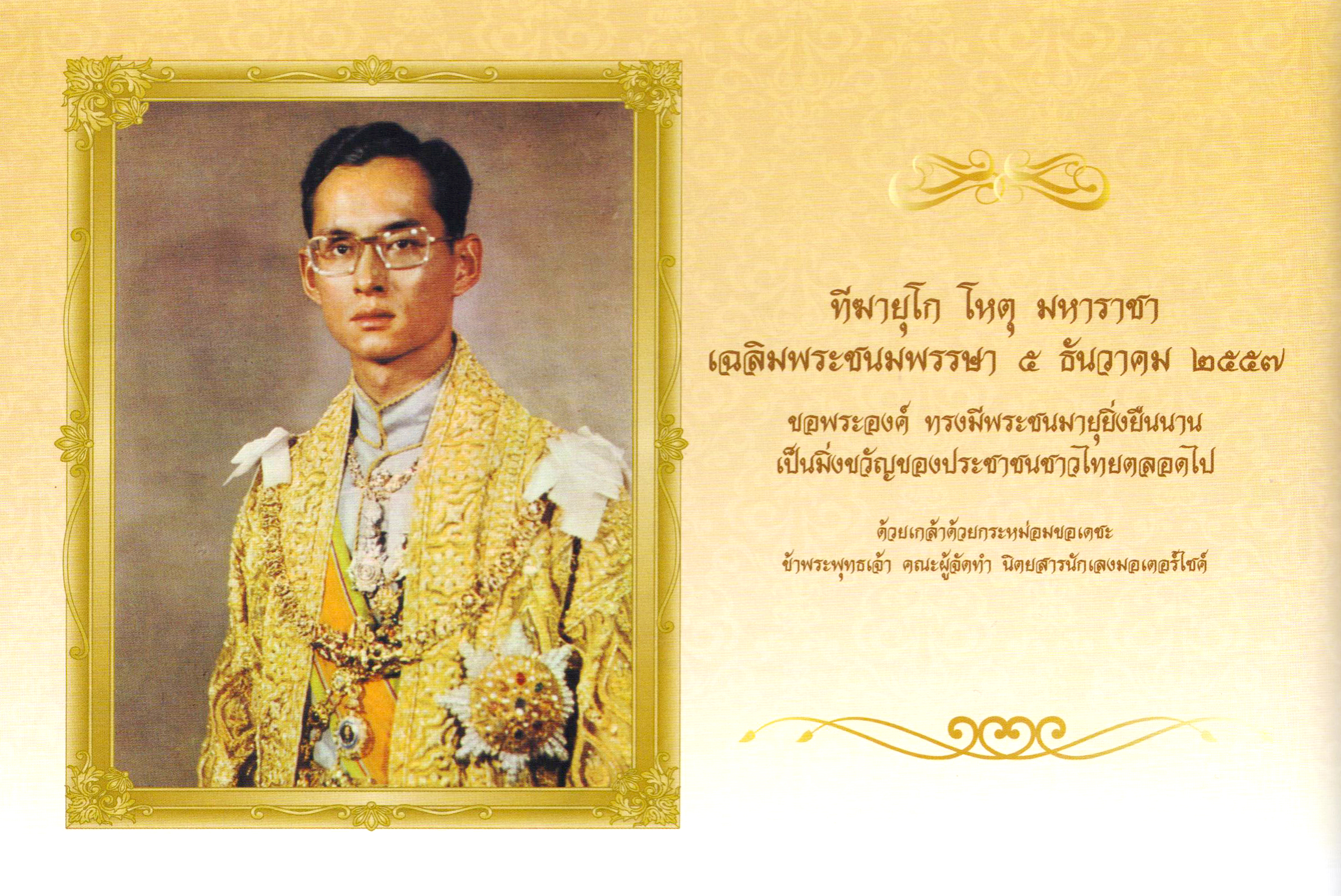
A birthday wish for the King of Thailand, from a national newspaper, December 2014. Though upright, this (digital) design interprets the manuscript forms in a broadnibbed calligraphic style. Outstrokes are exaggerated, with verticals drawn out and bending around. Letters such as ฉ, ล and ว show the rolled-over roofs that we saw in the earlier palm-leaf manuscript.
.")
The country style (ลูกทุ่ง) is very popular for lively and informal display work such as posters for movies, music and festivals. It shows some traces of manuscript forms, but is based on brush lettering and is more expressive, with swashes, curls and other decorative elements.
This last image also makes use of different forms of letters to the traditional typographic forms. This would parallel the use of single-storey /a/s and /g/s in Latin italics. Such an approach, used sparingly, could be a useful trick to keep up one’s sleeve in differentiating Thai italics from uprights. These different forms can also make the designer’s task easier; letters such as the ห shown here are rather difficult to draw in styles like bold italic, and converting to a different ductus solves this problem.
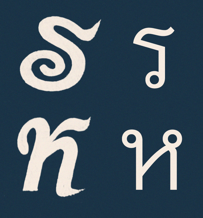
Some letterforms can take a ductus different to the standard typographic forms.
Conclusion
Though italics are used in Thai to signal a different typographic voice to the uprights, type families have not yet developed a distinct identity for italics: mere sloping doesn’t in itself convey much of a difference. This post has reviewed some of the other models on which italics can be derived:
- Toning down hard angles to give more fluid, rounder forms.
- Allowing outstrokes to be drawn out more from the letterforms, possibly even changing direction.
- Rolling the hoods over letters with open roofs.
- Opening the head loops to form hooks or other shapes.
- Simplifying the number of strokes by melding separate structures into single gestures, ironing out the corners.
- Using different forms of letters where appropriate.
Notes
| 1. | ↑ | namely the chancery hand of the 15th century |
| 2. | ↑ | This discussion also restricts itself to the genres that can provide inspiration for italics in a text font, and therefore doesn’t cover styles such as Farang Ses, Narit script, or other kinds of display lettering. For anyone getting to grips with the Thai alphabet in its different styles, Doug Cooper’s essay ‘How do Thais tell letters apart?’ [ pdf] is a useful starting point. |
| 3. | ↑ | And besides, I have identified only one typeface that gives italics a different treatment to the uprights, the award-winning Sarabun Mai typeface. Its italics are given subtle hints of cursiveness in the outstrokes. |
| 4. | ↑ | Both upright and slanted styles are found in paper manuscripts and in palm-leaf manuscripts. What’s interesting in this example is the way the slant of the Thai letters corresponds with the grain of the palm leaf: strokes at certain angles are easier to write. So the choice of substrate and the way it is processed and oriented can be seen to directly affect the style of handwriting. |
| 5. | ↑ | From conversations with Santi Lawrachawee, November 2014. |
| 6. | ↑ | Ibid. |
| 7. | ↑ | With thanks to Anuthin Wongsunkakon for his handwriting. |