Introduction
This blog post has grown in the writing, as various emails, conversations and Twitter threads seemed to be pointing in a similar direction. For reasons we will explore, Thai script is often seen as an example of a writing system prone to Latinisation. Its looped and loopless styles are easy to interpret as traditional and Latinised, but does that interpretation stand up to critical scrutiny?
Latinisation is a central discussion for type designers working on Thai, and a vexed, emotive one with complex, overlapping issues that cannot easily be teased apart. I’m not aiming to draw conclusions, but to offer observations and opinions that might prompt more discussion or open new lines of enquiry. There are also a few gaps in my research, and I’m trying not to fill in the dots speculatively, so I hope I’ll be corrected if I’ve passed over important points or written inaccurately.
I’ve broken the discussion into three parts: firstly an explanation of Latinisation and why the charge of Latinisation is levelled at loopless Thai typestyles. Secondly, I’m situating Thai in its local context by looking back at history, to decide if a lack of loops in itself indicates Latinisation. My opinion is that the presence or absence of loops is not a very clear indication, and there are other ways to gauge the cultural authenticity of a Thai type design, so the third section runs through some other possible indicators of Latinised Thai.
What is Latinisation?
For the uninitiated, Latinisation occurs when designers take the familiar As Bs and Cs used in English (and other languages) as their point of reference in designing other writing systems. The Latin script has undergone much evolution over the centuries, and its rich typographic heritage can easily spill over onto writing systems with different conventions. This overspill could amount to the borrowing of stylistic details like serifs, copy-pasting the same arches between different scripts, or even reappropriating entire letters. In a less obvious sense, it can also amount to the way a typographic family is set up with bold and italic styles being propagated onto scripts where they are alien, or re-proportioning a script to work in typographic environments that were set up to accommodate Latin.
Why would people think Thai is Latinised?
Written Thai is composed of letters rather than the pictograms or ideograms of Chinese; with its discrete, disconnected letters, it’s quite dissimilar to Arabic; and a fairly straightforward orthography sets it apart from the complex stacked clusters of many Indian scripts. The overall appearance more resembles Latin, so it’s no surprise that many people tend to talk of the Thai ‘alphabet’, though it is technically an abugida (or alphasyllabary). Indeed of all the Indic scripts, Thai is probably the one closest to Latin.
This analysis in itself places Thai in a category of scripts in the precarious position of being open to Latin influence; a category that needs to also include Armenian and Greek amongst others. As a thought experiment, compare the balance of strokes to counterspaces, the letters’ proportions and their complexity (or visual frequency) in the odd grouping of Thai, Armenian, Greek and Latin, and then compare these with Chinese, Devanagari and Arabic, and you’ll see that the letters of the scripts in the first group are potentially more easily confused.
There’s more. In its repertoire of straight stems and arches, written Thai is closer to Latin than Greek is. In some ways Thai is also closer to Latin than Armenian is, since Armenian has more extenders, more crossbars, and a lack of bisected/complex countershapes (like a, e, g, s, ด, ธ, ย, ล or ฮ). This would put Thai naturally in shape-wise proximity to Latin, whether or not the forms are deliberately Latinised.
Looped and loopless
Given these parallels between Thai and Latin, it’s logical for people to latch onto the biggest differentiator between the two scripts — Thai’s loops — as the defining feature of Thai and hence conclude that loopless styles are Latinised. This is an over-simplification, and I think it’s an attitude of primarily non-Thai type designers concerned about Latinisation. In fact the people most familiar with Thai, the Thai typographers, equate the loops with the serifs of Latin, since they seem to be a discretionary detail and are presumed to aid readability by differentiating the letters better. I don’t really agree with either of these views: things are not so straightforward.
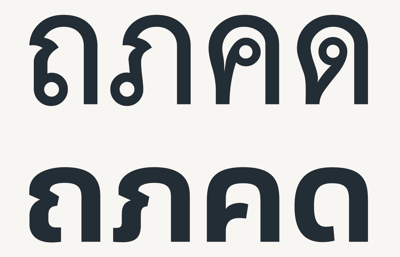
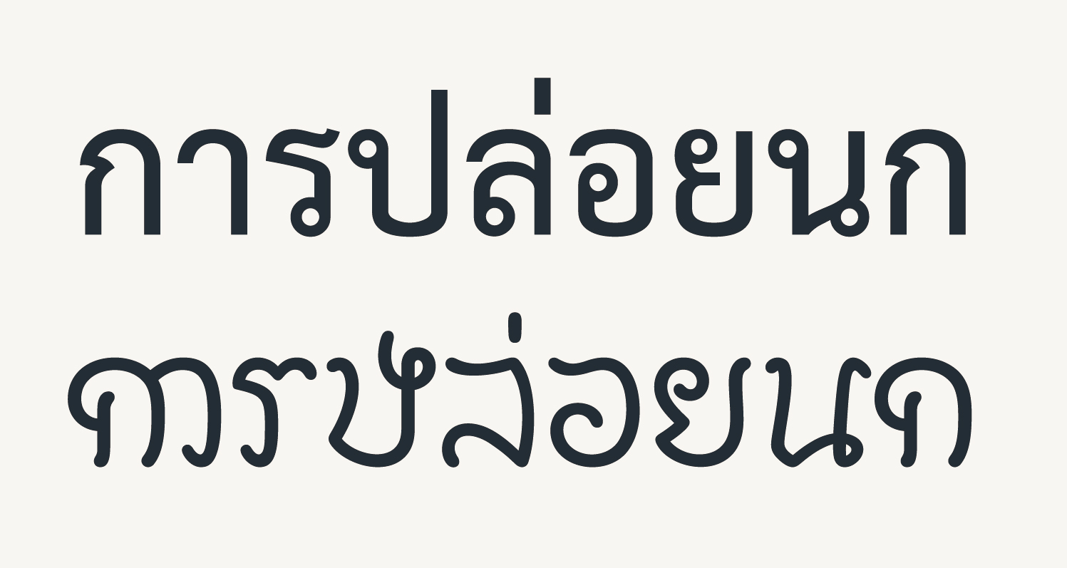
Looped and loopless styles of Thai
Above are two common typestyles. The first would commonly be used for body text and the second for titles and branding, and less commonly for body text; there’s perhaps a typographic or functional parallel to be drawn with the ways that serif and sans typestyles are used in Latin. But unlike serifs, the loops have semiotic significance: similar letters are distinguished by the orientation of loops. (This is one reason why I don’t consider loops at all equatable with serifs.)
In a loopless style, the designer finds other ways to disambiguate the letters. In the above comparison, the lower line shows the typical way loops are reduced in a loopless style.
Here’s a quick analysis of both styles:
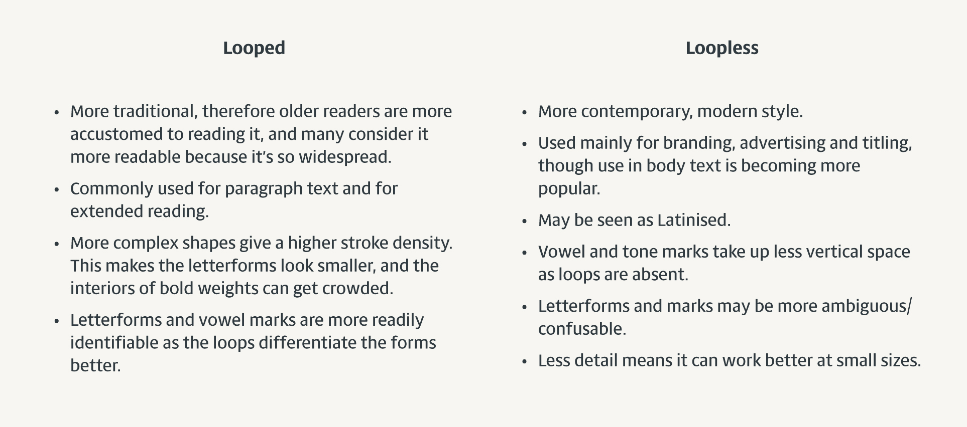
Characteristics of looped and loopless typestyles
Two kinds of loops
In my anatomy of Thai letterforms diagram, I marked a distinction between two types of loops: ‘heads’ and ‘knots’:
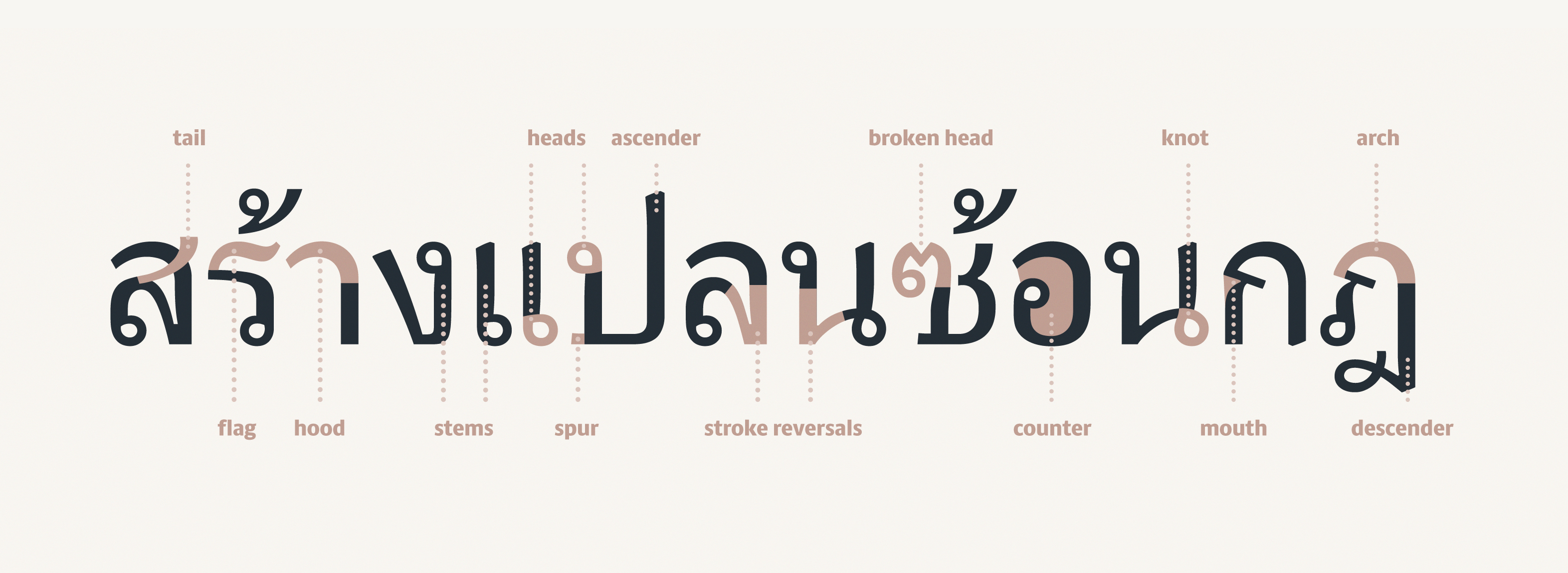
Establishing a vocabulary for anatomical features of Thai letterforms.
The head is the beginning of a letter as handwritten, and its position depends on where the letter’s stroke (or ductus) starts, sometimes at the top of a letter, sometimes in the centre and sometimes at the baseline. As stylistic details of letters, the heads are dispensable and are not always represented in loopless styles, just implied in letters that need disambiguating. The other type of loop is the knot, which is an integral part of a letter’s shape, formed when the strokes cross. Knots can be simplified, but it is rare to find them omitted entirely. They are often handled differently to the head loops: look at what happens to the knots (marked yellow) in the following image as the head loops progressively disappear:
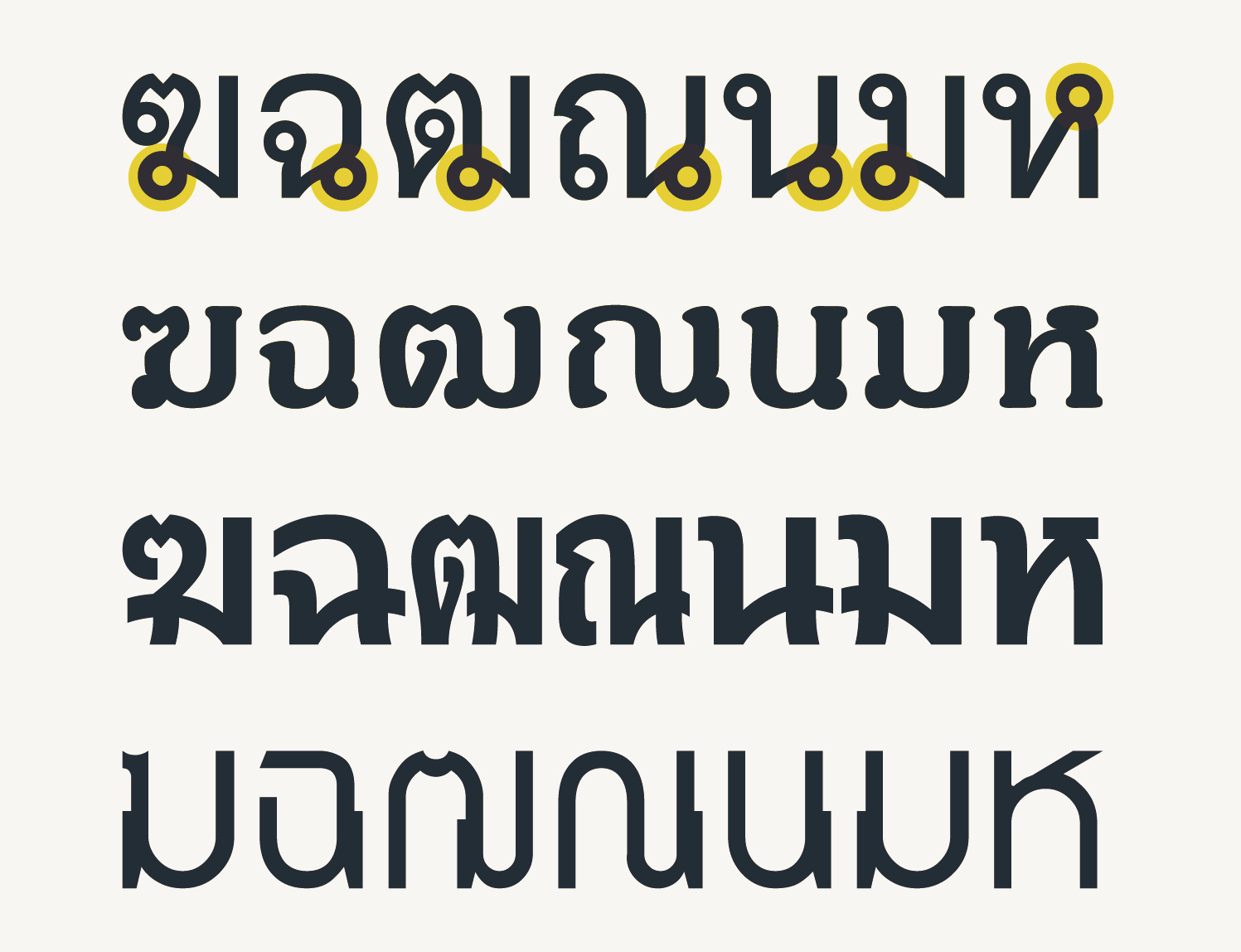
Knots in the letter strokes are maintained even when head loops disappear entirely
The Thai context: a quick retrospective
Thais generally consider the Sukhothai kingdom (1238 – 1438CE) as the birth of the Thai nation, and from even the most cursory glance at the inscriptions of that era, we can see the loops were not always present.
Unlooped letters were normal in the Sukhothai period.
Here I’ve made quick mockups of the key glyph shapes found in inscriptions in Bangkok’s National Museum from Wat Pa Mamuang (1361) and Pu Khun Chit Khun Chot (1392). (Without firm evidence to confirm or falsify the authenticity of the Ramkhamhaeng inscription, it seems best to leave it out of this discussion.) Instrokes (and some outstrokes) were not loops but curved hooks. It’s not clear when or why loops were introduced, but whatever their provenance, it’s extremely tenuous to claim they were ‘intended to enhance legibility’ (as asserted by an unattributed author on Linotype’s Thai fonts page, which incidentally contains a number of factual errors) since the change happened gradually (some letters gained loops earlier than others) between the 14th and 17th centuries, when legibility was presumably given little thought.
Evolution of loops
What seems more likely is that the loops began as stylistic details that later became integral parts of the letterforms. Looking at palaeographic evidence from around South and Southeast Asia (Indian Palaeography, Ahmad Hasan Dani, 1986) gives a broad context from which we can see how writing systems take shape. Evolution of letterforms is everywhere. People embellish, simplify, stylise, match, differentiate, reverse, flip, turn, chop, combine, discard, borrow, add, stretch and squeeze letters (and parts of letters) like mad. Just one little example is the Indian headmark, which has shown a great deal of variation, having been represented in at least nine different ways, from the familiar Devanagari horizontal bar headline to open and closed triangles to v-shaped notches, open and closed squares, and many things in between. In this context, it’s little wonder that certain groups of people stumbled upon the circular head loops: the appearance and disappearance of such details is well within the normal ‘evolutionary’ variation of Brahmi-based scripts without necessarily attributing it to Latinisation. (I’m not here drawing a parallel between the Thai head loop and the Indic headmarks, that is a separate discussion.) Through repetition, the head loops became embedded in certain types of Thai writing (as well as Lao and Lanna Thai; and in a slightly different shape, in Khmer and Khom Thai scripts).
Along came printing
While all this stylisation was happening in the inscriptions, along came printing. Printing would have demanded standardisation, reduction to clear basic forms, and some degree of unitisation. At any rate, the letterforms that solidified after that technological advance were the looped style. But loopless styles were not forgotten. What we must remember is that many of the Thai letters have shapes that are rather fiddly to write. With little loops, stroke reversals and broken heads, letters become difficult to write fast; a fact that has kept more cursive styles of handwriting in circulation. Many Thais today simplify the letters, which bear little resemblance to their looped archetypes. The natural speed of handwriting results in head loops falling open, resulting in curved instrokes similar to the above Sukhothai forms.
Effectively Thai can be seen to have branched into a style for reading (looped) and a style for writing (loopless), in much the same was as we have double-decker /a/ and /![]() / for reading and simpler, round forms /ɑ/ and /g/ for writing. (And yes, I’m beginning to see the loopless style as a parallel for the Informal style occasionally seen in Latin type families.)
/ for reading and simpler, round forms /ɑ/ and /g/ for writing. (And yes, I’m beginning to see the loopless style as a parallel for the Informal style occasionally seen in Latin type families.)
The move to loopless
Nowadays, we are no longer constrained by the requirements of casting type in metal and printing mechanically. Anyone can make a font in their bedroom. At the same time, brands want to be seen as approachable, friendly and enjoyable, and modern. It should be no surprise that in the move away from the formality and conservatism of the past, the loopless style has been seized as a source of inspiration for type designers. Tempting as it is to consider the loopless style as Latinised, isn’t it more important to relate it to local context and history? Just because some loopless Thai letters happen to share forms with Latin letters, does that make it Latinised? I don’t think so: there are other provenances besides Latin and other factors at play.
So what does Latinisation mean for Thai?
So if Latinisation is not caught up in the removal of the loops in Thai, what else could it mean?
- Situating Thai script in relation to its Indic siblings, a typically Indic feature is the way strokes cross each other or reverse direction sharply. In Latinised Thai, these stroke reversals (as in ค, จ or ล) are replaced with high junctions that echo the Latin /r/, /t/ or /a/.
- In terms of proportions, Thai is traditionally quite narrow, and prefers to have the active parts of letters towards the tops. Latinisation could therefore mean a tendency towards wider forms, or equalising the top and bottom counters, rebalancing the letterforms or counter areas to spread the active areas out more.
- Addition of serifs, of course, is alien in Thai, and seems likely to interfere with the parsing of loops and knots.
- Direct copying of letterforms. The Thai letter ร is the most notorious example, often being substituted with a Latin /s/. But again, this may not be straightforward Latinisation, as in cursive handwriting the ร is tricky and often approximates an /s/. Perhaps a better example is the letter อ which can be handled as a circular /o/, at a push.
- Possibly the use of modulation. This is something I haven’t yet figured out, but traditionally, Thai was a monolinear script. With the introduction of printing, I think, and the familiarity with colonialist typestyles, Thai was given some modulation. I’m not sure whether that amounts to Latinisation or typographic-isation, but that’s a question for another time.
Typography in flux
Looking back on the history of Latin type, the introduction of italics, sans serif letters, and later bold weights gave printing houses a broader, richer choice of styles. When sans serif letters were introduced, people were not discussing where they might eventually be suitably employed, such as on digital screens or magazine headlines; it is only with the perspective of hindsight that we can say these additions led to the establishment of our familiar conventions. What makes Thai a particularly interesting case study is the fact that people are aware of the change as it’s happening, and are thinking about where it could lead to. Is the expansion of loopless styles going to pave the way for further Latinisation of the script? Is it going to influence the way typographers set text? Or are the typographers the ones in charge here, needing to set more and more complex text that will demand more adaptable typestyles? Or are they simply seeking typestyles that fit nicely with a Latin conception of typography or can be typeset harmoniously with Latin? And what of the influence of the Thai readership? Will their preferences determine, or be determined by, what type designers and typographers cook up?
This discussion is currently unresolved: nobody knows what’s right or where things are headed — even clients commissioning new Thai typefaces don’t always know what they need. Thai readership seems to be on the fence, with magazine publishers hoping to sway them into loopless territory. Reading habits are changing, and will continue to change. The choice is nicely illustrated by the dual styles of Frutiger Thai; and it raises the question of whether other typeface designers will follow this lead by drawing looped and loopless variants of the same typeface.
Latinisation seems to mean different things to different people; being aware of the local contexts, whatever script we’re talking about, is the key.
Pingback: How to build a Greek typeface, by Eric Gill | Big Jump Press
Pingback: Thai italics part 2 : Design | The Fontpad
Pingback: ‘On loops and Latinisation’, by Ben Mitchell « Fortress of Solitude IV