Last month I was delighted to be invited to speak at the sixth BITS conference in Thailand. My presentation explores how we can create natural-looking designs in scripts we’re not native to, but at the same time unify diverse scripts into a coherent design. Since the most popular slide sharing media don’t seem to allow me to keep the transcript with the slides, I’m posting the slides as images and transcript as text below. Continue reading
Tag Archives: typeface
Reviving Emerson
The origin of ‘adhesion’
Gerry talks us through why the letters of ‘adhesion’ are a good starting point for designing type.
Branding types workshop, Reading
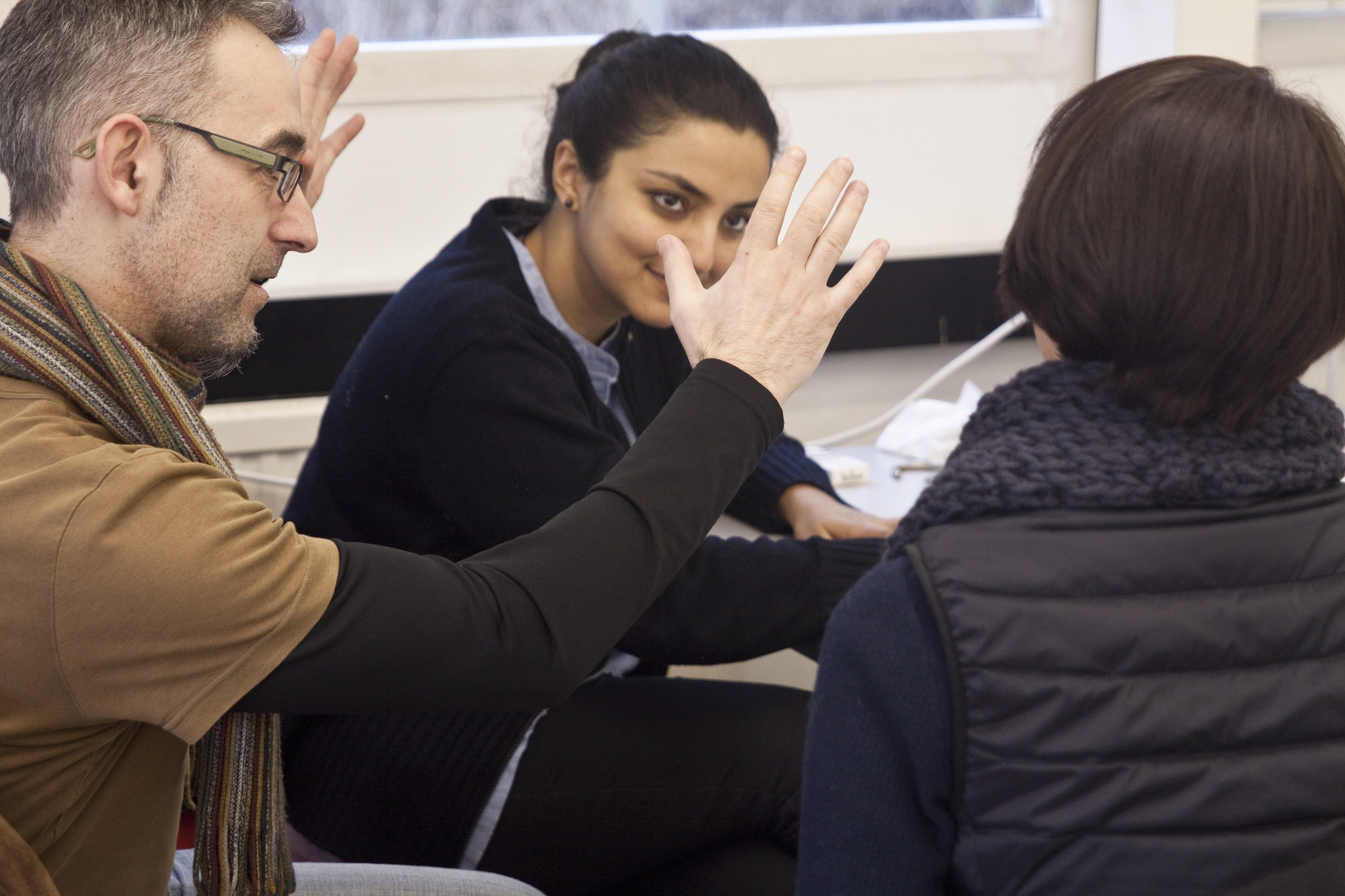
Along with my good friend Julian Moncada, we held a 4-day workshop for students of Reading’s MATD programme. Students worked on team projects to create a system of typefaces for fictional clients. We gave them some background info on each client, and set out what the typefaces would be used for. It was then up to the teams to decide on the creative direction, the number of typefaces needed, and the allocation of work among themselves. Continue reading
International Student Typeface Exhibition
The Ampersand Conference is always great because it brings many of my friends from the type community around the world to Brighton, my hometown. This year was extra special because I coordinated the first ever exhibition of student typeface work from around the world. Continue reading
Mastering type exhibition

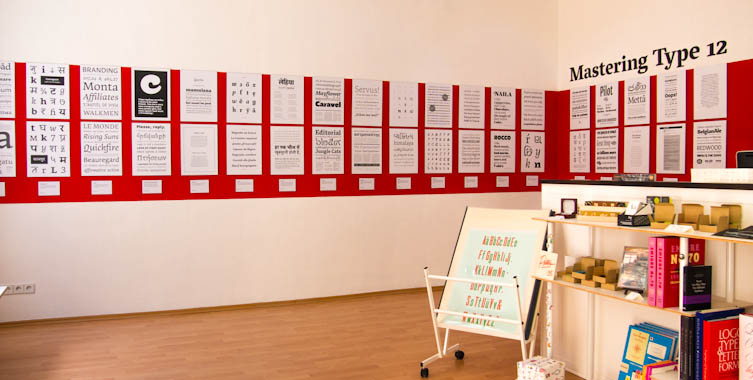
The Mastering Type exhibition now on at Mota Italic in Berlin features the work of type design students from this year’s classes at KABK and Reading.
Lumen specimen
Gallery
Whence originality?
David Březina () came to visit us last week, to talk through his career in type design and his award-winning, multi-script foundry, Rosetta, to critique our typefaces, and to ask us an impossible question. What he wanted to know was how we plan to create original work in our typeface design careers over the next ten years. A ten-year plan is not something I’d naturally sit down and think about, so it certainly struck me as an intriguing question. How on earth can I set about planning my long-term creativity? It was the kind of meta question that demands you take several steps back from the process itself and consider how one approaches one’s approach. Continue reading
It’s May already!
The year has flown past at an alarming speed — not that it’s over yet, but as our project deadlines are in June, it feels like we’re very much in the final stretch. After our fantastic field trip to Antwerp, Amsterdam, the Hague, Haarlem and Bussum, the Easter break gave us some much needed breathing room to get down to some serious business with FontLab. Continue reading
Finally, Burmese begins to click
Our Spring term has flown by, and progress on my typeface was honestly a bit disappointing. Perhaps I tried to tackle too many things and ended up spreading things a bit thin with unresolved attempts at Greek and Thai, or perhaps it was the packed timetable of workshops, visiting lecturers and assessment deadlines, but I was expecting to have achieved more by the end of term. I was especially unhappy that I didn’t have very much new stuff to show Gerard in his two visits of the term, as I’d been focussing on the non-Latin designs rather than bold, italic or sans fonts I’m also trying to develop. On the plus side, however, my Latin lowercase in the regular weight is now accomplished, including most of the spacing, so I’m freezing that now to work on the caps and Burmese. Continue reading


