David Březina () came to visit us last week, to talk through his career in type design and his award-winning, multi-script foundry, Rosetta, to critique our typefaces, and to ask us an impossible question. What he wanted to know was how we plan to create original work in our typeface design careers over the next ten years. A ten-year plan is not something I’d naturally sit down and think about, so it certainly struck me as an intriguing question. How on earth can I set about planning my long-term creativity? It was the kind of meta question that demands you take several steps back from the process itself and consider how one approaches one’s approach.
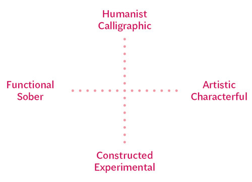
David suggested one way to respond to this question might be to map the design space in which to plot typefaces, and use this to identify areas that have not yet been exploited. Maps have always seemed useful, so I started to sketch out how I personally categorise designs. It turns out that I judge typefaces based on two axes, which seem to run from functional/sober to artistic/characterful and from humanist/calligraphic to constructed/experimental.

A possible framework for describing typestyles.
However, I quickly realised that there are two aspects to a typeface: its form and its styling. These aspects may need to be categorised separately — for example Gill Sans Shadowed has rather restrained and conventional forms, but more eccentric, trendy styling. This may mean typefaces need to be classified twice, once according to their form, and once for their styling.

Form and styling may need to be considered independently.
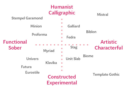
I plotted a few typefaces to see if the map would work:

Plotting typefaces in this grid.
This sort of thing is hugely subjective, but could be useful in talking to clients, especially if illustrated with example typefaces. I suspect it could be useful in finding contrasting typefaces that work together nicely.
From this map, I wondered if everybody isn’t trying to achieve the same goals in type design: the design space in the middle of the chart should be some sort of sweet spot where ‘perfect’ tension arises through the interplay of conventionality and playful creativity. Nobody generally wants a bland or cold typeface, but neither do they want a wacky, overstated thing that won’t stop shouting. Therefore the best way to create original work is to avoid the crowded space where everything blends together. One option might be to think about balance rather than blending. Somehow the idea of yin and yang popped into my head, where the black contains a spot of white and the white has a spot of black. Why not let’s try and apply this to design? Instead of blending the opposites, draw on them both but keep their characteristics distinct. I’m sure some interesting possibilities lie that way.
There could be some other approaches that promote originality. Originality seems to stem from individuals creating work that is truly personal. FontLab’s bezier wrangling interface results in certain kinds of curves, but sketching with pencil and paper produces shapes of a different quality. So it follows that using a range of different tools (and I include different software in my definition of ‘tools’) will result in more personal outputs.
It seems also to make sense to study a range of different typefaces to see how others have solved certain problems, and broaden our repertoire of what constitutes ‘acceptable’ or ‘conventional’; also, to plot new areas on the map. Reading about type allows deeper, theoretical or historical concepts to inform our choices.
Lastly, typefaces solve problems, so seeking new problems is very likely to lead to original ideas.
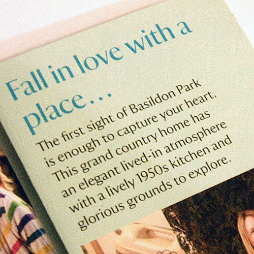
Following David’s stay, we were delighted to welcome Reading alumnus Paul Barnes (@paulobarnesi) from independent foundry Commercial Type to talk about his approach to type. Paul emphasised the way originality can be grounded in a sensitive appraisal of historical sources. His main interest lies in 19th century British typefaces in the ilk of Baskerville, but his expertise also includes European influences going back to the 17th century. He finds original ideas evolve, interestingly, from being faithful to traditional letterforms, perhaps treating them in new ways stylistically. For example, his typeface developed for the National Trust took traditional English letterforms from the 17th century, converted it to a sans-serif design and applied Optima-style modulation:

Paul Barnes’s National Trust typeface
Paul’s typeface experiment, Marian epitomises this approach: he took a selection of typefaces that represent different historical eras, and wondered what they would look like if stripped down to their barest form. He rigorously consulted thousands of sources to develop a very well rounded judgment of the typefaces’ inherent characteristics, and then drew their strokes in the thinnest hairlines. The result is an unexpectedly elegant family of display faces and I’m looking forward to seeing how graphic designers treat and use it.

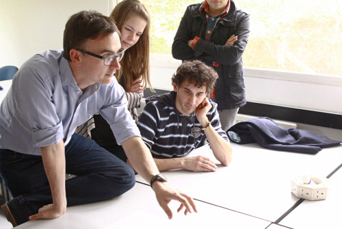
Paul Barnes visits.
Originality in typeface design, then, is personal to each of us, so we shouldn’t aim to be prescriptive. It is somehow linked to inspiration, and to a full understanding of historic context and precedents. It can be offering a new take on a well-loved model, or it can be driven by a synthetic exploration of concepts. It’s been a fascinating start to our final term, and the meta-thinking will serve as a continual, quiet reminder to produce better informed work.
With thanks to David and Paul for their generosity and encouragement.