The year has flown past at an alarming speed — not that it’s over yet, but as our project deadlines are in June, it feels like we’re very much in the final stretch. After our fantastic field trip to Antwerp, Amsterdam, the Hague, Haarlem and Bussum, the Easter break gave us some much needed breathing room to get down to some serious business with FontLab.
My serif face now has the complete character set (aside from Thai, which I’ve started but am not sure whether to continue — spending time on it could seriously compromise the quality of my other styles) and spacing is almost done. The sans face was feeling a little bland or rigid or something, and I’ve added more warmth and softness by drawing it slightly away from where it started. One thing I’ve realised through the year is that even with the strongest concept behind a design, or perhaps especially with a strong concept, there is a time to let go of one’s fixed ideas about a typeface and realise that things can evolve in their own direction and gain a stronger identity. So although I had begun with some fusion of Excoffon’s and Bloemsma’s ideas, I’ve allowed myself to open the gates to my own expression. I think that’s happened in a few areas of my typeface, so perhaps there’s some higher conclusion one can draw about being attentive to a design maturing and outgrowing its origins.
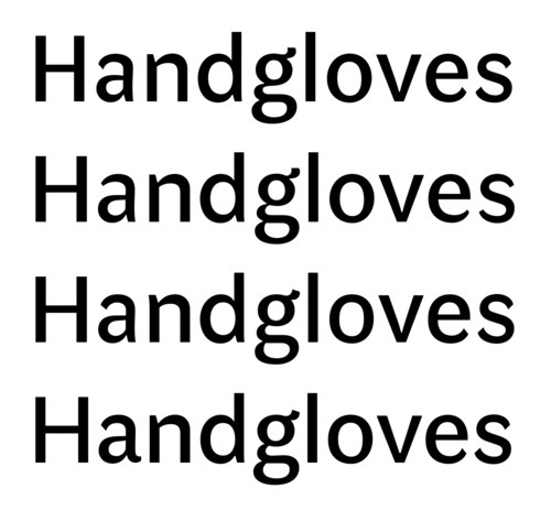
Of course it’s not always certain which way to take a design, so I tried a couple of possibilities before settling on a more humanist option. Top row shows the design that wasn’t quite working for me, middle rows show exploration of a couple of new options, and bottom row shows something I’m more comfortable with.
Bold is currently under development, then I’m hoping to give condensed a go, if time permits.