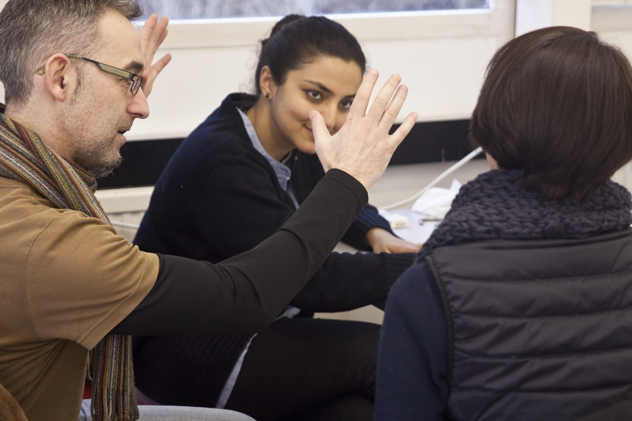
Discussing concepts in the early stages of the workshop
Along with my good friend Julian Moncada, we held a 4-day workshop for students of Reading’s MATD programme. Students worked on team projects to create a system of typefaces for fictional clients. We gave them some background info on each client, and set out what the typefaces would be used for. It was then up to the teams to decide on the creative direction, the number of typefaces needed, and the allocation of work among themselves. Continue reading