I decided to take advantage of Gerard’s third visit of the year to finalise the relationship between my Latin serif and sans serif designs. Several people had remarked that the sans was looking too skinny, too small or too light, but I wasn’t really sure whether fixing it meant stretching the thing or redrawing completely. In the end it was an illuminating and actually quite easy process, despite the many dimensions at play.
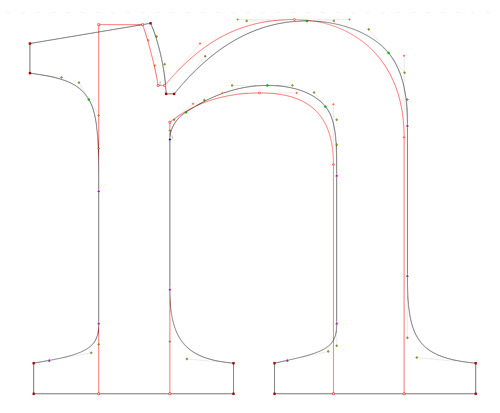
The first thing to fix was the width. The sans was feeling too condensed, and Gerard advised me that the proportions of the lowercase /n/ for example should match between the serif and sans design, so I compared the ratios of height to width of both together, and found they were almost identical (in fact I’d pulled in the stems in the sans 5 units to compensate for the lack of serifs):
I used InDesign’s character menu to mechanically stretch the letters horizontally in steps from 100% up to 108% and ran some test prints:
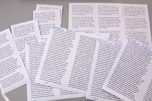
When comparing my printed proofs with the serif design, I found that a horizontal scale of 102¼ % fitted nicely. In fact anything over 103% began to look as though the letters were a larger point size.
The next thing to fix was the stroke weight, which I did by hand in FontLab. I increased the width of the heavy strokes in increments of 4 units and found that 8 units was the right amount to give the same text colour as the serif face.

Finally, the expansion had messed up the letterfitting, so I had to reduce all the set widths to compensate. Again, I used InDesign to quickly proof different settings. The result was a reduction of 12 units all round, and this matches the serif very nicely. Both cuts may still be spaced a little widely, but as long as I remember to tweak them both at the same time, it should be no problem to alter the overall fitting.

Compared to the original, the final result (above) had a width of 102.25%, an increase of 8 units in stem weight and a negative tracking of 12 units. The image also shows a difference between two of the printers in the department: the Xerox on the right gives consistently darker results than the HP on the left. It goes to show that we should continue to proof on as many printers as possible, rather than relying on the results of one which may be an anomaly. Luckily we have six laser printers at our disposal in the department and can also use the offset press from time to time.
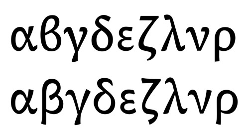
With these two styles reconciled, I’ve been trying to fix my Greek! Gerry had been a bit underwhelmed by my first attempt, which wasn’t altogether surprising as I’ve never drawn Greek letters before and don’t read the language. Due to my unfamiliarity, it seemed that I’d been focused on the stylistic details like terminals and stroke junctions instead of looking at the fundamental architecture of the letterforms. Interestingly that resonated with what Fiona had been getting at with my Burmese: try to settle on the essential proportions and relationships between letters before thinking about the modulation and stylistic treatments.
I’m really struggling to assimilate this advice, as I have a strong inclination to experiment with unexpected styling and dissonant harmony whilst keeping such details under the radar for text sizes and immersive reading. I need to remember not to run before I can walk. It can’t be all exciting until the basics are grasped, even if the forms look boring to start with. Step one leads to step two. I guess I’m seeing the forms and the styling as one process, enmeshed and depending on each other. Another problem is my typeface is trying to steer away from the stroke-and-tool model, and I want to let form and counterform have some independent rationale not following the ‘internal skeleton’ of each letter.
My solution so far seems to be to figure out what combinations of form and styling work well together. To help with this, I’ve started the Greek twice, with opposite modulations that affect the forms somewhat.
I’m not yet decided which model to follow, so I’ll keep working on both sets and make a decision later.