We’ve definitely moved up a gear or two this term as our timetable becomes filled to bursting point.
My seminar on how designers respond to technological constraints went quite nicely; the gist of the presentation was that successful type designs accommodate the needs of technology, but don’t depend on them. A talented designer will always develop their typefaces to work with more than one technology, and let their eye for aesthetics be the final arbiter over design decisions.
Next up, we had John Hudson visiting the department from Canada for an enjoyable and highly useful two-day workshop. John co-founded Tiro Typeworks with Ross Mills and they produce award-winning typefaces for major clients including Adobe, Apple and Microsoft.

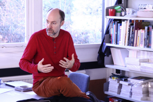
John Hudson
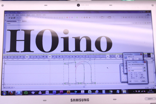
Our mission for the two days was to collaboratively produce a typeface. John had drawn five characters /HOion/ of a heavy poster face (below) and we each took a random selection of the remaining characters to draw.

Our starting point for developing a collaborative typeface.
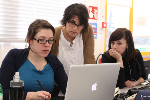
After we’d each drawn our first six glyphs, we printed proofs and had a group critique. John had to go to an appointment, but in fact that worked very well as we then had to manage our decision-making processes ourselves, and decide which glyphs should lead the design and how to harmonise everyone’s designs. Apart from variations in overshoot and proportion, there were decisions to be made about ball terminals, counter shapes and openness, speed of modulation between thicks and thins, the flatness or pointiness of diagonal junctions, the weight of hairlines, shape of inner brackets and many other stylistic features.

Collaborating.
The exercise revealed the multiplicity of design decisions that need to be made deliberately, consistently and coherently. Following the critique, we all made changes to our glyphs and then took another batch of characters to draw. It was an instructive exercise for many of the group: some had never seen a currency sign (¤) before, others had to get to grips with components and blue zones.

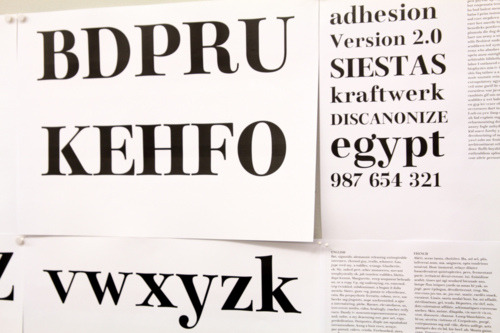
Proofs of our collaborative typeface.
By the end of day two, we’d produced quite a consistent typeface, and the hope is to continue polishing it into a useable font. I found the collaborative approach really useful, as the benefits of everyone’s different styles and approaches led to better decisions based on more possibilities, which outweighed the loss of control I could have worried about. Our speed was also surprising: to be able to have a basic Latin character set after only two days felt really good!