There’s a phrase that pops up from time to time in the department; it’s probably a Gerry-ism. ‘Designing the design’.
My take on it is that before we start drawing letterforms and thinking about details like what style of serifs we’d like, there’s the important matter of how the thing should look holistically. Can I visualise the rhythm and texture on the page, the way the letters perform together? Am I aiming for a particular mood and tone? What connotations and atmospheric values would I like to suggest?
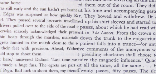
For a text face, these questions are primarily answered not at the glyph level, but at the level of the paragraph. The image below shows that typography also has an part to play, as the two pages are set in (different?) cuts of the transitional-modern face Baskerville. Even though a certain letter may not change much in its details, the countless repetition of those details can lead to a very different impact:
Dan Rhatigan, Monotype’s Senior Type Designer, (and Reading MATD alumnus) visited us last week, and suggested by this stage of the academic year, it is quite easy for students to let their designs get carried away, away from the briefs we set ourselves at the beginning. By now, everyone tends to be enjoying seeing their design take shape and there’s a temptation to experiment with all sorts of new ideas as we get more familiar with FontLab and our skills and knowledge increase.
This advice sent me deep into my paperwork to dig out the brief I’d filed away in November. Luckily, it’s quite a strict brief, so I hadn’t really needed to keep referring to it, as I have a clear idea what I’m aiming at. What was useful was looking back at the bits that dealt with what sort of typographic tone I wanted the letters to elicit, and I’d been very explicit in defining this, using words like ‘liveliness’, ‘flow’, ‘forward motion’ and ‘bright, cheerful shapes’.
Somehow, after pondering these ideas, I was able to clearly visualise how my Burmese should look on the page. My first attempts had been dominated by a fixation on individual letterforms and stylistic details, but following advice from Gerry and Fiona, I needed to have more unity and an overall plan for the script. Although I’m referring to Burmese lettering, signwriting and manuscripts for inspiration, the key to a readable typeface is having all the letters click together in paragraphs and not draw attention to their actual forms.
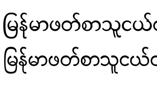
In the first line, I was trying interesting patterns of stress where the heaviest part of the stroke was opposite the apertures. I’d been inspired by 18th century metal type, which followed this pattern. However this didn’t lead to any consistency, and the shapes seemed to be fighting with each other. The lower sample shows a more considered approach to stroke modulation, and a smoother, much more even and harmonious tone. My Burmese now feels like it has a direction, which will no doubt be further refined as I go through the rest of the year.