Our Spring term has flown by, and progress on my typeface was honestly a bit disappointing. Perhaps I tried to tackle too many things and ended up spreading things a bit thin with unresolved attempts at Greek and Thai, or perhaps it was the packed timetable of workshops, visiting lecturers and assessment deadlines, but I was expecting to have achieved more by the end of term. I was especially unhappy that I didn’t have very much new stuff to show Gerard in his two visits of the term, as I’d been focussing on the non-Latin designs rather than bold, italic or sans fonts I’m also trying to develop. On the plus side, however, my Latin lowercase in the regular weight is now accomplished, including most of the spacing, so I’m freezing that now to work on the caps and Burmese.
One of the problems with designing Burmese type had been nagging me since the start: Burmese script seriously challenges a type designer because there are ostensibly very few things you can do with a circle: make them circular, or make them circular? At the end of the day, a circle is still a circle. Referring back to my brief, those words ‘active, fluid, lively and cheerful’ seemed incommensurate with drawing a circle. Whoever heard of a lively circle? And with letterforms so completely removed from the Latin, what could be translated across to harmonise the scripts? The interesting lesson was learning to see beyond these limitations, think about how those adjectives could be implemented in different ways, and design at a higher level. I’ll try to explain how.
Joins
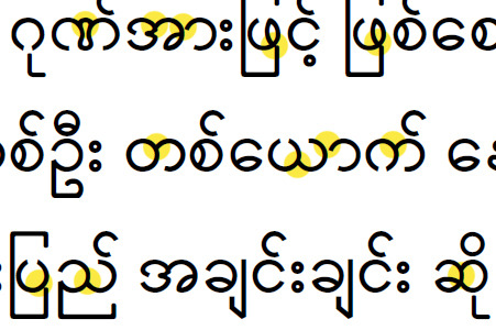
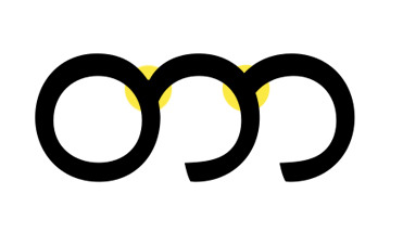
In this sample from the Universal Declaration of Human Rights, using a font called Myanmar2, we can see that a good proportion of the circles in Burmese are connected (and some of the connections have not been well implemented). My first response was to look at how I’d made the junctions in my Latin letters and transpose this onto the Burmese shapes. This meant substantial thinning at the junctions to brighten the joins. At the same time, I’d responded to the requirement of ‘fluid’ by smoothing the joins into one continuous stroke.
Unfortunately, this had unwanted side-effects. The stress in the second circle has now moved around to the right side of the shape, and more importantly, the shape now bears no relation to the way it is drawn.
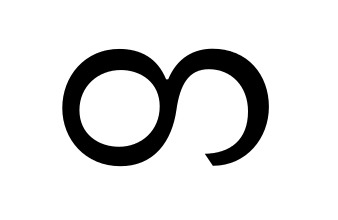
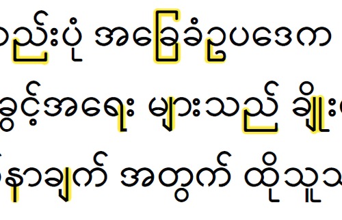
This image from John Okell’s indispensible Burmese: an introduction to the script shows clearly the consonant Ta is composed of two strokes, with the tool lifted off the page between strokes. Although my typeface is not strongly calligraphic, it seemed unwise to contradict the stroke construction only so that it would seem fluid. It also seemed the continuous construction didn’t give enough definition to the joins. In addition, the vowel sign Aa needs to connect to differently shaped consonants as a distinct mark, so having different joins just looked inconsistent.
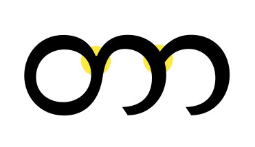
It was at this stage I realised the strokes and components of Burmese needed to overlap each other rather than join in a Latin way. I also remembered Fiona saying that Indic scripts tend not to thin much at the joins.
The result above seems much more assured and less contrived.
Wraparounds and verticals
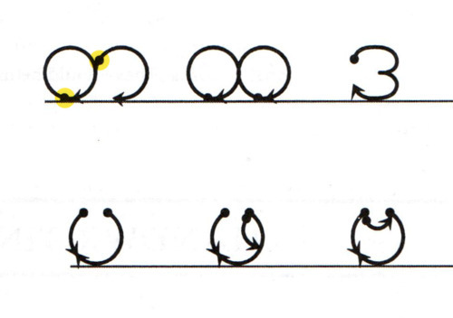
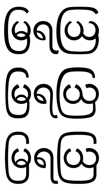
These highlighted parts in digital fonts always seemed so out of character for such a round script, and my original intention was to make them much less intrusive by ironing out the straight lines and sharp corners. My first attempts looked too clumsy, with inconsistent stress and shaky verticals. By the time I created my most recent version (third line below), I’d realised the problem with other fonts was not the verticality of the forms, but their squareness and sharp corners.
What about those adjectives then?
Yes. Active, fluid, lively and cheerful. As mentioned above, the simple way didn’t work out. Lightening the joins and making the strokes continuous ended up with a style that contradicted all the evidence. Instead I chose to lighten the interiors of the circles by taking weight off the inside strokes (resulting in a new way to avoid the problem of too much monolinearity and creating a pleasant balance of thick and thin strokes). I also brought in more energy and bounce to the leaf shapes by making their counters much more open. (Image above shows two letters with the leaf shapes.)