The Adobe Font Development Kit for OpenType (AFDKO or simply FDK) is a set of command line tools that Adobe makes freely available for font developers to help with production and testing. If, like me, you’ve struggled with FontLab’s glitches only to end up with incompatible font names, duplicate encodings or extra features you didn’t write, FDK seems like a better way to do things. Unlike glyph-editing software like FontLab, Fontographer, Glyphs or DTL BezierMaster, the FDK’s strength is in directly wrangling your fonts’ behind-the-scenes properties, such as naming and compiling extensive font families (especially from multiple masters), scripting the OpenType code that FontLab can’t manage, and comparing stem widths to expedite hinting.

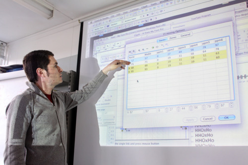
Miguel Sousa, Adobe’s Type Team Lead, (and alumnus of the MATD programme), visited last week to teach us how to use the FDK, and even came to the department on Saturday to explain pretty much everything there is to know (or at least everything we wanted to know!) about multiple masters and hinting.
The FDK model is based on CFF/PostScript outlines, which are compiled with a set of text files into an OpenType font file. The text files set out all the font’s properties (font tables) like naming, style linking, hinting, glyph positioning (GPOS) and glyph substitutions (GSUB), The compiling is instructed mostly through the command line, but there are also several Python macros that can be run directly in Fontlab.
We started off working with Adobe’s multiple master font AdobeSans, which is built into Acrobat to generate instances that mimic the width and weight of missing fonts in .pdf files. After generating a regular instance of the font in .pfa format, we created the FontMenuNameDB and GlyphOrderAndAliasDB files. The former determines the weights in the family, and how they appear in menus, whilst the latter sets the order of glyphs, converts working (friendly) glyph names to final (production) names, and assigns Unicode values to the glyphs. After a couple more skeleton text files were complete, we ran the MakeOTF command, and out popped a functioning font file.
On day two, Miguel took us through the CheckOutlines function, which is very similar to FontLab’s font audit function, checking for points at extremes, sharp junctions, crossed paths, incorrect contour directions, and overlaid points. The resulting text file listed the errors Miguel had introduced for the exercise, and after I’d corrected them, I was delighted to see CheckOutlines processing the revised .pfa smoothly without encountering any problems. The next task was to run the AutoHint tool, which is more intelligent than FontLab’s inbuilt routines, in that it reports inconsistencies in stem width (when individual hints don’t quite match up to the user-specified stem widths).
By the end of the second day, we’d created a family of eight hinted fonts from the AdobeSans masters, and the whole process seemed very promising. With a bit of practice, the FDK model is quite logical and more powerful than FontLab. The only thing I struggled with was setting up the correct directory structure, as certain files apply to the family and others need duplicating into the subdirectory for each weight or style.
Day three took us through Type 1 hinting, from alignment zones to stem widths to all those odd ‘blue’ settings that have always been so opaque. In a well-rehearsed and methodical way, Miguel managed to make even the most advanced production techniques completely clear. For example, the blue scale defines at what resolution (in fact PPM) the overshoot zones are rasterised: below this level, all overshoots are trimmed. Blue shift, on the other hand, determines the minimum amount of overshoot you wish to control: overshoots less than the blue shift amount will still be suppressed if they would rasterise smaller than half a pixel. We fiddled with these settings and output the resulting font to a .pdf. Acrobat has the ability to set the on-screen resolution (under Preferences/Page Display/Resolution) to allow direct on-screen proofing — a highly useful feature I hadn’t thought to look for.
By popular demand, the workshop continued into the weekend. Although nothing was planned in advance, a number of us wanted to understand better how to set up and manipulate multiple masters, how to do TrueType hinting and how to get our complex scripts working with anchors and mark positioning. Again, it was wonderful to have such complex ideas explained so expertly, building on the concepts from the previous three days.

Many thanks to Miguel and Adobe for a highly beneficial workshop.