Recently, we were visited by Will Hill, ex-Reading student and now Senior Lecturer in Graphic Design at Anglia Ruskin University. His lecture touched upon something that’s been bothering me for some time…
From printing’s beginnings, type has taken its cues from inscriptional lettering, handwriting and calligraphy. Over the next 500 years, type started to diverge from hand-tooled forms, becoming slowly emancipated from these external sources, and becoming more standardised; new typographic environments and developments in technology both fuelled and fed off the evolving spectrum of typeforms.
But until the end of the 20th century, type designers were still constrained to using the traditional technologies of production: drawing letter patterns by hand, cutting punches and casting metal type. With the advent of digital type drawing, those technologies are slowly being left behind, with many type designers nowadays drawing letters, unmediated by paper, directly on screen.
In The Stroke, Gerrit Noordzij reduces typeforms to handwritten strokes: letter shapes are unavoidably composed of the strokes of our pen or pencil. The stroke is the unassailable basis (‘fundamental artefact’) of a shape. For Noordzij, outlines do not define a shape, they are simply the bounds of a shaped stroke. Unfortunately, this is only one way of seeing things, and it relies on drawing letters from the inside, as though tracking the ductus with a tool. It is not clear how his theory relates to computer-generated outlines not conceived with penstrokes in mind.
However, Noordzij is right that most of what we read is based on models of how we write. Adobe’s Robert Slimbach states “It makes sense that type designers look to the established archetypes for inspiration…Because the familiar, traditional form — which grew out of centuries of handwriting practice — remains embedded in readers’ minds, it is crucial that designers of text typefaces work within its bounds.” (Quote from the Arno Pro specimen.)
But let’s step back and think about this: why should what we read and what we write be related? After all, the physiology of the eye and that of the hand do not in any way imply a logical connection. Are the letterforms that come out of our hands when we write the best possible forms for reading?
Some people seem to think so. So-called ‘infant’ typefaces with the single-storey /ɑ/ and /ɡ/ are very popular among children’s book publishers. But perhaps these publishers have conflated reading and writing. Studies have shown that children do not find ‘adult’ versions of these letters especially problematic, and understand that one version is for reading, the other for writing. (Sue Walker, 2003). Adults generally don’t find variant forms problematic (though some people prefer their handwriting to use the type-typical double-decker forms of the /a/ and /g/). And letters in other scripts often have differences between handwriting and type. Doesn’t this imply the connection between reading and writing is not as necessary as we tend to think?
So here’s the question: type is not handwriting. So why has the influence of handwriting persisted for so long in type design?
Will Hill cast an interesting light over the matter in his lecture. He sees the stroke-and-tool paradigm as a model that ensures coherence in type design. It provides a set of ‘relational constraints’ or a ‘behaviour pattern’ that makes all the letters in a design belong to each other. Our firmly entrenched and largely unquestioned conservatism in following the stroke-and-tool model acts as a kind of safety net that gives us a set of design parameters that ensure consistency in our typeface.
If that’s the case, and with technology now at a stage where designers can work directly on screen, one would now expect there to be a quiet revolution in the way we think about type, and new models should have the chance to spring up.
Jeremy Tankard’s new Fenland typeface shows that this is indeed the case. Instead of basing Fenland’s ‘relational constraints’ on the stroke paradigm, the letters are formed by bending hypothetical steel tubes. In direct contradiction to Noordzij’s theory, Tankard abandons a stroke model and begins his drawings with outlines. The curves bend around the letterforms instead of following the shape of some internal ‘skeleton’. The curves really do unexpected things, collapsing in on themselves as they go around corners and throwing away the conventions of where thick and thin strokes appear.
Which brings us to a second reason why the stroke paradigm persists. All the questions the type designer asks in designing letters can be answered by considering the stroke model, what tool is used and what logic is being applied to that stroke. Therefore, it is a paradigm that sets out sufficient parameters for designing type. Additionally, as Noordzij shows us, the model provides enough variability for different forms to emerge: expansion, translation, running and interrupted constructions can be freely combined to different degrees, generating a huge spectrum of possibilities.
Much as Tankard’s tubular premise is fascinating and original, it isn’t quite sufficient to provide all the answers to how the letters should look. For example, he has also had to define a particular ‘stroke’ order, which strokes are primary, and whether they connect in a ‘running’ or ‘interrupted’ way: the tube model itself says nothing about these matters, and the answers have to be decided on a letter-by-letter basis. This doesn’t promote the consistency that the stroke paradigm is so good at ensuring. The skill in Fenland is in Tankard’s ability to reconcile the letters consistently without a sufficiently explicit behaviour pattern.
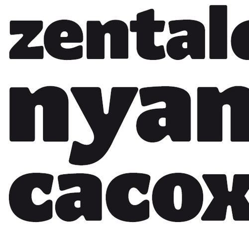
In my Mint typeface, started in 2009, I began to see the outlines as primary, rather than the strokes. Although the strokes are still very much apparent, conceiving things this way allowed some fresh thinking. The outlines alternate between shaping the black letterforms and locking in the white counterspaces. The interplay between black and white (similar to the Japanese design concept of ‘notan’) gives the white page a more active role in the typography of the text block, in a way the stroke model wouldn’t naturally elicit. But again here, the ‘outline’ model doesn’t provide exhaustive parameters to ensure consistency.
The MATDs have now submitted their typefaces (woo!) and are moving on to the next projects, but it’s definitely time to experiment with these questions and see what alternative models can offer.