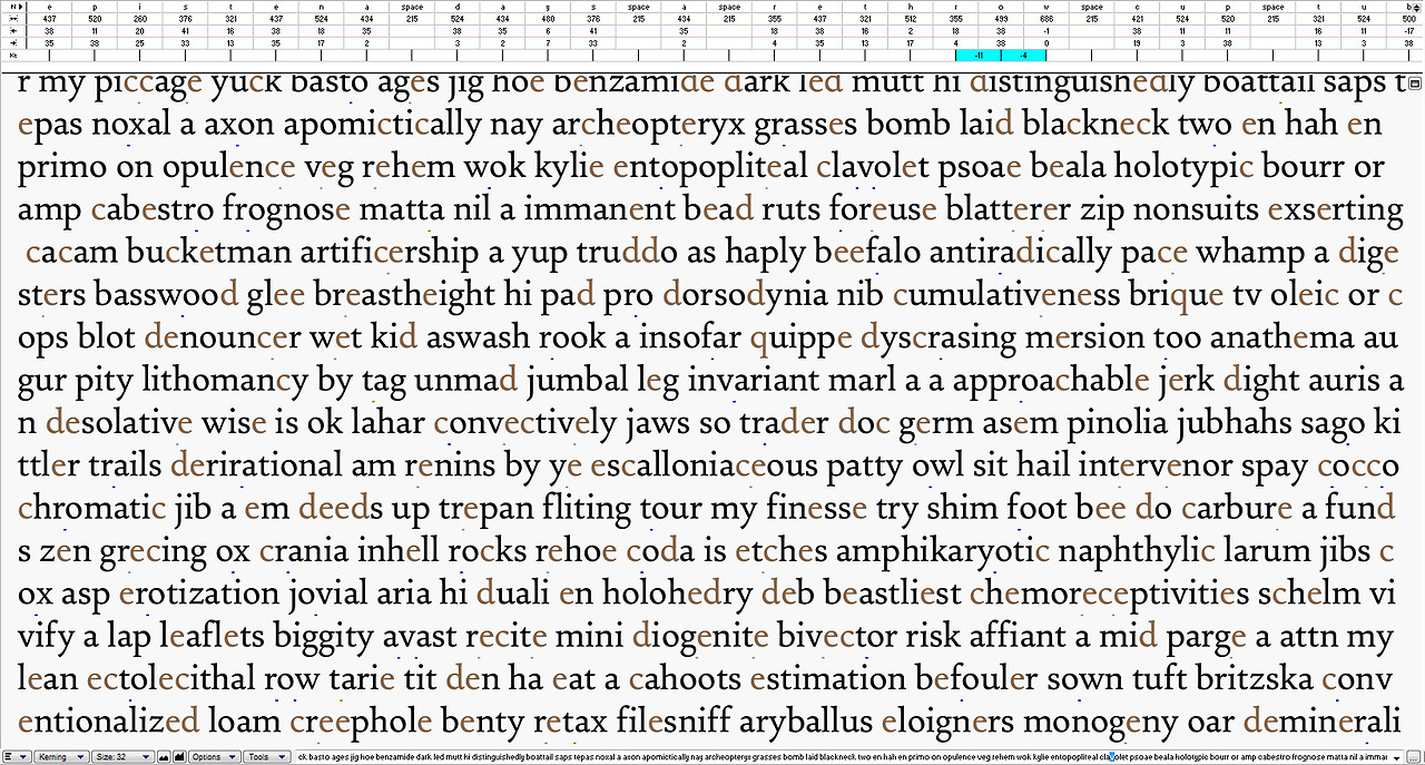
Settling on the ideal forms for the letters would seem easy for a revival, but there are still a huge number of decisions to make. Most of those only become apparent as decisions when seeing the overall texture, weight and regularity of the letters. Finding the answers that produce the most pleasing result is a matter of correcting issues, noticing where the corrections have gone too far to the opposite extreme or where they can’t be made to work with other forms.
Achieving regularity needs an exploration of the design space and the dimensions of variability, constant attention to the relationships between forms, and an eye for the sweet spots where things begin to click.


