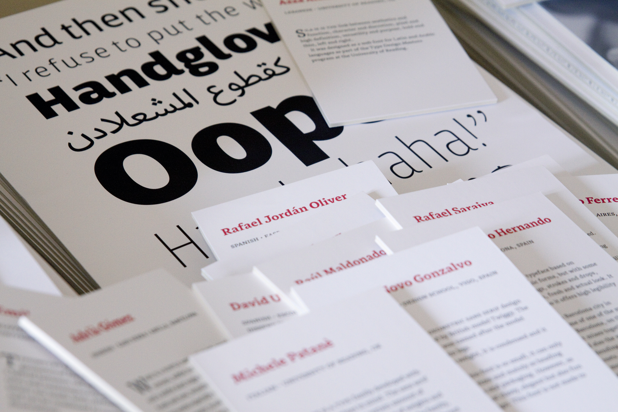
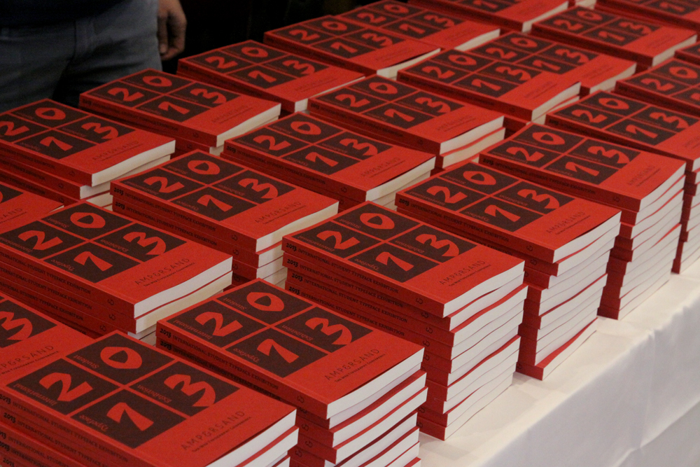
The Ampersand Conference is always great because it brings many of my friends from the type community around the world to Brighton, my hometown. This year was extra special because I coordinated the first ever exhibition of student typeface work from around the world.The exhibition included 111 entries from around 40 design schools worldwide, with students from as far apart as Chile and Japan. This meant a great deal of diversity in students’ aspirations, abilities and approaches, some designing heavy-duty text typefaces, others designing illustrative lettering for graphic design purposes, and one or two icon fonts. With such a mixed bag of type design, we were not inviting people to compare or judge the entries: it was more about exhibiting how students get to grips with type projects, to demonstrate the many interpretations of type design, and the enthusiasm and new ideas that design education is all about.
Along with the A3 posters, we produced an exhibition catalogue for delegates to take home.
Many thanks to all the students and their teachers who helped get this project off the ground, and thanks to Monotype for their support.
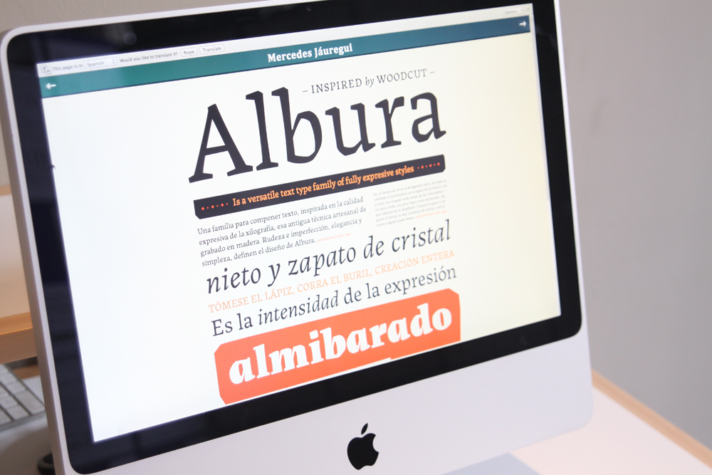
Web specimen by Mercedes Jauregui
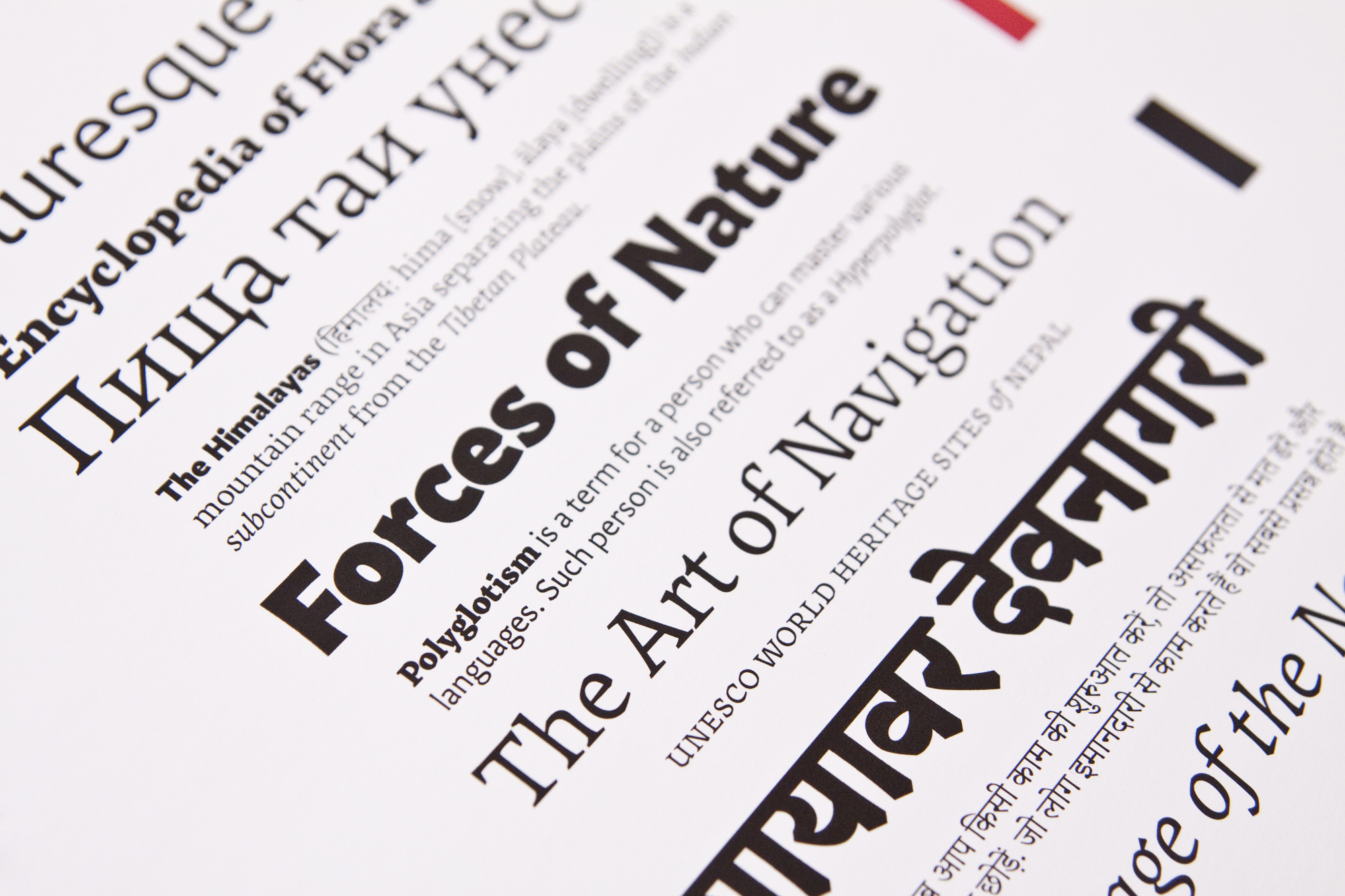
Nomad by Florian Runge
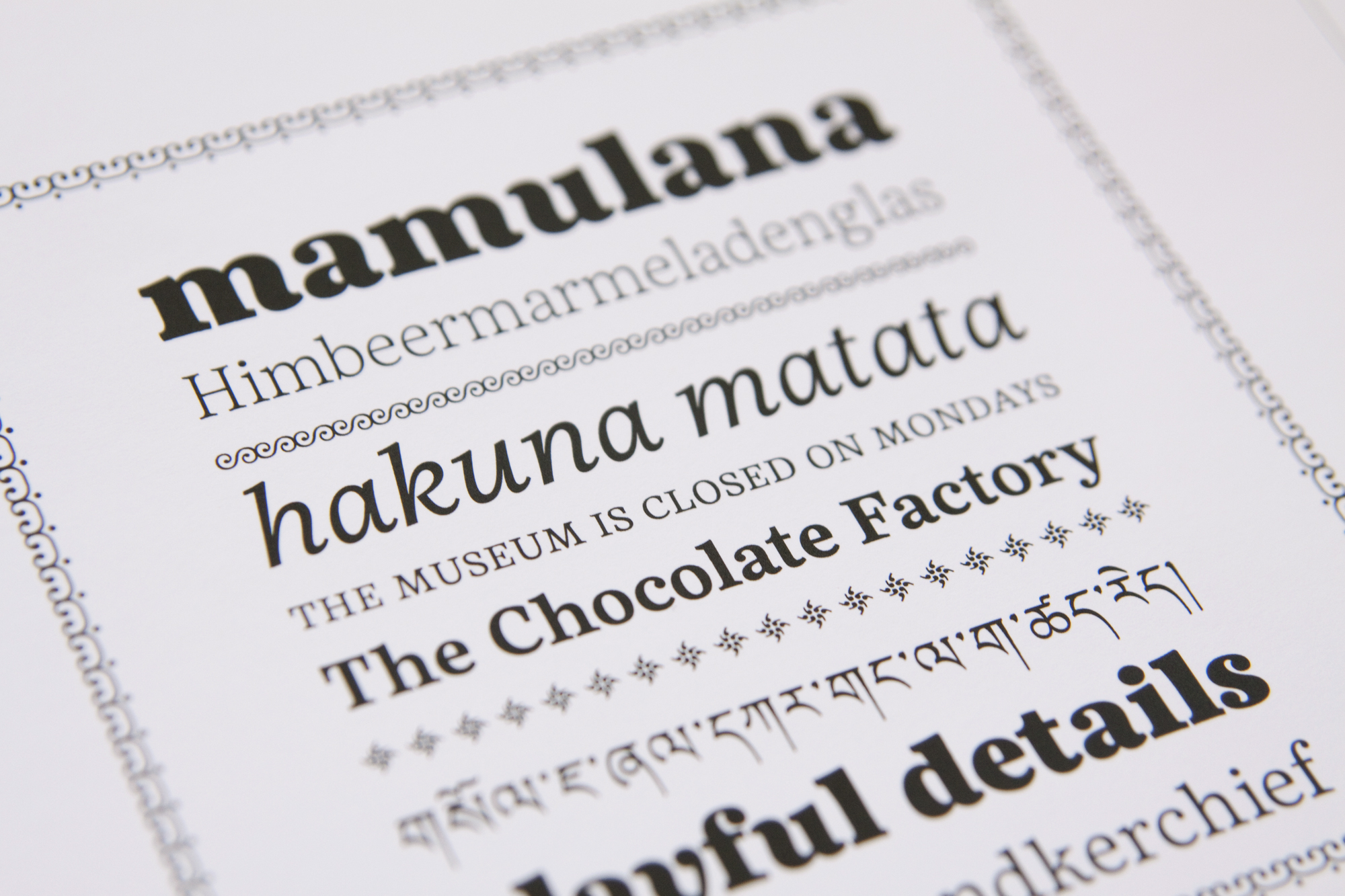
Emelia by Sandra Adler
More photos of the conference over on Flickr.
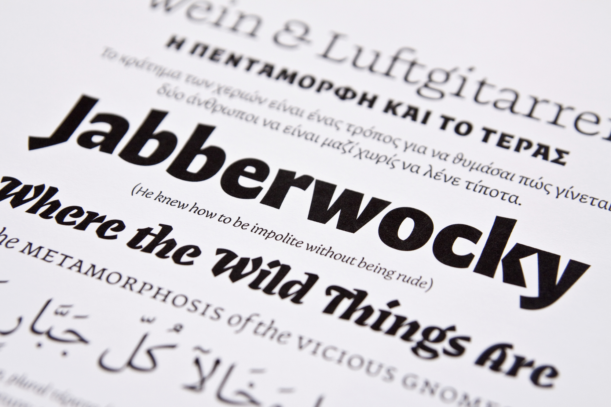
Teras by Sebastian Losch

