This wonderful font synopsis presents one of the earliest instances of the Thai script in printing type. Unfortunately there’s no accompanying information with the sheet, but Fiona Ross suggests it dates to between 1836 (when Vincent Figgins died and his business passed to his sons Vincent and James) and the 1880s (the latest date of type specimens under the name of V&J Figgins).
An early Thai typeface from the Figgins foundry gives us clues about 19th-century typefounding and composition.
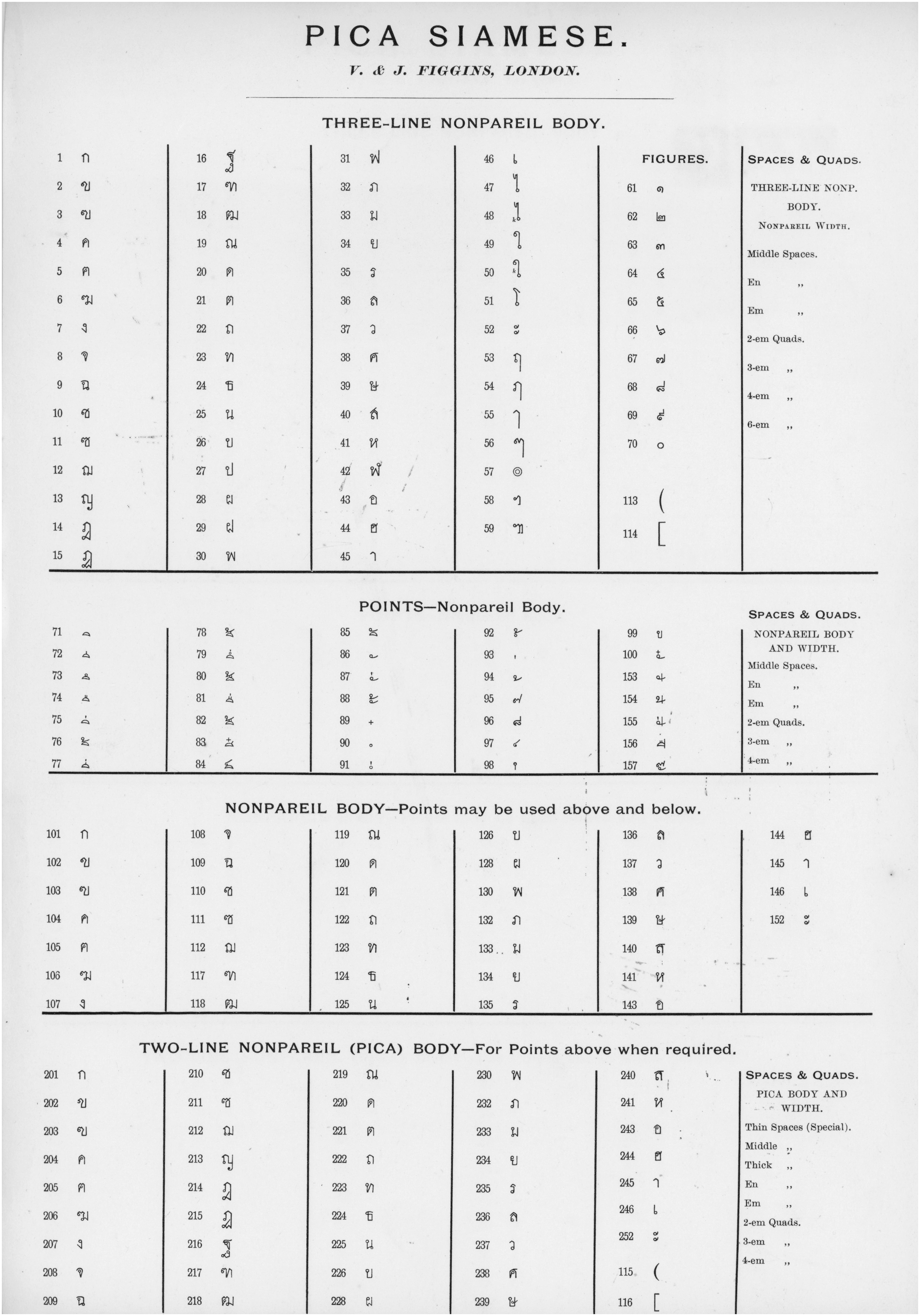
The synopsis is interesting because it gives us useful information about how the type would have worked mechanically. As can be seen, the sheet is divided into four sections, and the entire 190 sorts shown above would have been needed to typeset Thai. (The numbers run to 252 but 158 to 200 are absent.) The four sections show the sorts needed for different typesetting purposes.
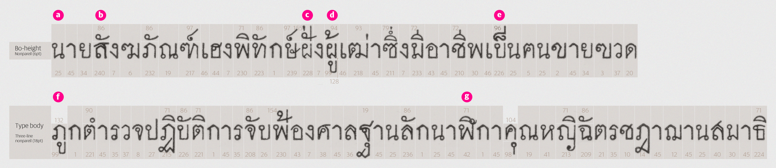
Let’s see how the type would have worked, by means of an example. I’ve chosen a Thai pangram to get an idea of how the letters would have looked alongside each other. I’ve numbered the sorts according to the synopsis above, and indicated the body size of each.
Typesetting Figgins’ Pica Siamese would have been fairly complex, involving three tiers of composition, but provided an effective means of rendering Thai script acceptably.
As can be seen, the type is set on an overall body size of 18pt (or three-line nonpareil, as it was termed in those days). The bo-height (the Thai equivalent of the x-height) is 6pt (nonpareil), allowing tiers above and below the consonants to be inserted within the overall body size.
Base consonants with no diacritic marks above or below (for example the first letter, marked a) are taken from the first section of the synopsis, those with the full body of 18pt. Composition continues this way until a diacritic mark appears in the tier above the base consonant (b). The appropriate variant of the consonant can be found in the fourth section of the synopsis, as these are cast on a body of two-line nonpareil (pica, or 12pt). It is surmounted by the required diacritic mark taken from the second section of the synopsis (points). Where diacritics in the top tier need to share space with an ascender (c), special combinations with stems are available in the ‘points’ section of the synopsis (numbered 153 to 156).
In syllables where a consonant takes diacritics both above and below (d), the letter should be taken from the third section of the synopsis. These are cast on a 6pt (nonpareil) body which allows the required space for diacritics inside the main body height.
Note that not all combinations of diacritics with ascenders are supported by this font as it stands. In (e) and (g), this causes issues which can’t be solved tidily. In (e), what is needed is a precomposed combination of ascender with maitaikhu, to form the syllable เป็น. In (g), we need a nonpareil-size variant of ฬ so that the diacritic can be accommodated within the overall body size. There are various other combinations of vowels, tone marks and ascenders that do not appear in this synopsis. These would have required manual hacks (by hand-cutting or squashing the sorts, or having the diacritics in the wrong positions).
In cases where diacritics appear only below base consonants (not in combination with diacritics above), the nonpareil-size variants of consonants (from section 3 of the synopsis) are used, and would have required the insertion of padding above the consonant to fill the gaps and ensure the type was locked up securely. There are also some variant sorts of letters missing, such as versions of ญ (which would be 113) or ฐ (116) that accommodate marks below.
Variant forms and discrepancies.
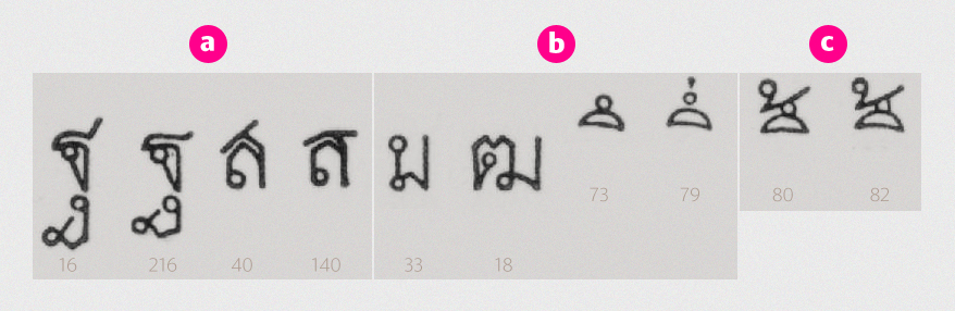
The variant forms of some letters are well handled. In (a), we see alternate forms of ฐ and ส, with tails shortened to accommodate diacritic marks above. On the other hand, in (b), we see needless discrepancies between letterforms. Finally, (c) is problematic: sort 80 is ◌ึ้ (sara eu with mai tho) and sort 82 is ◌ื้ (sara euu with mai tho), but their design makes it very difficult to distinguish which is which.
Overall the quality of this typeface is pretty good considering its era. The system of composing type is appropriate, even with the lack of all the required alternates, and with a few improvements, it could easily have accommodated all the necessary combinations.
With thanks to Fiona Ross and the Linotype non-Latin collections in the Department of Typography & Graphic Communication, University of Reading.