After a good winter break it’s now time to put our brains back in gear and prepare for a packed term. Our dissertation proposals are due at the end of next week; this is where we outline our topic, how we want to approach it, and where we’ll find information, resources or people to write about. I haven’t yet started mine, as I’ve been also occupied with writing my seminar, which is also due next week, and which counts towards our final marks.
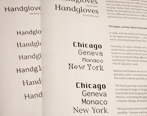
During the year, everyone has to give a 10-minute presentation on an assigned topic, with an accompanying handout that covers the topic in more depth. Luckily, I have an interesting topic: embracing digital technology in type design. I’m reviewing how designers kept up with technological changes since the decline of hot metal type, by looking at photo-typesetting, the Apple 4 bitmap fonts, laser technology, the advent of TrueType outlines, screen fonts and Microsoft’s ClearType engine. Each stage of technology has presented its own particular implications for typeface designers, and the seminar aims to shed light on the various approaches designers have taken to address the technical requirements of their day. It’s been fascinating to research because every book and journal I’ve read has opened more doors.
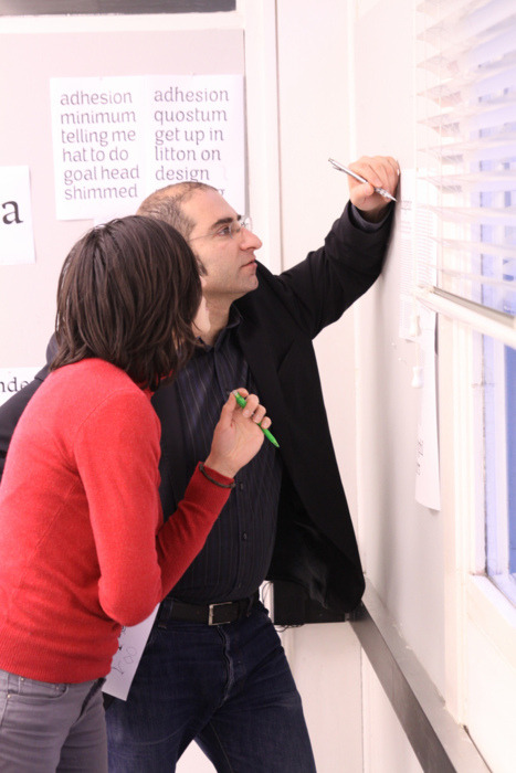
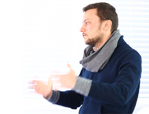
Our first week back is also focused on our practical projects, with several critique sessions in quick succession. Independent type designer Jean-Baptiste Levée visited on Monday and gave a good presentation of not just his work, but how he works through questions and design processes with his clients. Jean-Baptiste showed us slides of his sketchbook, saying that he enjoys doodling not as part of his design process, as they’re not an efficient way of exploring ideas, but that doodles are a good way to get the ideas out and make way for new ideas to grow.
His biggest project in 2011 was to develop a corporate typeface for AirInuit as part of their rebrand. Interestingly, the typeface had to include support for the Inuktitut writing system, a set of geometric letters that rotate and flip to inflect phonemes differently:
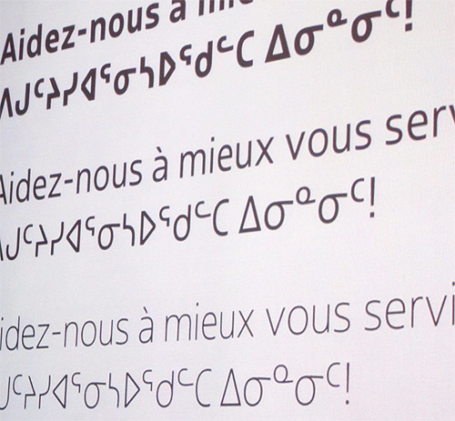
A couple of tips if you’re designing Inuktitut: the Latin word space isn’t big enough to separate words of Inuktitut, so make it wider; and Inuktitut will require extensive kerning due to the different letterforms and vertical positions.
Of course, Jean-Baptiste was hugely excited to finally see his typeface plastered across the fuselage of a real Boeing 737!
Jean-Baptiste went on to talk about some of his other clients and typefaces, but the most interesting part for me was when he was talking about the challenges of setting up a small independent foundry. Luckily France has particularly good laws regarding intellectual property and typeface designs, names and code can all be protected by copyright. The most time-consuming and costly parts were to draw up a legal framework for the business, drafting contracts and licence documents with lawyers. Another big job was building and promoting the company website (BAT Foundry).
Due to the nature of being a small independent foundry, Jean-Baptiste has to work on commissions from clients, which means fewer resources can be devoted to building retail fonts. However, with the help of his colleagues, BAT Foundry is busy preparing several new typefaces for release in the coming months.
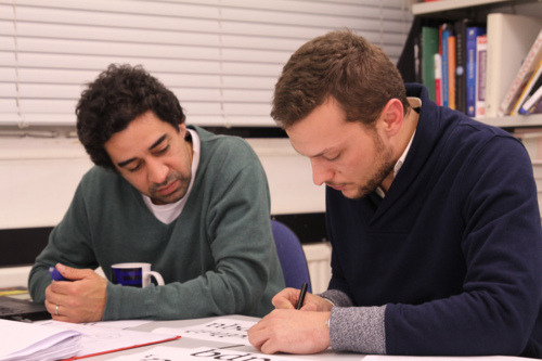
Jean-Baptiste then spent the afternoon reviewing our typefaces and offering critique, and on Tuesday, Gerry also did a critique session, and today we have a visit from Jonathan Barnbrook who’s doing a presentation followed by critique session. I’m not sure where I’m going to find time to think about my dissertation proposal, and still need to finalise my slides for the seminar next Tuesday. It’s going to be a busy term.