Our first term is over, though it feels as though we’ve all only just settled in. The ten weeks have passed so quickly, in a flurry of workshops, conferences, seminars, critique sessions and typographic delights. I’m feeling lucky to be able to spend this year doing something I enjoy so much at a department with such a great name.
Progress on my typeface is going well, I think. I had the chance to talk to Fiona about my Burmese letters, and we agreed that there was definitely room for improvement. The thing that puzzled her was the inconsistent stroke modulation (see image) which didn’t seem to follow any pattern.
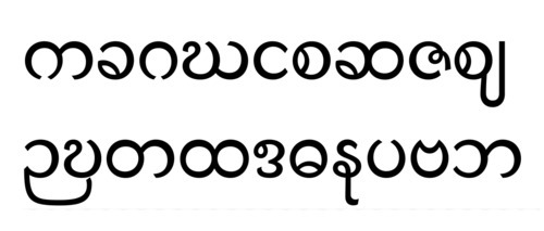
Referring back to the images of old manuscripts and Burmese folding books, we noticed that the heaviest parts of the stroke were often at the tops of the letters, and followed a pattern consistent with the pen-tooling of other Indian scripts, namely having the pen angled the opposite way from the normal Latin model. Unfortunately in my enthusiasm to create something new and exciting, I’d put the stress all over the place, and had to agree that whilst the letters might look interesting, they wouldn’t do a very coherent job at forming words since the eye would be drawn up-down-up-down, rather than along the reading line. Worse, the overall texture of the paragraph would be rather spotty. I’d been seeing the glyphs primarily as cool shapes, instead of as word components. I guess that’s about the worst thing a type designer can say!
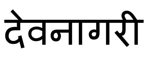
Fiona suggested looking at some more Burmese manuscripts, in fact as many as possible, to try and work out the best model to follow. It’s also helpful to look at other south and southeast Asian scripts. The letters of these are typically drawn hanging from the headline (see image above), rather than sitting on a baseline, which lends further support to the idea of stressing the tops of the letters. In fact I noticed with curiosity on one Burmese folding book that the letters had been drawn hanging from a faint ruled guideline. This came as no surprise to Fiona: “It’s a Brahmic script”. I need to be faithful to that ancestry to make it authentically Burmese. Strangely I didn’t feel discouraged by the prospect of starting again: it’s the first time I’ve tried drawing Burmese and if my first Latin is anything to go by (below), first designs are never really very clever! That it will also look more harmonious and read more smoothly only makes me more excited to revise and redraw.
(My first attempt at drawing letters from 2007. In this rather unassured design — just look at that skinny f! — I was seeing the shapes as discrete entities rather than drawing them to fit well together in words and actually paragraphs. You can see I was drawing them at large scale on the screen as the serifs are tiny.)
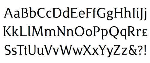
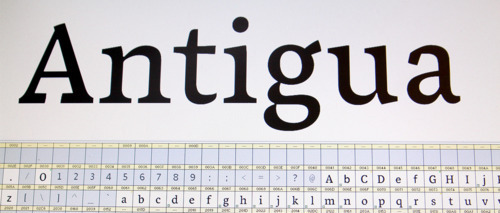
Anyway, back to my Latin. We hadn’t had group critique with Gerry for a very long time, so people had generally made a lot of new things to show him.
I was quite certain my serif cut was heading in a good direction; and now having had Gerard’sspacingletterfitting workshop twice, feel much more confident about the whole thing. Also I should mention one of last year’s students, Julián, who’s been working in the department, has been very generous with critique and advice about spacing. One piece of advice was that the space between two lowercase /o/s should be about the same as the lowercase stem width. This provided a foundation from which to overhaul the spacing, and I think it really works.
Gerry seems to know what sort of feedback is useful. For me, it’s mainly been things I’ve overlooked or haven’t noticed, rather than raising stylistic questions about what makes an /a/ an /a/ for example. My odd rectangular serif-terminal features on the /a/, /c/, /s/ and /z/ weren’t all the same shape, sometimes being square and other times trapezoid, so that needed attention. The same shape on the diagonals made letters like /w/ too dark — I’m still not quite sure how to resolve that. My /x/ had a disjointed appearance where I’d offset the thick strokes too much at the centre. Here’s progress on the serif face.
One recurring difficulty I face is determining the different amounts of overshoot on the x-line and baseline. My glyphs seem not to align properly, sometimes floating above the baseline, sometimes dipping below, and sometimes looking too tall or short. Although I have learnt how to see the problems, I haven’t yet discovered how to correct it, and end up overcompensating every time.
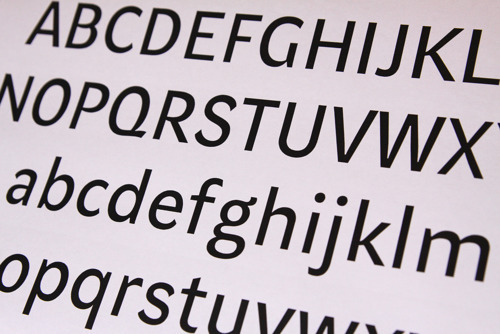
I was delighted to hear Gerry quite liked my sans serif design (above, with first showing of capitals). Gerry often explains the trouble with sans faces is there are fewer interesting design decisions that can be made. Along with the lack of serifs, there is much less scope for being creative with contrast and stress. This leaves only the overall width and shape of the strokes and terminals to play with. So it was really encouraging when Gerry said there was something very interesting about my design. Although it’s a monoline design, I’ve kept a bit of emphasis at the tops of the letterforms, in the hope that the Burmese will follow suit, and I’ve also kept the noticeable thinning at stroke junctions. Unfortunately, I’d gone a bit boring in the /h/, /m/ and /n/ and needed to ‘do something a bit more interesting’, so I redrew these with more movement and contrast. There was also a difficulty with the crossbars of /f/ and /t/ because they produced too much density along the x-line, where in the rest of the face, that’s quite a light spot. I tried a couple of different solutions to this but ended up following Gerry’s advice to taper the strokes on the left side. I may come back to this in the future. Initial feedback from the class and other type designers has been very positive. I can’t wait to try making the bold!
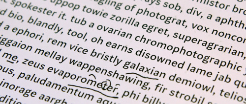
Paragraph sample showing problem areas. The /x/ with too much offset, also too wide, and the /m/ and /t/ with too much space on the right.