Week 8 was our second intensive practical week with Gerard, and with only two more weeks of term, it’s felt like time to really settle into a definite direction and concentrate fully on our typefaces.
I’d already noticed in my print proofs that the stems were a bit dark, and dark patches were interrupting the rhythm on the arches of /m/ and /n/. I decided that the best way to reduce these dark spots was to turn the stress a little more vertical and give the whole face a bit more rationality, toning down some of the extravagant shapes whilst keeping those features I’d originally felt interesting, such as the fluidity and springiness in my curves. This little animation shows how the letterforms have changed:

For a couple of days in the middle of the week, I wasn’t sure if I actually liked my typeface at all, and felt frustrated that I didn’t know how to respond to my doubt. After all, it’s no good trying to rationalise matters of taste. Gerard gave some constructive criti-fusion by pointing out a couple of misproportioned glyphs in passing and seemed to be drawing my attention to existing typefaces for inspiration (Enquire, Lexicon and Le Monde Journal — designs I dutifully appreciated before reverting to my own ideas!) Our classroom also became seriously overheated: even with windows and doors open, people were complaining of headaches. I found a soothing break with a stroll in the chilly autumn forest.
My Burmese is also coming along nicely. I visited Oxford University’s Bodleian Library to pore over old palm-leaf manuscripts, and I feel as knowledgeable as anybody about the historic derivation of the script. The Library was incredibly helpful in coordinating a mix of different stuff at my request, so I ended up with early Burmese-English dictionaries, cultural scenes in watercolour, pages of cloth inked with Shan script, traditional parabaik manuscripts scratched on bamboo and palm-leaf strips, and some unexpected large-format mazes. Others in the Library were peeking curiously over their little books as I spread out tropical-smelling concertinas across two desks to take photos. (Unfortunately I can’t publish the images here due to Library policy.) I’m making a further trip to London on Friday to see the Burmese curator of the British Library, who has promised some exciting things too.
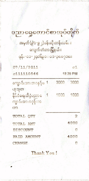
Another surprise was the arrival of a hefty package of goodies from my mum’s friends who just returned from holiday in Burma. They sent me a collection of newspapers, photos, receipts, books and posters, absolutely super. Here’s a dot matrix till receipt:
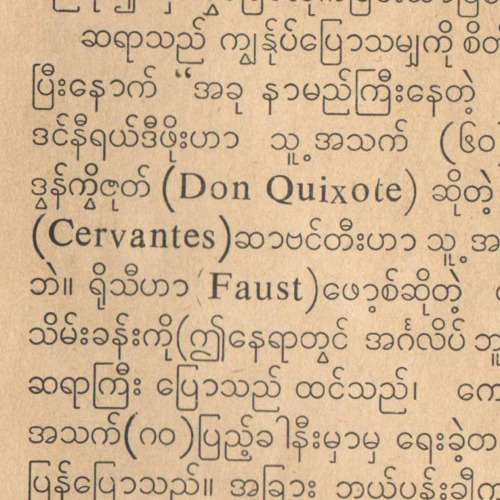
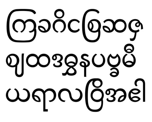
These resources have shown me there’s huge potential with the Burmese script: it seems very likely that 20th century printing technology and metal type have been detrimental to the Burmese script. These days Burmese print is dominated by a very mechanical, monoline style that severely restricts proper typographic expression and I suspect also hampers readability. Here’s an example:
The old manuscripts show great variety and richness of form, and these can act as clues how to humanise the script again. I’m much too forward-looking to want to produce an 18th century style of typeface, so it’s more about seeing ways in which those models can instruct and serve to revitalise and renew typographic trends. Given current events in Burma, it seems the perfect time to be thinking of a more open future, where written communication can explore new territories.
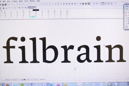
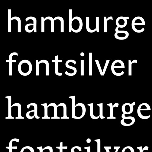
Here’s my progress:
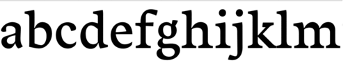
Meanwhile, back in the classroom, Gerard gave us a live letterfitting demonstration using Pooja’s typeface-in-development. Starting with the lowercase /o/, he showed us how to tackle the multi-dimensional balancing act that results in every letter fitting nicely with every other letter. Due to the different shapes and different surrounding whitespace, it’s not as easy as giving each letter the same amount of space. In fact it’s pretty much the hardest thing about type design! Some letters like /c/ or /g/ need to have a fraction extra space — somehow their whitespace is integral to their identity. The aim is to harmonise the counterspace inside letters with the whitespace between letters, and of course all these shapes are pretty much incommensurable. Serifs, curves and letter widths all have complex effects on the overall colour of the text on the page, so making it even is a real challenge. Here’s a spacing proof I made on Friday:
And a quick test of the serif and sans cuts together:
After that full week, it’s good to be nearing the Christmas break; however we next have our italics workshop with Victor Gaultney and then the dissertation preparation week. It’s all very exciting!