The last couple of weeks have felt a little more pressured, as we concentrate more on our practical projects, delve more deeply into the non-Latin scripts and start our core seminars.
As well as classroom commitments, I have become the student representative for the class, which involves extra meetings both in the department and with the Students’ Union. The food situation near the Typography and Arts departments is pretty dire, so some sort of petition or direct action may be in order. There have also been a few silly problems with IT in the department which have needed more patience than expected.
So anyway, back to type. We’ve seen very little of Gerry lately; instead Fiona Ross has been introducing the Brahmic scripts of south and southeast Asia. To most of the class these are completely unfamiliar, though we do have two lovely Indian classmates who are helping us to understand how these strange systems work. Actually, when thinking about it, it seems a bit insane that we’re trying to learn ten different writing systems at once! — but in fact the principles that apply to these scripts are the same and it’s not the details that matter at this point. As a speaker (and reader) of Thai (and with a rudimentary understanding of Lao, Khmer and Burmese), these abugida syllabaries all fit into my conceptual framework rather easier. I already understand the phoneme-based alphabetisation, the virama or ‘killer’ symbol, subjoining consonants and character reordering for complex scripts, but the production of Devanagari or Telugu typefaces involves a lot more glyph combinations. The southern Indian scripts for example can theoretically take up to five consonant signs in one cluster, all to be pronounced at once! Thankfully we have OpenType these days to take care of chained characters, but I still need to create my own ligature table to show what combinations of initial consonants, subjoined and medial consonants, vowels and tone marks are possible, and how they affect one other.
Figuring out how to convert Burmese orthography into OpenType routines has proved rather more involved than I initially expected. I had the chance to speak to Victor Gaultney, who visits us a few times through the year, and who suggested that OpenType wouldn’t be able to handle the complexities of Burmese. (Victor works for SIL International, whose Burmese font Padauk uses the Graphite rendering engine. Unfortunately this font won’t work on either of my machines, so I can’t tell if it allows the designer more choices between alternate glyphs.) I’ve been buried in Unicode documentation, getting to grips with the order of keying, storing and sorting glyphs (generally the sequence in which letters are input does not match the order in which you’d find them in dictionaries, and neither of these orders necessarily matches the order they appear in words; in fact for Burmese there seem to be three competing sort orders).
I’ve been studying inscriptions, manuscripts, vernacular signage, newspapers, handwriting, 20th century movie posters and book jackets and all sorts of random Burmese lettering to get as full a view as possible of the writing system. In the coming weeks I’ll be making trips to the Bodleian Library in Oxford, British Library in London, the School of Oriental and African Studies in London and the Cambridge University Library. There’s also a possibility of making a field trip to Burma in the Spring break, if I can organise some useful meetings at museums and publishing houses there. Also some family friends have just returned from a holiday in Burma, and a package is on its way to me containing some stuff I’ll ‘be impressed’ by, which sounds groovy.
All this has gone into my final proposal, submitted today, so now it’s a matter of collating all the ideas and designing the actual Burmese letters. I spent Sunday playing with some ideas for a small selection of them.
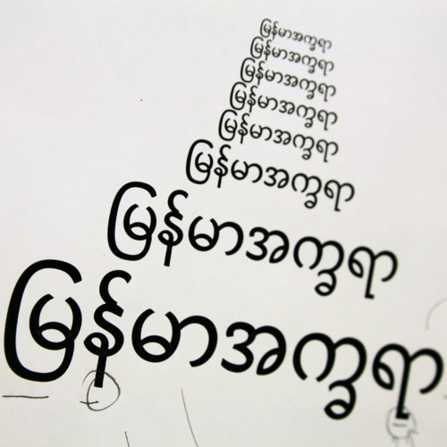
Here the idea was to move away (gently) from the generic monoline appearance of so many Burmese fonts. I found the medial ra conspicuous by its squareness in most existing typefaces and wanted to make it seem more like the other letters…in my work I’m conscious of the tendency to Westernise non-Latin letterforms but in this case, the precedent is Burmese as I found this style more customary on palm leaf parabaik manuscripts. I’m fairly certain this is a culturally sensitive approach but will continue rebalance against a number of other sources. Those parabaiks (at the British Library) also showed me that the traditional writing implement, a stylus, effected a kind of stroke modulation with heavier and lighter parts — another way to abandon the geometric forms common today. (I’m currently not sure whether this modulation needs to be more or less evident.) I’ve also condensed the forms slightly for the same reason. It’s far from polished as the extenders are the wrong lengths, the ligated forms are not quite joined well enough, and the stroke terminals need work, but the basic forms are much more interesting to draw than might be suggested by the predominance of circles.
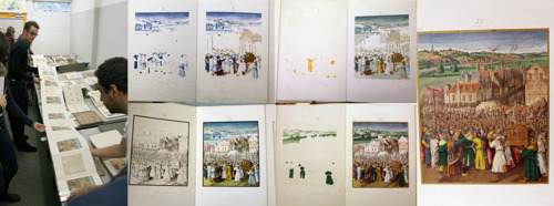
Michael Twyman’s sessions continue to inspire us. His lecture series ‘Typographic Delights’ traces the history of print. Each week Michael brings in a huge selection of artefacts, mostly from the 19th century, and introduces the historical and technological circumstances surrounding the emergence of a particular kind of typographic printing. So far we’ve covered French and English letterpress posters, photogravure cinema magazines, the history of forms, signwriting and chromolithography. For me with no academic appreciation of arts and crafts nor design, it’s been hugely instructiveto match up my knowledge of the industrial revolution and the rise of globalisation with developments in printed communications.
Today’s centrepiece was a 17-colour progressive proof from 1866, with a litho-printed snapshot of each stage of production as the page was stamped by each litho stone. Somehow today’s eight-colour inkjet printers pale by comparison.