Designing type is an exercise in parallel thinking. On one level, it’s about coming up with interesting ways to inject each letter with some visual interest and simultaneously respond to the brief chosen. But on another level, it’s about ‘designing the design’, as we’ve seen before. What is it about the letters that hangs them all together? How can a set of ideas be applied consistently and logically so that it can be called a design rather than just a set of shapes? The answer to that is one reason why to me, designing a text face is so sublime: it’s necessarily about eliminating everything that doesn’t gel with everything else, refining and reducing the idea behind it to its clearest, most elegant expression.
Getting everything to gel together means everything has to be considered in light of everything else, or at least in light of the parts of everything-else that are related by the application of the design rules. (This of course also implies a certain circularity, which is why type design is a recursive process). For example, my design rules might prefer the /c/ and the /f/ to have similar terminals at their tops, but that terminal may or may not be related to the /r/ or the /j/, depending on my idea of the design. So this is what ‘designing the design’ actually means.
Some of these parallel considerations spill over between scripts too, when we attempt to harmonise different kinds of writing systems. The links may be explicit, with shared formal attributes, or more subtle, with an intangible link that makes the styles belong together without copy-pasting outlines between scripts.
With my brain now used to thinking in parallel (or at least getting a bit more comfortable with it), it’s naturally started to wonder about the parallel histories of the Brahmi scripts that I’m interested in.
The Thai, Khmer, Lao and Burmese scripts are related through their Brahmi origins, and I’m starting to see why piecing together that history is a useful exercise.
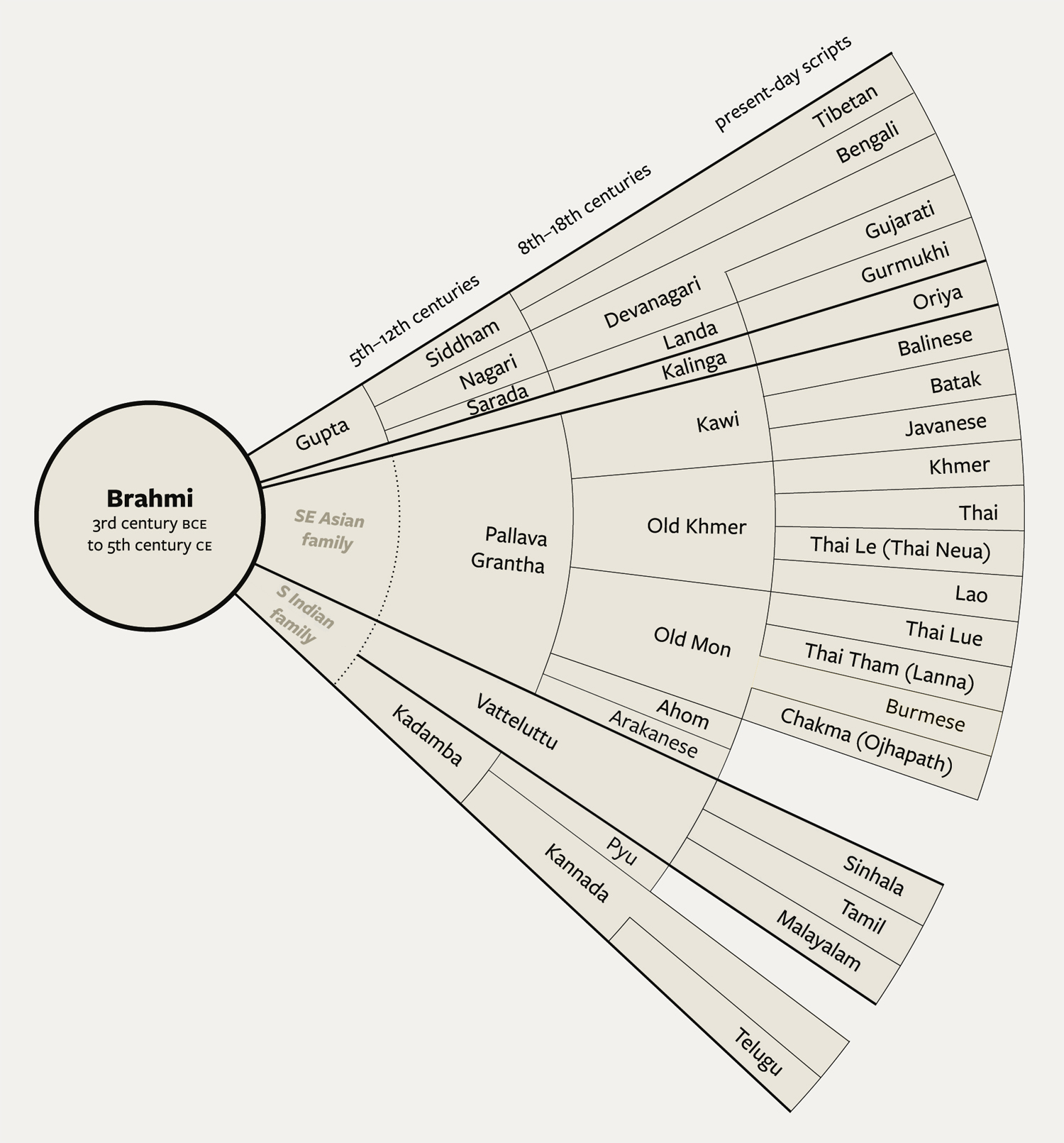
(Schematic of Brahmic scripts. There is no universal consensus and mistakes are mine alone. Click to enlarge.)
I’ve always noted similarities and discrepancies between Thai, Lao, Khmer and Burmese. Some of the forms have clearly evolved from common roots: Lao ຈ and Thai จ are unmistakable cognates, as are ດ with ด and ຕ with ต. Pairs like ທ and ท may be less obvious, with different proportions but the same topology. Burmese and Khmer are less readily matched up, mainly because the different styling imposed repeatedly through history has now become part of the letterforms. Burmese is mainly circular, while Khmer prefers zigzags. But Burmese ခ and Khmer ខ match up, as do ဃ with ឃ and ဍ with ឌ. (Depending what font your browser chooses, these may or may not look similar) The story gets more interesting when you also notice parallels creeping in between Old Burmese and Old Thai, or even more distant cousins Rakhawanna, Chakma, Lao and Khmer.
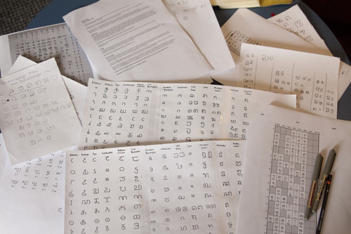
Ordering the writing systems in the traditional Brahmi articulatory vargas (phonemic series) shows common threads between them.
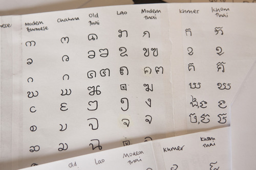
Comparing letterforms between sibling writing systems.
As well as these similarities, there are also large discrepancies between scripts. Undoubtedly the tools and substrates in different areas had a great influence. But also the differentiation of these scripts took place through a gradual alphabetic Chinese Whispers, with stonecarvers and manuscript writers preserving aspects of each character that they thought were essential, but inevitably leading to a gradual morphosis. Getting to grips with that long slow game leads to useful insights for the type designer:
1 Although the different scripts have their own look, the differences are often quite superficial, to do with styling rather than architecture. The underlying topological structures are often very similar. Even when they don’t initially look very similar, considering them together shows unexpected links, for example where disconnected strokes have become joined using a point of inflection or a knot. Understanding how the individual letters have evolved to be the way they are today gives us the design space available for taking our own designs in unconventional directions.
2 If the underlying architecture of the letters (or the writing tool’s ductus) is so similar, the look of each script is very largely determined by proportion and the way strokes are modulated. Old Burmese and Khmer may not look very similar, but focussing on the track of the tool rather than the modulation reveals their shared history. Writing Burmese with a broad-nibbed pen makes it look almost like a different alphabet. While it’s perfectly possibly to play with these conventions, the results are too far outside the normal expectations to be suitable for text typography, instead making an impact that can be useful in display settings:
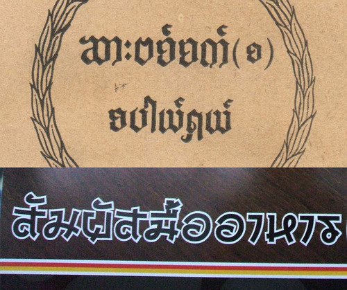
Top, Burmese styled with a broad-nib pen. Bottom, Thai styled to look Japanese.
3 Over the course of time, the letters of a script begin to develop a coherence. Practical needs, such as the use of a particular tool, or the expediency of writing at a constant speed, the methods of punchcutting or casting type, or even the ease of reading, ensure that letters that are used together tend to end up looking uniform. For example, the ancestor script to all these writing systems is Brahmi, a script that uses elemental shapes like crosses, semicircles and diagonals. The letterforms have different degrees of complexity and angularity, and different amounts of whitespace. But as Brahmi evolved into different writing systems in different places, and with typography playing a significant role, all these aspects are evened out. (There are of course exceptions, such as Tamil with its very disparate letterforms.)
4 There are aspects of the letterforms that are not determined by the three previous factors, and which can be played with…
5 Scripts like to have their own identity. Repeated stylistic features are a way to bring cohesion to a script as well as introduce new ideas. The knots and loops of Thai, the zigzagged heads in Khmer, the notched instrokes of Pallava or Pyu, the circular forms of Burmese or the tick-shaped head in Telugu are now so embedded that they are the distinguishing features of those scripts. Often these features can be reinterpreted, simplified or exaggerated in different styles of writing (and type) but cannot usually be omitted altogether.
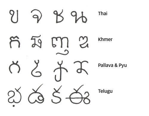
Showing how stylistic details have become identifiers of different scripts. Excuse my lack of finesse with these unfamiliar scripts!