My last few weeks have moved really quickly, as I made my decision to come to the MA programme only at the start of August. Since then, I’ve had to finish off some freelance design jobs, sort out my enrolment and accommodation in Reading and get some vfb font files in good enough shape to send to the publishers (unfortunately no sign of a release date yet, as I’m going to need to concentrate on the MA for the next 12 months).
To get us started for the MA, Course Director Gerry Leonidas sent us our reading list and a couple of exercises to work on over the summer. Whilst sometimes quite dense and technical, I have found the books largely interesting. My favourite so far is Twyman’s British Library Guide to Printing as I didn’t know much about the different kinds of printing presses. I’m currently getting to grips with Kinross’s Modern Typography, which is not quite so friendly in style (rather dry and detailed).

Interpreting letters digitally
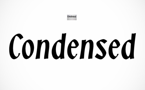
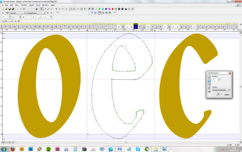
Our first practical task was to get familiar with FontLab. Gerry sent us an image of some (hand) lettering, and asked us to convert it into font vector outlines, then set the word ‘Condensed’ in InDesign. Accidentally, I used the tiny thumbnail version (200px wide) of the image, rather than the full-size image, which explains the round corners at the stroke terminals. This was an exercise in curve-wrangling, and although Gerry suggested we auto-trace the image in FontLab, I chose to manually draw the nodes and position the handles intentionally, rather than end up with an untidy mess of extra nodes and bumpy curves.

Vectorising and normalising the letterforms
I also chose to normalise the /o/ and /s/, which seemed unbalanced in the original lettering and difficult to space in a working font, where the letters have to work no matter what combination they appear in (unlike in single-word lettering).
My spacing (letterfitting) is still rather uneven, as I’m not very experienced with this style, or italic forms, and would probably want to normalise all the letterforms a lot further to obtain a harmonious font. I did put in the key dimensions and generous alignment zones (the hand-drawn nature letters are different sizes), in case I ever need to build this into something more.
I wondered if I slightly rushed this (it took about an hour), but then figured this was intended as an introductory exercise, not a full-on practical project.

Sketching letterforms
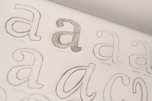
Our second assignment was to sketch some selected letters from the fonts FF Tisa, Plantin, Electra and Adobe Jenson. I also sketched some letters from other fonts, thinking it might be useful to see how different forms are constructed. It was a fun assignment; my biggest difficulty was getting the overall proportions to match the originals. My /k/s for example invariably had the knee way too high to start with.

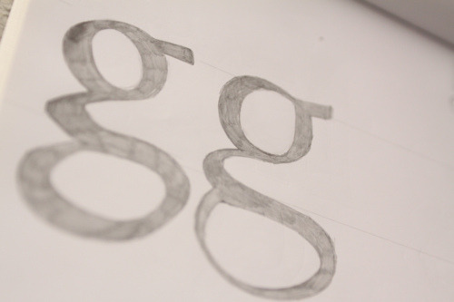
Getting to grips with the lowercase /g/