Branding types workshop, Reading

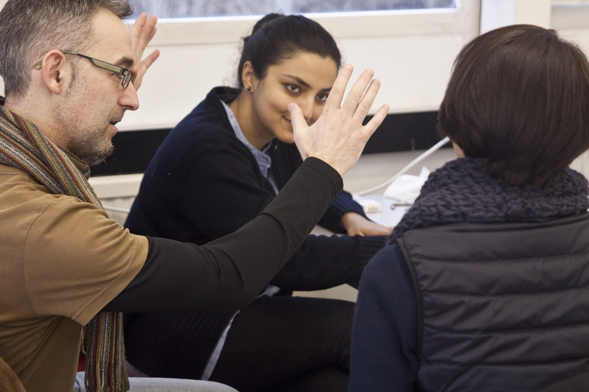
Discussing concepts in the early stages of the workshop

Discussing concepts in the early stages of the workshop

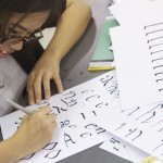
Along with my good friend Julian Moncada, we held a 4-day workshop for students of Reading’s MATD programme. Students worked on team projects to create a system of typefaces for fictional clients. We gave them some background info on each client, and set out what the typefaces would be used for. It was then up to the teams to decide on the creative direction, the number of typefaces needed, and the allocation of work among themselves. Continue reading


Parallel thinking, parallel histories

Designing type is an exercise in parallel thinking. On one level, it’s about coming up with interesting ways to inject each letter with some visual interest and simultaneously respond to the brief chosen. But on another level, it’s about ‘designing the design’, as we’ve seen before. What is it about the letters that hangs them all together? How can a set of ideas be applied consistently and logically so that it can be called a design rather than just a set of shapes? The answer to that is one reason why to me, designing a text face is so sublime: it’s necessarily about eliminating everything that doesn’t gel with everything else, refining and reducing the idea behind it to its clearest, most elegant expression. Continue reading


International Student Typeface Exhibition

Work from 111 students was exhibited.

The Ampersand Conference is always great because it brings many of my friends from the type community around the world to Brighton, my hometown. This year was extra special because I coordinated the first ever exhibition of student typeface work from around the world. Continue reading


Between black and white

This week, the annual ATypI conference is taking place in Hong Kong. Unfortunately I’m not going to be attending, but its theme, ‘Between black and white’, has prompted me to think in more depth about how the principles of notan can be implemented in typeface design, not just as a curiosity, but as a pragmatic tool to enhance readability. Continue reading