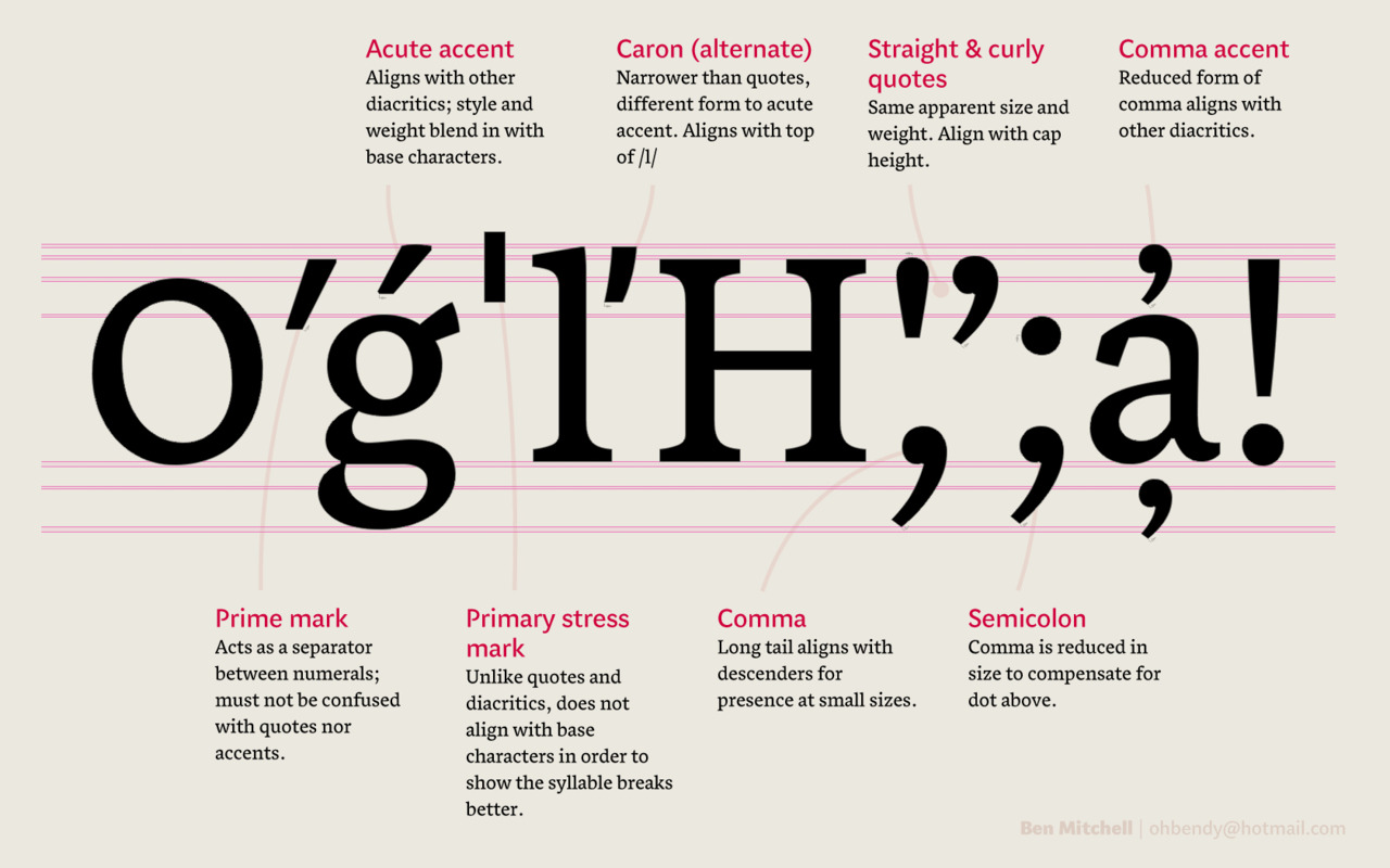
This week, the annual ATypI conference is taking place in Hong Kong. Unfortunately I’m not going to be attending, but its theme, ‘Between black and white’, has prompted me to think in more depth about how the principles of notan can be implemented in typeface design, not just as a curiosity, but as a pragmatic tool to enhance readability. Continue reading
Category Archives: Blog
The MA ends
Our fantastic year at Reading is now complete, and the class of 2012 has dispersed to make way for the incoming students — a talented looking bunch judging by some of the websites I’ve seen. Continue reading
Mastering type exhibition

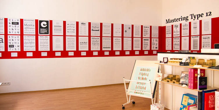
The Mastering Type exhibition now on at Mota Italic in Berlin features the work of type design students from this year’s classes at KABK and Reading.
The Paradigm of the Stroke
Recently, we were visited by Will Hill, ex-Reading student and now Senior Lecturer in Graphic Design at Anglia Ruskin University. His lecture touched upon something that’s been bothering me for some time… Continue reading
Spiro curves

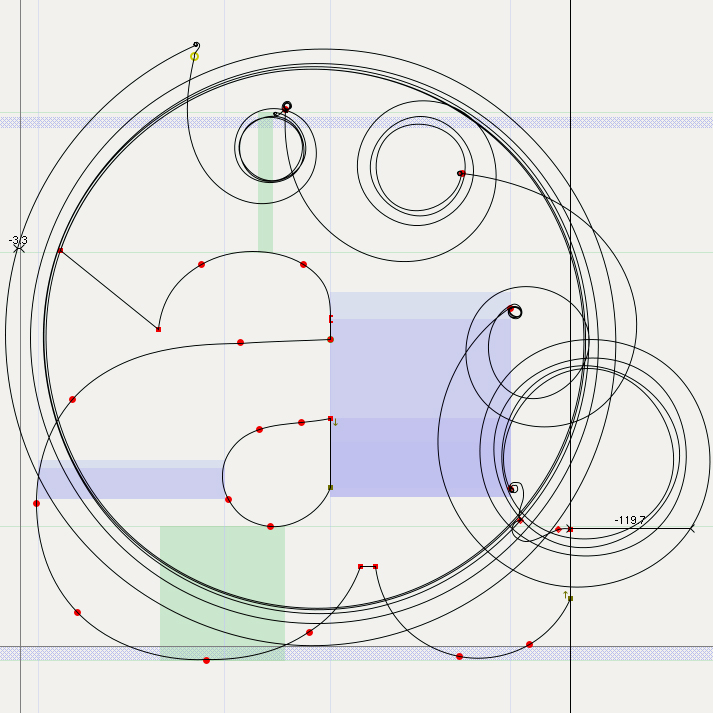
Spiro curves go mad when they don’t converge.
I’ve been meaning to give Spiro curves (or clothoids) a try for a while. By now, I’m fairly confident with Bézier curves, but I’m always interested in finding other ways to do things, and Spiro curves have a very different quality to them. Continue reading
Whence originality?
David Březina () came to visit us last week, to talk through his career in type design and his award-winning, multi-script foundry, Rosetta, to critique our typefaces, and to ask us an impossible question. What he wanted to know was how we plan to create original work in our typeface design careers over the next ten years. A ten-year plan is not something I’d naturally sit down and think about, so it certainly struck me as an intriguing question. How on earth can I set about planning my long-term creativity? It was the kind of meta question that demands you take several steps back from the process itself and consider how one approaches one’s approach. Continue reading
It’s May already!
The year has flown past at an alarming speed — not that it’s over yet, but as our project deadlines are in June, it feels like we’re very much in the final stretch. After our fantastic field trip to Antwerp, Amsterdam, the Hague, Haarlem and Bussum, the Easter break gave us some much needed breathing room to get down to some serious business with FontLab. Continue reading
Aligning things!
Finally, Burmese begins to click
Our Spring term has flown by, and progress on my typeface was honestly a bit disappointing. Perhaps I tried to tackle too many things and ended up spreading things a bit thin with unresolved attempts at Greek and Thai, or perhaps it was the packed timetable of workshops, visiting lecturers and assessment deadlines, but I was expecting to have achieved more by the end of term. I was especially unhappy that I didn’t have very much new stuff to show Gerard in his two visits of the term, as I’d been focussing on the non-Latin designs rather than bold, italic or sans fonts I’m also trying to develop. On the plus side, however, my Latin lowercase in the regular weight is now accomplished, including most of the spacing, so I’m freezing that now to work on the caps and Burmese. Continue reading
AFDKO Workshop. Caution: geeky.
The Adobe Font Development Kit for OpenType (AFDKO or simply FDK) is a set of command line tools that Adobe makes freely available for font developers to help with production and testing. If, like me, you’ve struggled with FontLab’s glitches only to end up with incompatible font names, duplicate encodings or extra features you didn’t write, FDK seems like a better way to do things. Unlike glyph-editing software like FontLab, Fontographer, Glyphs or DTL BezierMaster, the FDK’s strength is in directly wrangling your fonts’ behind-the-scenes properties, such as naming and compiling extensive font families (especially from multiple masters), scripting the OpenType code that FontLab can’t manage, and comparing stem widths to expedite hinting. Continue reading
