I’m slowly piecing together the evolution of the writing systems of Southeast Asia, especially those derived from Old Mon and Old Khmer, which have been used in Burma, Thailand, Laos and Cambodia. I’m interested in how, when and why scripts branched off from one another, and what influenced the identity of each. Continue reading
Category Archives: non-Latin
Thai press typography
This post is written in response to some of the questions people asked me about Thai typestyles last week at ATypI in Barcelona. Here I’m exploring looped and loopless styles by analysing current typographic practices in the Thai press. Continue reading
On loops and Latinisation
Introduction
This blog post has grown in the writing, as various emails, conversations and Twitter threads seemed to be pointing in a similar direction. For reasons we will explore, Thai script is often seen as an example of a writing system prone to Latinisation. Its looped and loopless styles are easy to interpret as traditional and Latinised, but does that interpretation stand up to critical scrutiny? Continue reading
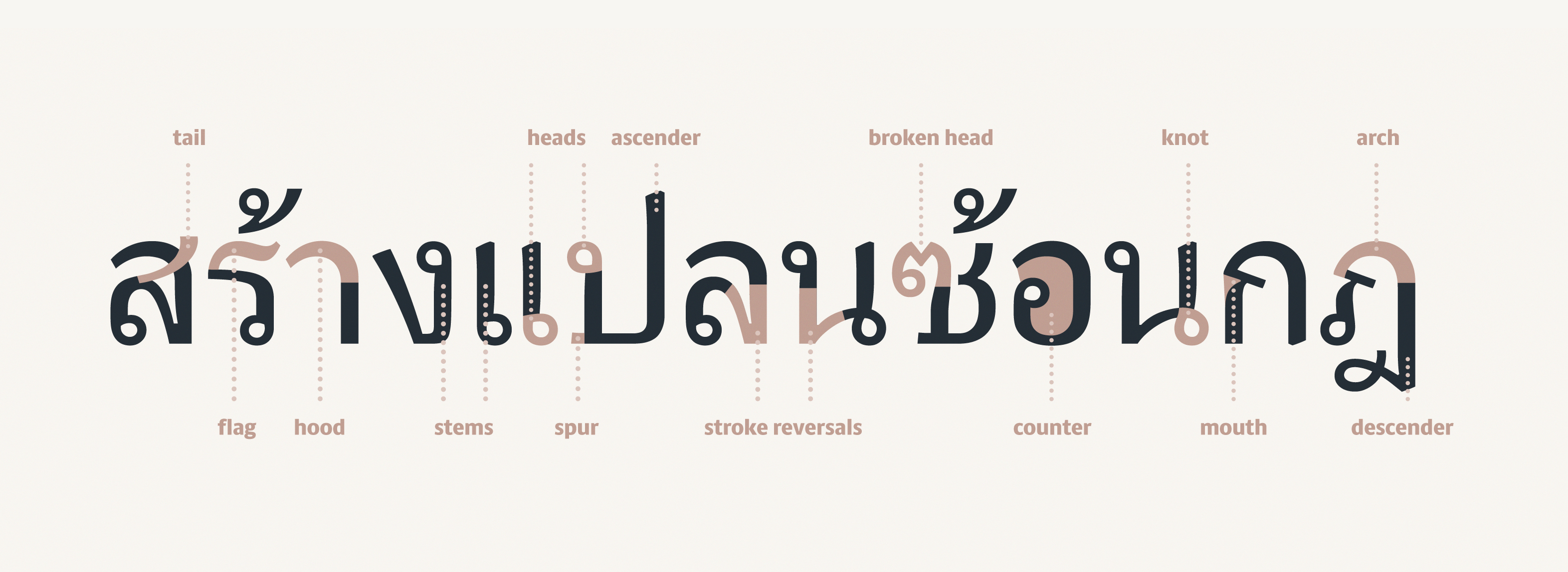
Thai letter anatomy
Parallel thinking, parallel histories
Designing type is an exercise in parallel thinking. On one level, it’s about coming up with interesting ways to inject each letter with some visual interest and simultaneously respond to the brief chosen. But on another level, it’s about ‘designing the design’, as we’ve seen before. What is it about the letters that hangs them all together? How can a set of ideas be applied consistently and logically so that it can be called a design rather than just a set of shapes? The answer to that is one reason why to me, designing a text face is so sublime: it’s necessarily about eliminating everything that doesn’t gel with everything else, refining and reducing the idea behind it to its clearest, most elegant expression. Continue reading
How can you design a typeface for a language you don’t speak?
This is a really common question I’m asked, so I thought I’d write a few notes about why it’s not necessarily a central part of type design to speak a language. Continue reading
Lumen specimen
Gallery
Finally, Burmese begins to click
Our Spring term has flown by, and progress on my typeface was honestly a bit disappointing. Perhaps I tried to tackle too many things and ended up spreading things a bit thin with unresolved attempts at Greek and Thai, or perhaps it was the packed timetable of workshops, visiting lecturers and assessment deadlines, but I was expecting to have achieved more by the end of term. I was especially unhappy that I didn’t have very much new stuff to show Gerard in his two visits of the term, as I’d been focussing on the non-Latin designs rather than bold, italic or sans fonts I’m also trying to develop. On the plus side, however, my Latin lowercase in the regular weight is now accomplished, including most of the spacing, so I’m freezing that now to work on the caps and Burmese. Continue reading
The typographic tradition in non-Latin scripts
In Europe, the various strands of typography came together over centuries. Even before the arrival of printing, there were many styles (and sub-styles) of writing: the Greek and Roman inscriptional capitals and everyday ‘rustic’ letters, the Carolingian and insular uncials, and the textura and rotunda gothics to name only a few key elements. Printing types started in the fifteenth century by mimicking the forms of handwritten letters, and thenceforth, developments in type included bicameralism (including upper- and lowercase versions of letters in one typeface), the integration of uprights with italics, and the gradual movement away from humanist models to the elegant swelling lines of the “modern’ types. Later we see the introduction of sans-serif faces, and the invention of the fat, poster faces that gave us our bolds. Continue reading
Constructive confusion
Week 8 was our second intensive practical week with Gerard, and with only two more weeks of term, it’s felt like time to really settle into a definite direction and concentrate fully on our typefaces. Continue reading

