In Europe, the various strands of typography came together over centuries. Even before the arrival of printing, there were many styles (and sub-styles) of writing: the Greek and Roman inscriptional capitals and everyday ‘rustic’ letters, the Carolingian and insular uncials, and the textura and rotunda gothics to name only a few key elements. Printing types started in the fifteenth century by mimicking the forms of handwritten letters, and thenceforth, developments in type included bicameralism (including upper- and lowercase versions of letters in one typeface), the integration of uprights with italics, and the gradual movement away from humanist models to the elegant swelling lines of the “modern’ types. Later we see the introduction of sans-serif faces, and the invention of the fat, poster faces that gave us our bolds. Continue reading
Designing the design
There’s a phrase that pops up from time to time in the department; it’s probably a Gerry-ism. ‘Designing the design’.
My take on it is that before we start drawing letterforms and thinking about details like what style of serifs we’d like, there’s the important matter of how the thing should look holistically. Can I visualise the rhythm and texture on the page, the way the letters perform together? Am I aiming for a particular mood and tone? What connotations and atmospheric values would I like to suggest? Continue reading
On multidimensional balancing acts
I decided to take advantage of Gerard’s third visit of the year to finalise the relationship between my Latin serif and sans serif designs. Several people had remarked that the sans was looking too skinny, too small or too light, but I wasn’t really sure whether fixing it meant stretching the thing or redrawing completely. In the end it was an illuminating and actually quite easy process, despite the many dimensions at play. Continue reading
Font Workshop with John Hudson
We’ve definitely moved up a gear or two this term as our timetable becomes filled to bursting point.
My seminar on how designers respond to technological constraints went quite nicely; the gist of the presentation was that successful type designs accommodate the needs of technology, but don’t depend on them. A talented designer will always develop their typefaces to work with more than one technology, and let their eye for aesthetics be the final arbiter over design decisions. Continue reading
Learning to read handwriting
Gallery
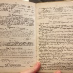
These intriguing old French and Spanish school books, from Michael Twyman’s personal collection, were made for helping people learn to read different handwritings. The handwriting throughout the books gets progressively harder to read. … Continue reading
Term starts
After a good winter break it’s now time to put our brains back in gear and prepare for a packed term. Our dissertation proposals are due at the end of next week; this is where we outline our topic, how we want to approach it, and where we’ll find information, resources or people to write about. I haven’t yet started mine, as I’ve been also occupied with writing my seminar, which is also due next week, and which counts towards our final marks. Continue reading
Puzzlements and progress
Our first term is over, though it feels as though we’ve all only just settled in. The ten weeks have passed so quickly, in a flurry of workshops, conferences, seminars, critique sessions and typographic delights. I’m feeling lucky to be able to spend this year doing something I enjoy so much at a department with such a great name. Continue reading
Constructive confusion
Week 8 was our second intensive practical week with Gerard, and with only two more weeks of term, it’s felt like time to really settle into a definite direction and concentrate fully on our typefaces. Continue reading
Research-led design
The last couple of weeks have felt a little more pressured, as we concentrate more on our practical projects, delve more deeply into the non-Latin scripts and start our core seminars.
As well as classroom commitments, I have become the student representative for the class, which involves extra meetings both in the department and with the Students’ Union. The food situation near the Typography and Arts departments is pretty dire, so some sort of petition or direct action may be in order. There have also been a few silly problems with IT in the department which have needed more patience than expected.
False starts, confusion and learning
For the past two or three weeks I’ve been bashing out ideas for my practical project, the type family designed especially for Burmese dictionaries. As I blogged before (Thoughts on a Brief and Exploring Burmese), I’m aiming for a fresh, lively and cheerful design, in which the Burmese and Latin scripts harmonise well. Continue reading